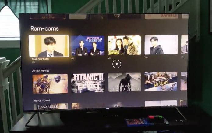
A few days before the new Chromecast is unveiled, a scroll-through video of the new Chromecast UI has appeared online. Shared over on a reddit thread is a video from Redditor fuzztub07. The scroll-though of the UI appears smooth with no lag. Specifically, this is for the new Chromecast with Google TV which is the next-gen model of Google’s very own media streaming product line. It is the one codenamed Sabrina that we’ve been hearing about the past few weeks and that will officially be introduced on September 30.
Last week, the Chromecast with Google TV and remote were leaked together with the next-gen Google Home speaker aka Nest Audio. More images were leaked earlier.
We also remember referring to it as a new Android dongle. The Google Sabrina Android TV dongle, now Chromecast TV, is expected to come with the latest features and enhancements like Meet on Chromecast for a bigger view of video conferences, Quibi phone app compatibility, and Files by Google support among others.
The Redditor was willing to answer numerous questions about the new Chromecast. He mentioned something about switching between NFL and Amazon was not bad. The apps reload pretty quickly.
The remote “feels ok” as described. It doesn’t feel cheap. It simply looks like a standard 4-way d-pad similar to the Fire Stick or Roku remote. Clicking on the buttons is not that loud.
To review, the upcoming Chromecast TV device will deliver a ‘Simple setup: plug, connect, and stream’. It will come with a physical remote and, of course, the Google Assistant for voice remote to start a search and control the TV.


