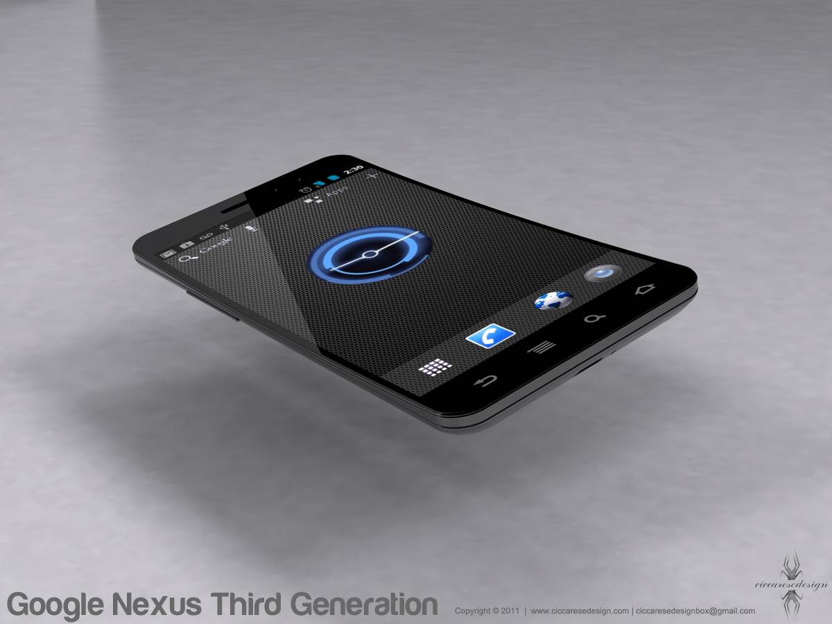
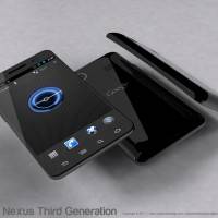
We have another awesome concept design by Federico Ciccarese and this time it is of the much rumored Google Nexus 3. Also known as the Galaxy Nexus, Nexus Prime, DROID Prime or whatever else you wanna call this Samsung Nexus device. This isn’t the first time we’ve seen his stunning work, but with all the hype surrounding the next Google Experience device this was too awesome to pass up. Check out the photos of his amazing Nexus 3 concept design below.
What Federico has done here is taken the neat and elegant design we know and love about the Google Nexus S and made it bigger, thinner, much more attractive and added in a few details from recent Ice Cream Sandwich leaks and rumors. We have heard it will be called the Samsung Galaxy Nexus but everything is still unconfirmed at this point. He keeps it simple and just calls this beautiful conceptual art the “Nexus 3” (but forgets to remove the capacitive touch buttons).
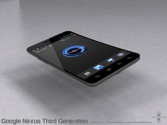
Just like the original we have that slightly curved glass for the display, and he’s neatly added all the juicy bits and pieces we’ve seen regarding Androids next version 2.4 (or 4.0) Ice Cream Sandwich with the Honeycomb clock, Google search up top as well as the beautiful cyan colors that should round out the next version of Android.
We don’t really have much to say here, other than this concept design was very well done and simply put — looks awesome. We could get into rumored specs and all that but instead we’ll just let your minds wander while you check out these concept images in the gallery below. Enjoy!
[via Ciccarese Design]




sensor buttons? wtf, its ice cream phone!
to galaxy s II like, i hope it wont come close to this concept design
This concept is very iphoneish…
is that a joke? Looks like an iPhone.
I thought ICS was supposed have no soft buttons and be replaced by screen?
I did mention he forgot to remove the capacitive touch buttons.
other than that this is pretty cool.
That looks absolutely gorgeous.
agreed
This is an awesome concept. How can it look like the iPhone when no one has seen the iPhone? Anyway, its just for fun. Geez. Give credit where its due. Its a very nicely done mock up. 4 days from seeing the iPhone and a little over a week from the nexus prime. If these phones look close to all these concepts that have been drawn up then its going to be a big win for us consumers.
Plus, what TRUE android fan wouldn’t buy this Google experience device just because it looked a certain way?
Wow. I thought Apple fanboys were idiots, but I see there are Android fans that are idiots too.
Just because something has a rectangular screen on a slim metal rectangular body, doesn’t mean it looks like an iPhone. THERE IS NO OTHER WAY TO MAKE A PHONE WITHOUT A KEYBOARD.
100% agree.
Truth be told i dont see iphone at all in this, i see a slimmer galaxy phones. IDk where you guys getting iphone, nothing like it at all.
Well, because it has touch screen. Crapple Fck boys think that TouchScreen is invented by Crapple.
Too thin.
Get rid of those Capacitive buttons and it will be running ICS 🙂
So cute 🙂 I like phones with this kind of shape.
these desings are really really great
I like it, but I thought its without buttons.
FAAAAAAAAAAAAAKE