


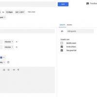
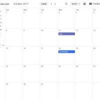
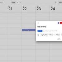
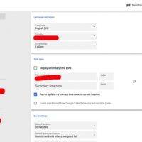
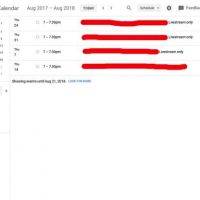
The user interface (UI) of the Google Calendar for desktop is about to get a facelift. Some redditor shared a few screenshots of the new UI on a thread and now we’ve got an idea how it will look like. We have no information when Google will roll out the new version but we know it is coming soon. Note that this is for the desktop version of the software only and not for the mobile app.
The Material Design elements are obvious in this version. The update for such is actually long overdue. The tech giant has only been updating the mobile app with the last one allowing users to move appointments with drag and drop action, 2-way and real-time sync, and events now visible on Google Maps.
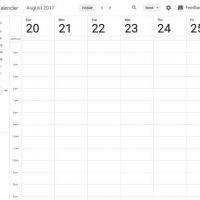
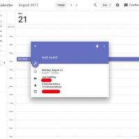
With Material Design in mind, the Google Calendar program now looks cleaner. It also now appears similarly in design with other Google apps and sites that have followed Material Design.
This looks like a total overhaul and only a select group of users is lucky to try the new UI. If you get to try this early, you will notice the program is now easier to manage and navigate. We’re looking forward to Google’s official roll out.


VIA: Reddit


