Users and developers always search for possible improvements or additions to any given product or service. Usually, consumers make suggestions or recommendations based on everyday usage. Developers then try to design possible ways on how to turn them into reality especially if the need totally makes sense to a great number of people. One significant innovation introduced recently is the AMP Project. Short for Accelerated Mobile Pages, AMP contents are lighter and optimized pages of websites that allow lightning-fast mobile browsing.
Google AMPlifies mobile search results and shows lightning fast websites. Other search engines like Bing also started to implement such to amp up mobile experience with quick-loading pages. The Google Play Newsstand then got AMPlified. Google also started to show a site’s actual URLs instead of just AMP URLs for easier identification.
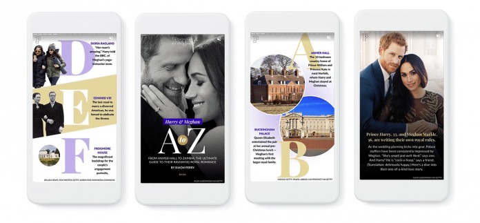
The AMP Project is a success but it has yet to be applied to more mobile experiences. At this week’s AMP Conf 2018, Google announced the AMP story format. This AMP Project allows publishers and content creators to come up with a format focused on mobile. This is made especially for email so news and information are shown with rich visuals.
This format is now visual-driven and is ideal for news and email. You see, there are stories that are best told with images instead of words. Truth is, not many people have the patience to write. Not many have all the time in the world to read in-depth articles. Photos, images, graphics, and videos capture the attention of more people so it is best if content creators use them to tell their stories and ideas.

AMP’s latest format aims to allow more creativity while minimizing technical challenges. It’s easier to make and is cost-effective so more publishers can benefit from this new feature. AMP stories are more like web pages now. They are still based on HTML and are hosted on a server or site. Contents like video and pages can be linked to ensure timely and quick delivery to the receivers.
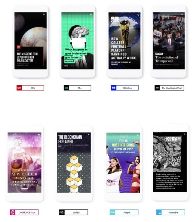
The AMP story format will come with flexible layout templates, standardized UI controls, and other components. Content creators are free to edit most of the sections. There are several publishers that have tried the format already including CNN, Mashable, The Washington Post, Vox Media, and Conde Nast. More are expected to follow so stay tuned.
SOURCE: Google


