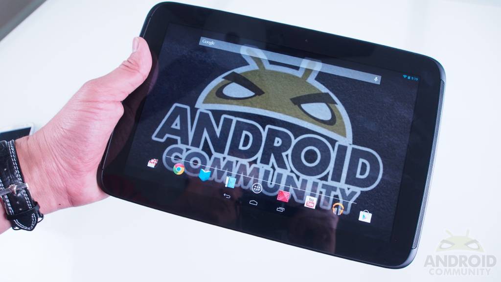
Meet the latest and greatest from Samsung and Google. The tablet that has outdone Apple and their “Retina” displays, the tablet that packs the latest version of Android, and the tablet with the absolute highest resolution to date — coming in at 2560×1600. This is true HD! The Samsung-made Google Nexus 10 is up on our review table, and it’s glorious. The screen is stunning, the processor is blazing fast, and of course we have Android 4.2 Jelly Bean powering this slate. Can this be the best tablet around just as the Nexus 7 has? Read on to see our full thoughts and tons of pictures.
Google’s Nexus 7 has been wildly popular for both Android tablet buyers, and tablet users as a whole. Being extremely powerful, efficient, and budget-friendly Google’s done the exact same thing with their Nexus 10. They’ve realized if they can get the perfect blend of top quality hardware and software for cheaper than the competition, well, they’ve got a awesome device that will sell. The Samsung Nexus 10 does exactly that!
Hardware
Before we dive into the actual hardware regarding the look and feel of this new slate, lets talk about the specs under the hood since they are essentially the star of the show here. Google’s pulled out all the stops with the Nexus 10 and has beat everyone, on paper at least. We get a mind-boggling 2560 x 1600 true HD display with 10.1-inches of real estate. This is what Samsung calls a PLS diplay and the viewing angles and colors should be even better than IPS. It stands for Plane to Line Switching and it lives up to Samsung’s claims. Colors are crisp, viewing angles are wide and exceptional, and contract is excellent — but more on the screen below.
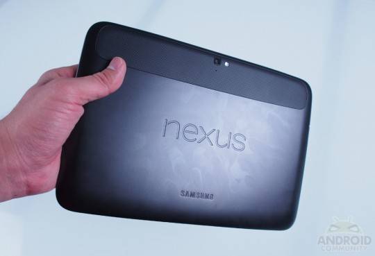
The next important thing you’ll need to know about the Nexus 10 is regarding the processor under the hood. Don’t get fooled by the dual-core vs quad-core more=better problem. It’s also about the technology behind the processor. Samsung’s brand new Cortex-A15 Exynos 5250 is powering the Nexus 10. This dual-core 1.7 GHz chip blasts through the benchmarks and leaves quad-cores like the Tegra 3, and even Qualcomm’s brand new Snapdragon S4 Pro behind. So while it isn’t a quad-core, this 1.7 GHz dual-core 5250 is extremely powerful. Now for the rest of the details. The Nexus 10 comes with that 10-inch 2560×1600 HD display, dual-core 1.7 GHz processor, as well as 2GB of RAM. You’ll get 16GB of internal storage or 32GB for a few more dollars. Sadly we don’t have a micro-SD card here, but we weren’t expecting one either sadly. See Google’s thoughts on the matter here. You also have an improved dual-band MIMO WiFi support for the best and fastest connectivity around — a first for Android tablets (Fire HD aside) and really makes a difference for speed, as well as distance and strength of connection.
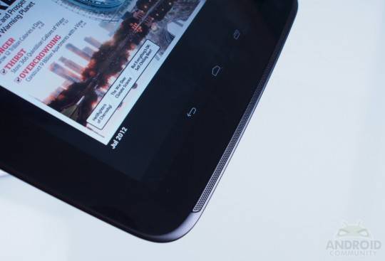
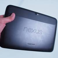
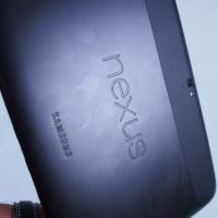
Other specs include a 5 megapixel rear camera that works with Photosphere and everything else from Android 4.2 we’ll mention below, it can take 1080p video and you’ll also rock a 1.9 front shooter for video chat with Google hangouts and more. Under the hood Google’s added in a 9,000 mAh battery (while keeping the slate thin) and promise around 10 hours of usage. The tablet is 10.39 x 6.99 x 0.35 inches across the top, side, and thickness, and only weighs just 1.33 lbs. Pretty light and thin considering the power and display inside. Here’s a full gallery of the hardware, which reminds us slightly of a much improved and prettier Motorola Xoom in a way. The full stereo front-facing speakers are such a welcomed edition. Just like the Galaxy Tab 2 10-inch. We’ve been wishing this would be the path all tablet makers take, and now Google’s finally on board.
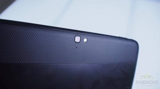
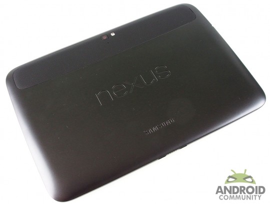
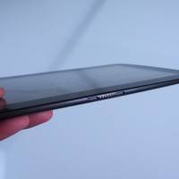
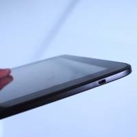
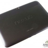
The camera and LED flash grace the back along with that plastic-like polycarbonate shell. On the top left the power and volume rockers are both housed, which are sleek yet easy to find and tap. The left edge rocks the 3.5mm headphone back and micro-USB for charging and syncing, while the right edge enjoys a much needed micro-HDMI out port. Overall we’re rather impressed with the hardware look and feel. Obviously the bezel is quite large and something we wish was smaller, but this is a first step in a new generation of truly HD tablets. What’s next? 4k? The bezel makes the device a little larger than we’d like, but then it’s still extremely thin, rounded on the edges and corners, and makes for an extremely comfortable handling experience. Overall we’d have to give the hardware a thumbs up in all regards. It’s extremely well made, very durable, feels great and is indeed a polished and beautiful product inside and out. Well done Samsung and Google!
Display
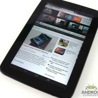
The 10.1-inch 2560 x 1600 True HD PLS display takes everything we love from IPS quality panels, and makes it better. Samsung promises brighter and vivid colors, crisper text, and better viewing angles. Here we have all of that and more. The contract is extremely pleasant, blacks are inky black, and the colors are bright and full of life. We have no noticeable bleeding around the edges, which I’m sure some are worried about with a new screen technology. Safe to say this is an absolutely gorgeous display on all fronts. Look at the quality of the image and the sharp text below.
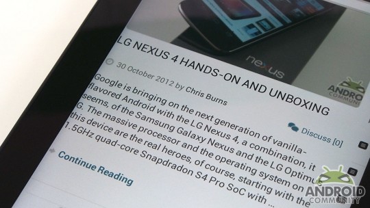
We’ll need more time with this slate to truly enjoy the 2560 x 1600 HD display, but so far playing games has been a blast (ShadowGun for those wondering), browsing the web is one of the best experiences yet, and overall we just can’t say enough good things about this Nexus 10. While we’ve never believed the iPad was on a level of its own, for those who thought it was, the Nexus 10 is here to show you Android can play too!
Software
There is plenty of new goodies with Android 4.2, but at the same time everything is as you’d expect. Still being called “Jelly Bean” this isn’t about what’s new, it’s about what Google’s refined and perfected. Yes we have some awesome new features like multiple user accounts, Photosphere for epic pictures, a new quick settings menu and more, but overall this is still extremely similar to the Android 4.1 Jelly Bean we already know and love. For a better idea of what’s new with Android 4.2 Jelly Bean you’ll want to check this out!
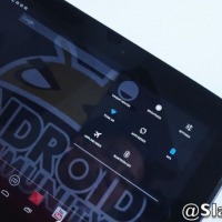
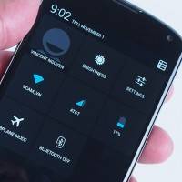
The link just listed above details what’s new in 4.2, so we’ll just go through what’s important here. Just like the Nexus 7, the Nexus 10 employs the same user interface that isn’t quite a phone UI, but isn’t like most tablet interfaces either. It’s a blend between the two that seems to only be offered on a Nexus. While some might not like the wasted space with the black bar on button and just the on-screen navigation keys, we personally love it. It’s very simple! The dock of icons has been improved and clearly we have a much wider selection, not to mention quick settings. We mentioned quick settings earlier in October but now Google’s implemented this in a different manor. Instead of wasting valuable notification pulldown bar space with WiFi, Bluetooth, Airplane Mode, and GPS settings toggles like most 3rd party skins — why not make it another option all together.
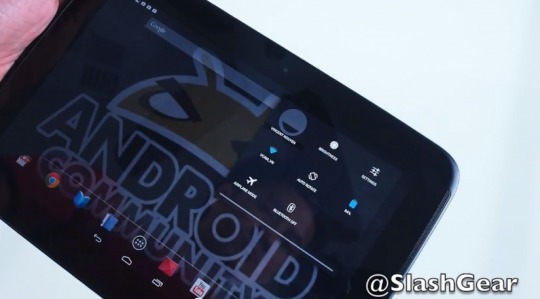
Quick Settings also exist on the new handset from Google – see our LG Nexus 4 review too!
On the Nexus 4 with Android 4.2 you swipe down a second time, or swipe with two fingers for the quick settings menu. On the Nexus 10 it has its own side. The left pulldown is what we’re familiar with, while the right houses the new quick settings. This makes flipping on WiFi or changing settings an absolute breeze and puts other mobile OS settings like iOS and especially Windows Phone 8, absolutely to shame. Why stumble through multiple menus when it can be at your fingertips in seconds? We love it. This is what makes Android… Android!
As mentioned above there’s a brand new improved camera and gallery app. Photosphere lets you virtually take panoramic pictures up, down, left, right, and anywhere you’d like to direct your photo — and they are amazing. This is more of a feature for smartphones, and you can see more in our LG Nexus 4 Review. What we want to talk about is multiple user accounts. This is all new with Android 4.2, and just like quick settings, was hinted and leaked back in October.
Multiple User Accounts
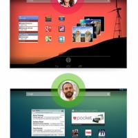
This is a feature that for now is only coming to tablets, and makes sense considering most don’t share their smartphone. For the couch or coffee table tablet the entire family uses, the Nexus 10 is a perfect match unlike any tablet available today. Now I can have my own account with my own wallpaper background, apps, settings, notification options and more. Then for those with a wife, kids, roommates and more can all have their own too. No longer do I need to pass my roommate my tablet and hope he isn’t reading through my Gmail. Everyone gets their own user account with their own content. For those that needed this feature, it’s awesome!
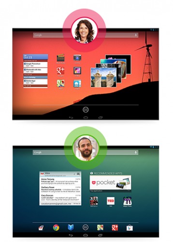
What makes user accounts even more powerful is the simplicity of the entire process. Google’s made it as quick as going to the lockscreen and entering your account with the usual slide-to-unlock. There are no reboots needed or settings to fumble between. Nothing. Simply unlock into your user account and you’ll be greeted with everything that’s yours. Obviously you can set passwords too so your friends and family can’t mess with your background image and play games on you. Kids can’t accidentally delete that game you’ve been working on for months either. This is truly like Windows login options, and it’s a welcomed edition to the coffee table family tablet. Sadly this isn’t available yet on our units, and will be in the OTA update the day the Nexus 10 starts shipping from the Play Store. Same goes for lockscreen widgets.
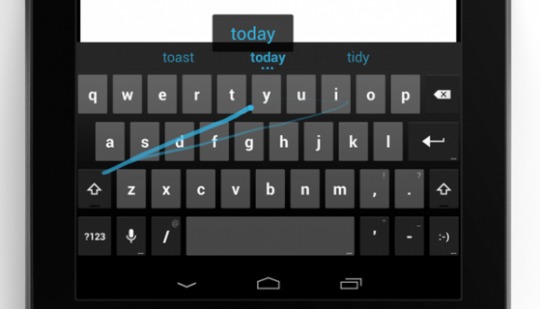
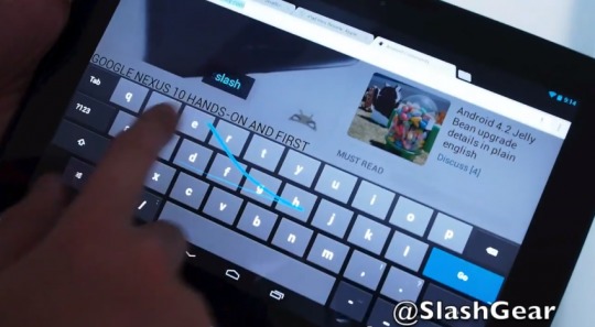
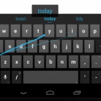
As far as other things new with Android 4.2 mentioned in our detailed breakdown linked to above. We also have an improved Google Now, Gesture typing (to erase Swype from our minds) Wireless streaming, and even better expandable notifications that were introduced with 4.1 Jelly Bean. Gesture typing is actually rather impressive, but is another feature that smartphone users will enjoy more than tablet fans. Sliding your finger across a 10-inch slate isn’t ideal, but the option is available. This will essentially replace the need to download a 3rd party keyboard like Swype and even the upcoming SwiftKey Flow. Google’s also added a hovering prediction option unlike anything we’ve seen. As you slide your finger and gesture across the screen it predicts the word and it hovers above the keyboard. It’s quite neat. It’ll also warn you you’ve made a mistake on that swiping action before you waste time finishing.
Google Now has the ability to search through your Gmail and give you alerts that are needed most. While the feature is scary, using it this past week has been amazing. It noticed I had hotel reservations and flight confirmations in my Gmail, then added the cards to Google Now neatly for me. I learned my flight was delayed 3 hours (uhh) and even got a reminder that my hotel check-out time was in 38 minutes. This also will change the clock when you travel (and show you “Time at home”) show you attractions and famous photo stops when you are on vacation, will alert you on incoming packages based on tracking numbers in gmail, Restaurants, event bookings, and even a Pedometer for how much you walk/cycle from month to month. Google will tell you that you’ll need to be more active. Not really, but the Pedometer is actually pretty cool. Google Now can do everything and more now. It is truly a real virtual assistant.
Overall without diving into Android 4.2 too much (as we’ll review it itself soon) we’re loving what Google’s done, and their direction with the Nexus 10. Other than the few actual new features, they perfected everything even further — like the camera for example. They now have a full arsenal of Nexus devices of all shapes and sizes that completes the picture. The Nexus 10 is beautifully crafted and matches the elegance of the Android operating system. Everything about Android 4.2 Jelly Bean screams project butter, and then some. It’s blazingly fast, fluid, and even smarter and simpler than ever. Android is coming along quite nicely if I don’t say so myself.
Performance
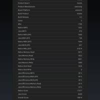
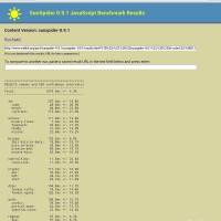
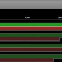
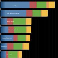
Being a brand new, improved, and more efficient version of Android, not to mention the fastest mobile processor on the planet we surely had to run some benchmarks. Running Samsung’s brand new Exynos 5 dual 5250 1.7 Ghz dual-core processor with 2GB of RAM this tablet screams near the top of the charts. We’ve ran a few of the usual Quadrant, AnTuTu and more, but will let you see the results and decide for yourself. Obviously benchmarks are only benchmarks, and real world usage has mirrored these results, if not been better. Not to mention all those pixels you have to push compared to “older” tablets. Here’s a few benchies for those counting at home.
Camera
We went over the new camera above, but just wanted to rehash some of the awesomeness Google’s introduced here. Photosphere is excellent, and you can see a few samples below. The camera UI has been streamlined and is much simpler. We now have a new autofocus ring on screen that isn’t an ugly square, and hold your finger on the display for more “quick settings” to tweak the flash and multiple other options. No more fumbling through menus here either.
There are also powerful new edit tools, even more filters to take on Instagram and more. We’ll be continuing to test the camera over the next few days – the following gallery will be expanding accordingly, of course.
Battery Life
Google has put forth tons of effort to make Android more efficient. Chip manufacturers have also been working extremely hard at the same feat. While we have a 9,000 mAh battery under the hood that has to push tons of pixels, continuous content, and that fast new dual-core processor. How does it hold up? Excellent. 9,000 mAh is bigger than many 10-inch tablets, and the new Cortex-A15 is the most efficient mobile processor to date.
Combine the two and Google promises 10 hours of battery life — and we’ve managed that or better. Browsing the web, reading Google Play Magazines in truly 1080p HD with crisp text, streaming a few HD movies and more we’ve still been chugging along here. This tablet has reached 11 hours on more than one occasion.
Wrap-Up
With impressive products like the Nexus 7, the new and bigger brother in the Nexus 10 has a lot to live up to. Does it deliver? Absolutely. This is a beautifully crafted tablet inside and out. Hardware and software. Google’s improved the core experience, improved on the tablet UI they appear to be using, and have added all of that to top-tier hardware specs that are almost unrivaled on all levels. Then they’re offering this for just $399 for the 16GB version. Sadly we don’t get a micro-SD card, but the 32GB model runs you a another hundred. This is the essential Android tablet — other than the Nexus 7.

Google added one thing almost every Nexus 7 user wanted, and did it in two ways. We now have HDMI-Out as well as Wireless Streaming with Miracast support and more. We have a front and rear camera, better battery life, improved performance, and the best tablet display in the universe. Google’s done all this for less than the iPad mini. Well played Google, well played! The choice is clear for Android fans. This is the best 10-inch tablet available, and if you’d like something smaller their new $16GB Nexus 7 for just $199 is impressive in its own right. The Android tablet market is saturated with devices of every size, color, price, and operating system and while Google doesn’t want to upset their partners, they do want to steer them in the right direction. The all new Samsung and Google Nexus 10 does exactly that. It gives users a clear choice moving forward, and a model all Android manufacturers can look at and decide what the best route is to take. While we’ll be putting this thing through the paces for the weeks and months to come — we have no doubt this is the best 10-inch tablet experience. Period!
[device id=”3769″]











Yay another table no one will buy.
At $399… you sir, are wrong.
Lets wait and see then. Could you imagine if the iPad only sold 1 million a month? Apple would be DOOMED as the freetards say.
What you’re forgetting is that it is only one of the many Android tablets out there, in many form factors. Apple is dramatically loosing market shares on the tablet market, even you can’t ignore that, can you?
One of the many that nobody cares about. All android has is market share. Only Samsung is making money of the shit code, everybody elts is loosing money on it. To bad apple only cares about profit share not some meaningless number. Apple could have 100% market share to. They could sell at a loss and make shit products like all the android OEM’s.
Go home zac, you’re drunk.
Go home zac, you’re drunk.
What you’re forgetting is that it is only one of the many Android tablets out there, in many form factors. Apple is dramatically loosing market shares on the tablet market, even you can’t ignore that, can you?
dual core and 32gb memory? isn’t that a little too late for that? in november of last year that would be kinda attractive, but in almost 2013? are you kiddn me?
A lot og people bought the nexus 7. Why do you think no one want to by this. I’m getting one for sure. I allready have a nexus 7 and om gonna by this as soon as it arrive in Norway.
For one it has no apps. And for 399 your better off getting an iPad mini or spend a little more and get the new iPad 4. I have a nexus 7 and I will never buy another nexus or any android product again. What a laggy mess of a tablet. Scrolling in chrome is all but useless.
The lag is thanks to the Chrome team being retarded and not giving Android Chrome any attention in months. Try a different browser, and you’ll quickly realize that it’s not actually laggy at all. Mine never lags, except when installing a new app, I’ll get a bit of a stutter, but that’s like 2 seconds, and only when installing/updating apps.
ipad mini screen resolution is so crap for such an expensive device lol…heck even ipad 4 has lower reoslution LOL
ipad mini screen resolution is so crap for such an expensive device lol…heck even ipad 4 has lower reoslution LOL
and it does have apps….700000 on google play plus other sideloading capabilities….you are factually incorrect by saying “no apps” because clearly there are apps.
I said it has no tablet apps. If you want to run stretched out phone apps on a 10 inch screen go ahead. So good to be free and open.
you must be an ifool. what are you doing here on android community?
actually im selling my ip3 now to get this baby, will never purchase another apple product again. loving my note 2 atm~
Question, does this have a vibrate motor built in? I know it has a notification light, but a vibrate motor would be awesome for haptic feedback.
Hmm, am I the only one surprised by Google’s decision to go with such weird layout for notifications and navigation buttons? It seems quite unusable.
I mean, on ICS tablets, you got navigation buttons in reach of your left thumb, and notification panel within reach of your right thumb. So you could use it comfortably while holding it with both hands. But here? Whatever you want to do, you have to move your hands around the device, or even hold it in one hand to allow the other one to reach the back button for example.
This might have worked well for smaller, lighter device such as Nexus 7, but for such a big and heavy tablet, it just does not seem very comfortable. Or am I just imagining things?
I have to agree. I was hoping for the more traditional Android tablet layout on the Nexus 10. It’s ok on the 7 but just seems odd to be on the 10. I’m sure the rooting community will sort it as the traditional layout is still built into Jelly Bean (Motorola Xoom has it). Tablet still seems a good buy though. 🙂
I would purchase one if it came with a keyboard dock with sd card slot and full size usb and more battery life in the keyboard, otherwise no thanks, 32gb is not nearly enough for me. Not bad, but my Acer Iconia A500 has 80gb of storage not even including a full size usb port for another 64gb on the tablet itself.
Will they realize that the lack of a microSD card slot will hurt this tablet? Forget the cloud storage. Give the people the freedom of choice to store data where they want. Those who like cloud, it’s fine, and those who like to have data within their grasp, they should also be catered to, no? Don’t miss the boat, Google. For this very same reason, I prefer my SGT2 over the N7.
It look nice, I just wish the added the feature my Surface has. It puts volume rocker and headphone jacket on the left side where you will not mistake them and power button on the top. The design in the Nexus 10 and other Android Tablets is for the power button and volume rocker to be next to each other which means I hit the power button when I trying to up the volume all the time. Even my surface has a micro-SD car slot so why can’t this top end Android Tablet have one. I personally use the Cloud drive so I do not miss it but I understand some people want lots of client storage. Lastly, the one thing that screams attention to detail is the power supply. It its going to take 4 hours to charge and it charges so slow you cannot play a game that limits it usefulness. I know the battery is huge but how about a fast charger? Waiting for my tablets to charge is my biggest gripe.
The other thing I noticed about Tablets is that weight really matters. You WILL reach for the lower weight tablet over time, Here the Google Tablets exceeds. Of course the high-res makes a difference and you will reach for it for that reason as well.
the prices should have been $399 64GB, and $499 128GB !!!!!!!!
the prices should have been $399 64GB, and $499 128GB !!!!!!!!
Wonderful review, thank you very much for leaving your thoughts on this great tablet that probably soon fall into my hands.
Wonderful review, thank you very much for leaving your thoughts on this great tablet that probably soon fall into my hands.
Impressive but i think ill wait for Samsung to pull out one with a micro-sd slot and this amazing screen
Impressive but i think ill wait for Samsung to pull out one with a micro-sd slot and this amazing screen
I’m sorry but I couldn’t get past the horrible writing. I understand that the audience is adept at reading things like “more=better” and “here’s a few benchies”, but this is a disservice to readers and doesn’t help A.C. in the least. Mr Gunther, please refrain from being too cute in your articles, you’re enthusiasm for the products will not be lost.
Why no MicroSD? Google wants you to stream everything — just keep enough apps on your tablet/phone to need lots of content that they can charge for.
Google, Apple and Amazon are the same in this regard. You’re going to need to buy form one of the system vendors with nothing to gain (yet) from you streaming stuff.