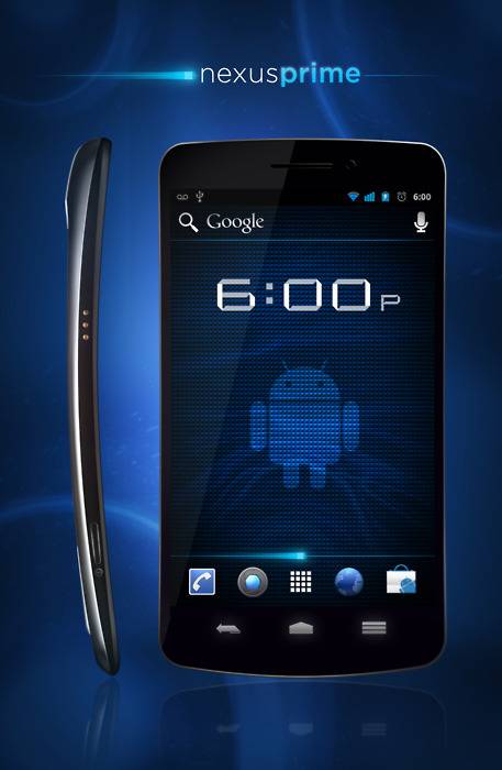
Are you sick of Nexus Prime/Galaxy Nexus leaks and mockups? Well friend, you’re probably on the wrong website. An anonymous Tumblr user extrapolated from the early Nexus Prime render, which was itself taken from the Samsung Unbox Teaser video, to get the beautiful bit of fantasy you see here. While of course this is about as unofficial as you can get, it matches up with both Samsung’s teaser and the supposed first wild photos of Google’s next superphone.
You can see the screen mocked up to look like Ice Cream Sandwich, or at least what we’re guessing it will look like. Note the virtual navigation buttons on the bottom of the Launcher screen, the homescreen’s search and voice control links, and the Honeycomb-inspired color scheme. All in all its a wonderfully well-done render, though I think the hump on the phone’s back is probably going to be on the bottom, not the top. if the real Galaxy Nexus/Nexus Prime looked like this, a lot of Android fans would be happy.
There’s a lot of back-and-forth going on over the rumored phone’s “real” specs. The first leak this morning claimed about the same specifications we’ve been hearing for months, but with a disappointing 5 megapixel camera and a rather typical battery capacity. New rumors this afternoon peg the battery at 2050 mAh, larger than pretty much all the smartphones currently on the market, and an 8MP, 1080p back camera. The processor also gets a theoretical bump to 1.5GHz, and the tipster claims that the phone will have a hybrid 4G CDMA/GSM radio ta make it work across all US carriers.
A rumor can run around the world before the truth has got its boots on. We can’t wait until Tuesday, when all hearsay will be put to rest at CTIA.


nice, but the nexus on the left is upside down (most likely). dont think the power button is on the bottom left
yup
wth??? i know it’s not real but what is the point of software buttons when everything is exactly as capacitve butoons?
i prefer android over other OSes. this nexus imo is a pos! let’s be realistic, majority of us would pick up a conventional rectangular-round corners over this thing in a heartbeat. sorry i have to let it out.
Did you ask the majority of people?
Probably not.
You just made that up.
I, for one, love this.
Software buttons are better because when you rotate to landscape, they can rotate with the screen.
PS – This phone is looking awesome. I can’t wait to give them my money.
looks nice but gs2 is my baby
god i hope its not that squared. looks a bit more rounded in the real side shot. Also the side shot is upside down everyone knows the samsung “hump” is on the bottom.
How come Apple day got here so fast, but Google day is taking so long? My money is ready. I hope this thing does NOT get leaked, iI hate spoilers.
Matted Blues scheme by default! I like!
don’t knock the curve until you try it! it makes every corner of the screen reachable without adjusting your hand when using your thumb to navigate the screen. It’s seriously one of the most revolutionary changes in phone design and everyone is sleeping on it.
Cannt wait~