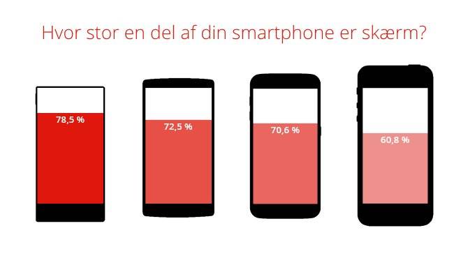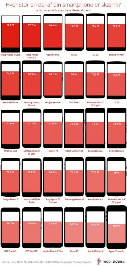
We love infographics. It seems that as the years progress, people have become better and better at doing this – that is, communicate a complicated issue with visuals so much better than just mere words would. Today we have a particularly telling one from the guys over at Mobilsiden.dk, one that shows you just how much of your phone is screen real estate in relation to bezels and other non-screen elements.
Of course, we don’t have to tell you that the bigger the percentage, this is normally better for users. This would mean that users will have more real estate for their touchscreens, and more space for icons on the screen, and better size for HD screens as well. At this point, would you hazard a guess at which phones will be on top and which ones at the bottom? See the infographic below.

It’s no surprise that Sharp’s Aquos Crystal (2014) and Aquos Crystal 2 (2015) sit at the top of the list, they pioneered this “no bezel” trend last year – with 78.5% and 77.2% respectively. Right there at the top also is OPPO’s R7 Plus, another bezel-less device, at 76.6% screen. I smile particularly as I see the LG G2 up there (my current phone), still a winner in screen ratio at 76.1%.

At the far end of the line, we will see something that is not really a surprise – Apple’s iPhones are really not designed well when screen ration is considered. The lowly Moto G (69% screen), Motorola’s budget phone, beats the iPhone 5S (60.9%), the iPhone 6 (65.3%), and the iPhone 6 Plus (67.9%). Apple seems to be improving these days, but their phones still have too much bezel. Mind you, bezels are not necessarily bad things – for instance, they keep your display from shattering when you drop it. But given the premium price you pay for iPhones, consumers should start demanding for better screen ratios from Apple.
VIA: Mobilsiden.dk


