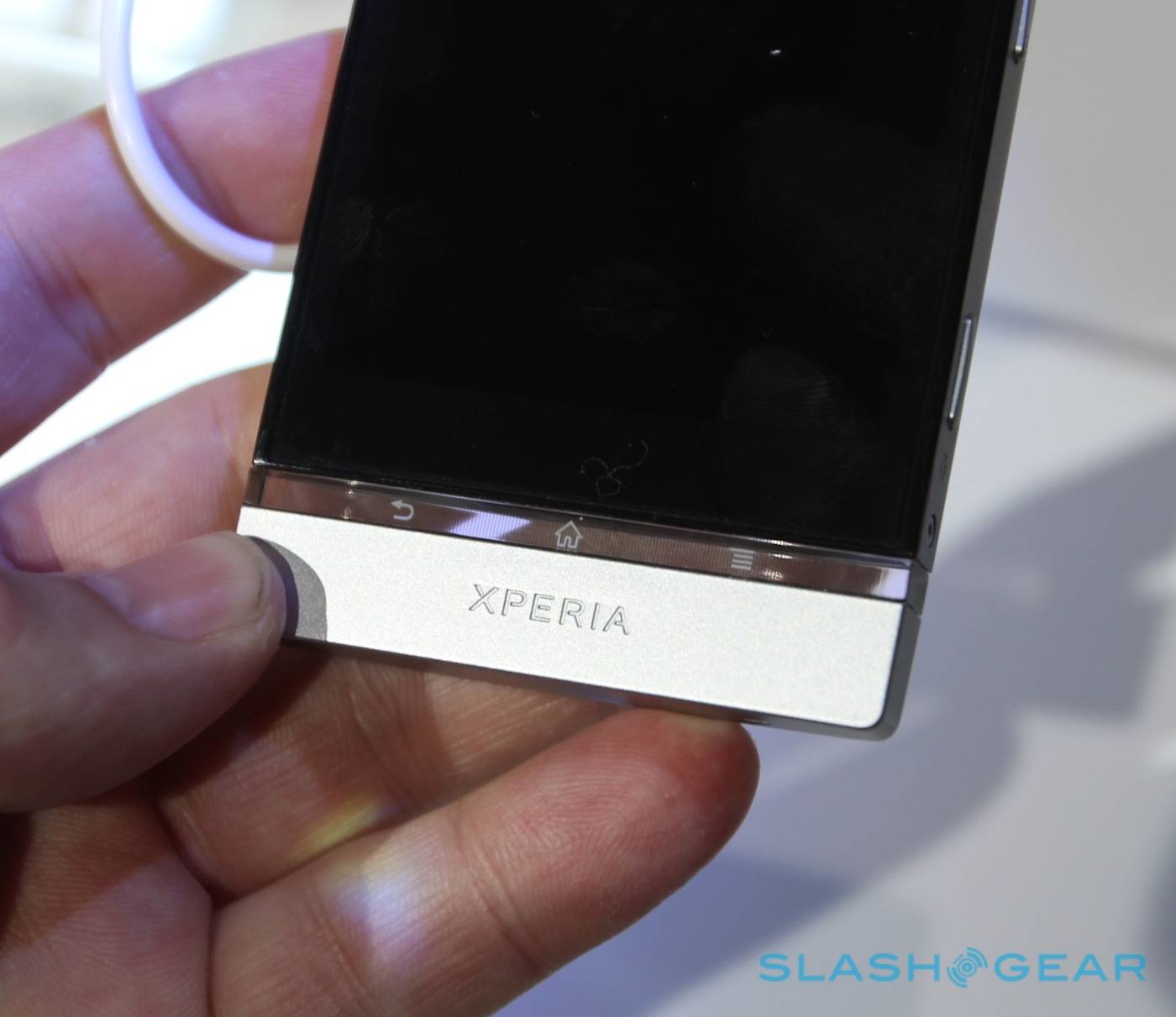
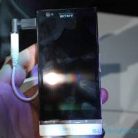
Being the middle child often gives someone some emotional scars. But if our first look at Sony’s Xperia P is anything to go by, the kid will be alright. Sitting in between the high-end Xperia S and the smaller Xperia U, the P plays the middle ground well, keeping the interesting styling of its big brother while incorporating a more pocketable form factor (and hopefully, a more palatable price). Check out our hands-on photos and impressions of from Barcelona below.
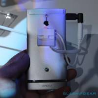
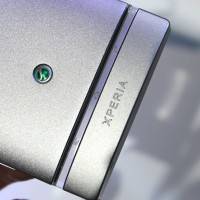
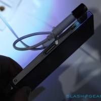
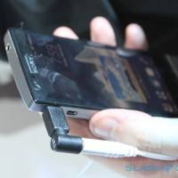
The Xperia P feels significantly more solid than the U, and if it comes to that, the S as well – chock it up to the aluminum back that extends over the “chin” on the front. The P keeps its siblings nifty transparent navigation buttons – hey, if you’re going to avoid Ice Cream Sandwich’s on-screen controls, best to do it with style. While the design of all of Sony’s new phones is a little chunkier than the Android norm at the moment, it’s still a pretty slick device. Unfortunately, there’s no sign of the HDMI dock that Sony showed off in the press conference.
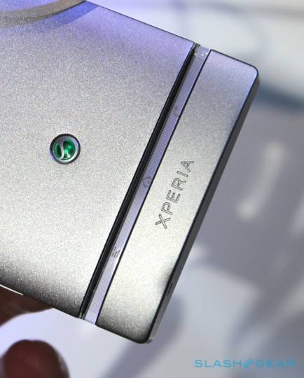
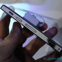
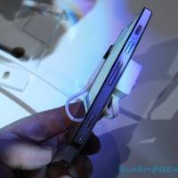
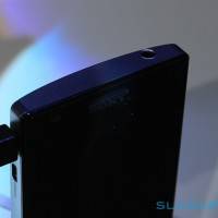
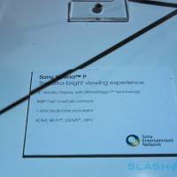
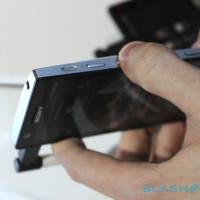
That all-metal back means you probably won’t be seeing a removable battery, and the SIM card slides in via a slot on the left side. Along the right, you get the standard power and volume buttons, plus a dedicated camera button for the 8MP camera – YES! The screen is 4 inches, though we didn’t see a good example of Sony’s promised “WhiteMagic” brightness mode. A 1Ghz dual-core processor is nice, but nothing we haven’t seen before.
Check out the video below for a run-through of the Xperia P’s hardware, and keep it tunes to the MWC 2012 channel for breaking news from Mobile World Congress.
[vms 6fa63738371ec0d5df81]




I love the look of this phone, but Sony will likely over price this thing. I could easily get one of the better hardware phones for the same price that this will sadly be at