
Android has an embarrassment of riches when it comes to app launchers, but there is a certain breed of them that deserves special mention. These are the so called smart or contextual launchers and today we’ll be giving you the rundown on a few of them.
What are they?
While most Android launchers give users the ability to endlessly customize their homescreens and app drawers, these smart launchers differentiate themselves by customizing things on their own. Well, almost on their own. The basic premise is that these launchers learn from the user’s habits and app usage and takes into account certain factors like location and time of day in order to present the most relevant apps and information. It’s pretty much like a personal assistant, but in a less anthropomorphic form.
Whether by design or by convention, these launchers do not offer all the bells and whistles of their fancier comrades when it comes to themes and configuration. But while smart launchers seem to be missing some personalization options, the end result is an even more personal experience.
Aviate
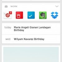
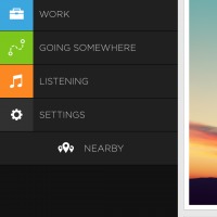
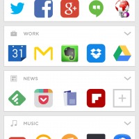
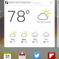
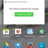
Aviate’s whole world revolves around the concept of Spaces. These are the dynamic parts of the homescreen that change depending on certain conditions, like time of day and location. To be exact, what really changes is not the homescreen but which Space becomes the default. For example, when Aviate detects that it is morning and you are home, it will make Morning Routine the default active Space that can be reached by a simple swipe from the main homescreen or a tap at the Space icon at the top. The Listening Space, on the other hand, gets activated when the user connects a headset or earphones. One can also manually switch to any Space at anytime via Aviate’s side panel.
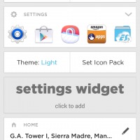
Each Space holds its own set of icons and widgets, some of them can’t be removed and are permanently associated with a Space. Users can still add regular Android widgets but these will be forced to take up a rectangular area. Widgets with rounded borders or those the size of icon will be forced to have large backgrounds just to take up the rest of the allotted space. Theoretically, one can add as many widgets as he or she likes, but the Space then becomes a long running list of vertically stacked widgets. This can be seen as a way Aviate can enforce its rather minimalistic aesthetic.
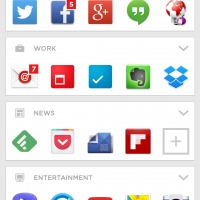
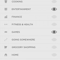
Collections are another crucial part of Aviate. These are semi-dynamic categories of apps. Aviate tries its best to group similar apps together but sometimes fails to do so. The good news is that users can add or remove apps from collections or even have one app appear in multiple collections. Some collections are innately tied up with Spaces, like the Work collection appearing as permanent widget in the Work Space.
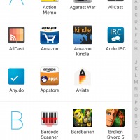
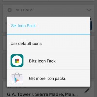
In terms of customization, Aviate is a bit limited. One cannot create a custom Collection or Space. The main homescreen, the primary screen that gets displayed regardless of active Space, can have an image widget. The number of widgets one can add, however, is limited to that single screen space. Aviate did just get support for using custom icon packs, a feature that the rest of the launchers in this review lack.
Everything.me
If Aviate’s design and layout looks a bit alien, then Everything.me will feel like home. Here you have a familiar launcher with multiple screen, configurable wallpapers, regular Android widgets, an app drawer, and whatnot. Make no mistake, however, as Everything.me is just as smart as anything else.
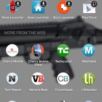
Everything.me’s dynamic features show through the Prediction Bar and the Smart Folders. Prediction Bar is an extra row of four icons that sit atop the bottom quick launcher. The contents of this bar change depending on the now familiar location and time factors. The first icon on the Prediction Bar is what indicates the special condition, like Evening when it is night time, Morning during morning, and My Day for other times. Tapping on this brings up a collection of apps associated with that particular condition as well as Web search results, which we’ll get to in a while.
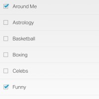
Smart Folders are almost similar to Aviate’s Collections but are a bit more sophisticated. Everything.me does lump similar apps together, along with Web search results, and allows users to manually add their own. However, unlike a simple collection, each Smart Folder opens up to a full screen grid that has a customizable wallpaper. Unlike in Aviate, users can add their own random Smart Folder and Everything.me will try to fill it up with the appropriate content. Strangely, though, the custom Smart Folder will disappear from the list of available choices the moment it has been created.
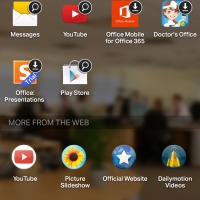
What sets Everything.me apart, however, isn’t exactly it’s smart features but its ability to seamless combine your homescreen and the Web. Search for anything and not only will you be given apps already installed on your device, you will also be offered Web search results. Not only that, you are also be shown downloadable apps as well as the chance to search within apps. Web search results permeate Everything.me’s features. It is no wonder why Mozilla chose it to be the core of its new Firefox Launcher for Android.
Google Now Launcher
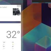
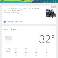
Formerly called the Google Experience Launcher, this is less of a smart launcher and more of a launcher that integrates with a smart personal assistant. In almost everything else, it resembles a regular, rather simple launcher, with actually very few options for customization. But swipe to the very left and you will be taken to the dedicated Google Now screen where all the magic begins.
Anyone familiar with Google Now on Android will not feel like a stranger here. You have all of Google’s learning and intelligent personal assistant here at your disposal, from search, voice recognition, Google Now cards, and everything else. Unfortunately, the Google Now Launcher lacks features in all other departments. It doesn’t offer dynamic apps or widget recommendations or dynamically grouped collections. It will let you change the wallpaper and add or remove screens but you can’t even change the number of rows and columns in each. In essence, the Google Now Launcher is a very limited stock launcher that just has a quick swipe shortcut to Google Now. One thing it does have that no other smart launcher has is the ability to launch Google Now from the homescreen via the iconic “OK, Google” phrase.
Cover
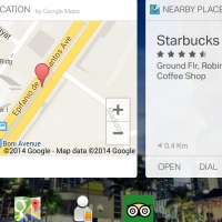
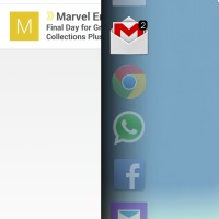
Cover technically isn’t a launcher but it might as well be. One can consider it a miniature smart launcher accessible directly from the lockscreen. It changes its contents depending on time of day and location just like any of the previous smart launchers. But it adds a few nice features as well when it comes to jumping to apps.
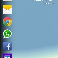
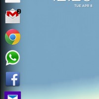
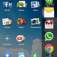
The column of icons on the left side of the lockscreen change depending on certain conditions. What makes these icons special is that you can take a quick peek at their content by simply swiping the app’s icon to the right. If you swipe all the way to the right, you automatically unlock the screen and jump to the app. Cover has another interesting feature, an app switching tray. Swiping down from the right top corner of the phone outside of the screen itself will bring up a side panel of recently used apps that you can quickly switch to. And odd feature for a lock screen but useful nonetheless.
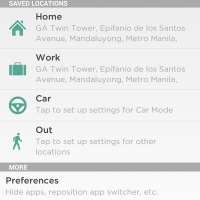
There isn’t much to customize in Cover. You can change the wallpaper for categories like home and work, but the categories themselves are fixed. You can set the location of home and work, a feature also found in Aviate, and even set up different ringtones for those conditions.
Wrap-Up
With the exception of the Google Now Launcher, all these launchers are still works in progress and leave something to be desired. While automatic context switching is convenient, it might be even better to allow users to setup certain additional conditions. For someone who works at home, registering the same location for both home and work will surely confuse the system, which can be fixed by letting the user put in a time range for work. It is also a minor, but not critical, disappointment that users currently have to choose between smart launchers or themeable launchers, as they give up certain customization options when they switch to a more dynamic launcher.
Still, contextual launchers are an interesting experiment in seeing how our mobile devices can help us keep better track of our lives, both digital and otherwise. The rise of personal digital mobile assistants will likely produce some interest in this type of Android launchers. It is definitely an interesting space to watch even if you yourself don’t use one. If you’ve ever used or found something similar or better to those mentioned here, hit the comments below to share them as well as your thoughts on these intelligent launchers.









after using Aviate for a long time, got EverythingMe 2 weeks ago and no way I’m going back… EverythingMe just feels better
I’m actually torn between the two, but mostly because I still need to get used to how EverythingMe flows. I keep on forgetting that I can simply just search for the app to get to it quickly instead of flipping through half a dozen pages of app icons.
Actually using both everythingme and cover
I’ve tried that as well. It’s an interesting combination.
Solo Launcher is king
“OK Google” can be launched from anywhere, any launcher. On a Note3, note 4, or S5, where you can wake the device with “Hi Galaxy” from a dead sleep, you can install S for Switch Voice which intercepts svoice and opens google now ready to listen.