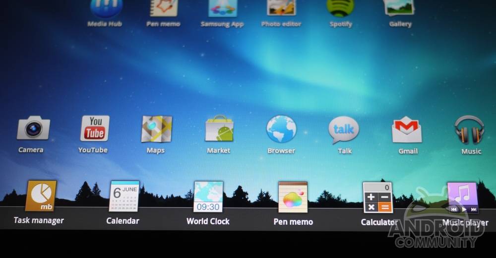
Today we’ve got our Samsung Galaxy Tab 10.1 Wi-Fi version hooked up with the newest version of what Samsung has dubbed TouchWiz UX. This is Samsung’s custom user interface and the first “official” user interface made on top of Google’s Android Honeycomb (version 3.1 right here right now.) This user interface reflects what the Samsung Galaxy S II is using with TouchWiz 4.0 with several enhancements that are unique to tablets. The big question on a lot of people’s minds today (if they own a Galaxy Tab 10.1 that is,) is “should I upgrade?” Let’s see if we can’t answer that question in a healthy deep dive review.
At the start here is a hands-on video with the interface on our Samsung Galaxy Tab 10.1 Wi-Fi version. This video also works as a review in and of itself, so if you’d like to just skip the rest of the post, you sure as heck can do so. On the other hand there are a few items in the text below that are not covered in intense detail in the video, so take your chances!
[vms 21b80f37d9b55f63ed8b]
Live Panels
The first and most noticeable change in this version of TouchWiz is that Samsung has bumped up Honeycomb’s widget game. Here instead of widgets being all by their lonesome sitting in panels of despair, they’re encouraged to play along with each other using the invisible grid on each home screen to place each of them in a magazine-style setting. Should you have the widgets to make it happen, you could take up your entire home screen with squares of information. Or if you’d like to turn your whole home screen into a photo album, you could do this with your stock Gallery widget, resizable to whatever height and width you like.
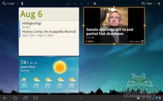
There are several new and/or retooled widgets included in this update, those being that gallery widget I just mentioned, weather, and social panels. While other reviewers may call these “cartoony” and tell you to toss them in the garbage immediately, you know good and well your humble narrator is going to have you take a bit more time to see what they’re good for. Each of these new widgets works surprisingly well considering Samsung’s widgets in the past have been relatively lackluster, the gallery widget, again, being amongst my favorites to utilize. On the other hand no one has HTC’s weather widget beat, but we’ll have to wait for that to come to Honeycomb for now.
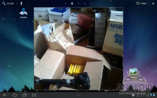
While this system may seem immense, it’s not that much of a change over the old system. In fact, if you only use widgets that are not compatible with Samsung’s way of doing things here, there’s no real big visible change at all. In other words – no reason not to upgrade. On the other hand we have noticed a bit of lag between screens when several gigantic widgets are open at once, but this same thing happens when you’ve got a screenful of widgets anyway.
Quick Panel
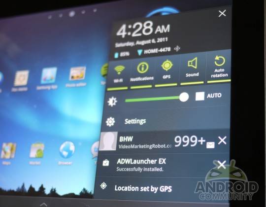
The single panel that pops up when you tap the lower right-hand corner of your display still pops up as per usual, but you’ll notice it has a bit of a makeover. You’ve now got the ability to adjust GPS, Wi-Fi, Notifications, Airplane Mode and more with a simple swipe and a tap. Screen brightness is front and center as well, as is a shortcut to your settings page as well as notifications and alerts (which you can clear out as well.) Time, date, batter life, and Wi-Fi signal can also be seen from here. All of this is certainly an improvement over the stock Honeycomb layout.
Mini Apps Tray
This is a persistent tray of apps that have been selected and customized by Samsung to work over the top of the rest of your apps. As you’ll see in the demo video below, this feature looks great on paper but is quite laggy. It’s one step closer to being truly able to multi-task, whatever that really means these days, but until the lag is done away with, (be it by processor power or by the tinkering with of the functionality, we’re guessing the latter,) it’s too slow to get an A rating – instead I give it about a B!
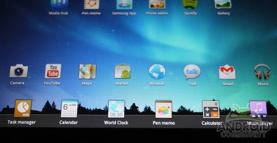
The apps in this tray get another hands-on view from us right here because, guess what? They pop up on TOP of your other apps if you wish. This is a brand new sort of situation in Android and certainly one that’s welcome – now again we’ve gotta make it a bit more optimized.
[vms 39589fdd2b0f7218d8b0]
Media Hub
Samsung here presents a lovely new interface for checking out new movies and television shows, each of them available for full-screen preview as well as renting or owning. The sliding back and forth of the movies looks cool, the interface with which you purchase or rent videos is slick, and the selection of special lists constructed by Samsung is well made. Would I purchase or rent videos from here? Sure I would, definitely, but only if the prices were at a lower point. I’m still of the notion that if I’m going to buy a movie, I’d like to have a disk. I’m an avid purchaser of apps on the other hand, so maybe the revolution starts with Samsung?
Pen Memo
Pen Memo is an extremely simplified version of everyone’s favorite note-taking app, Evernote. It’s not made by the same people and certainly isn’t meant to appear to be made by the same group, but it does many of the same things. Here you’re able to write with your finger, paint, type, and in general make things easy on your day to day forgetfulness. Furthermore this app has a mini version you’ll see pop up in your Mini Apps Tray.
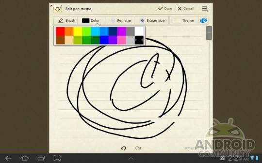
Photo Editor
What we’ve got here is what amounts to Samsung’s take on, yep, you guessed it, photo editing. You’re able to change basically any quality the photo has, chop, hack, flip, and resize them to your heart’s desire. This is the type of app that gets lifted and ported to other Androids via hackers because it works so simply and so well. Give it a few iterations and it’ll be beating Photoshop out for the mobile market – maybe.
Fun fact: the people in the photos above are myself and the guy who installed our cable internet – he wanted to see the photo quality of the front-facing camera of the Galaxy Tab 10.1 and I said sure!
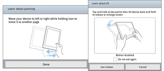
Panning and Tilting
This set of features you may remember from back at CTIA when we got an early glimpse at both of them already working one the Samsung Galaxy S II. They both still exist on the Galaxy S II, and are still seeming more like bonus features to me than selling points.
Samsung Dive
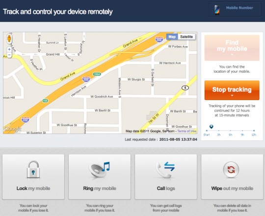
Samsung has created a system that you may have heard about called Samsung Dive. This system allows you to track and control your devices from your web browser, this coming in most useful when your device is lost or stolen of course, but certainly a feature you COULD use should you want to track… oh… I don’t know… your kid’s devices? Your ability to use this Dive functionality is activated in your Settings under Location and security and called “Remote controls.” Tap it ON then head over to SamsungDive.com and get to tracking!
Should I Update to TouchWiz UX?
Yes you certainly should. For more than one reason: first, it’s a new look at Honeycomb. The only drawback being the slowness of the Mini Apps Tray – but if you’re not just a big stickler on how apps pop up, you’ll never know the difference. A rather important point to make here if you’re an avid user of such home screen replacement apps as ADW Launcher EX is that yes, indeed, you can use said replacement apps, but the new TouchWiz toolbar will remain. It’s not giving up THAT easily.
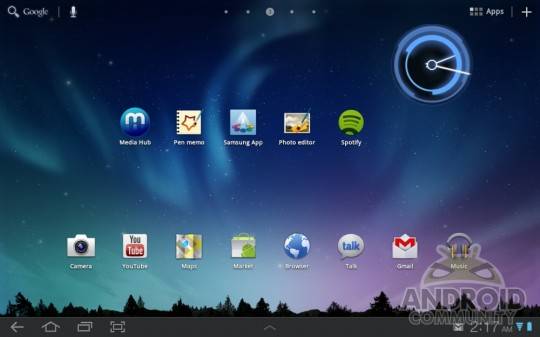
Once you’ve got the update, you’ll not be sad that you did. It’s what the manufacturer, Samsung, intends for you to get for the device they’ve made, and most of it can be done away with if you’re not feeling it. Grab it now! Found in Settings under About tablet and Software update. Should take you less than 30 minutes for the whole situation to complete itself, and make sure you’ve got your tablet plugged in during the process!
Also note that you can check out a full review of the Samsung Galaxy Tab 10.1 Wi-Fi edition tablet you see in this post right here on Android Community: [Samsung Galaxy Tab 10.1 Wi-Fi Review]
[device id=89]


I’ve had this on my Acer A500 for a few weeks as a custom ROM and I love it. It’s much better than the TouchWiz garbage Samsung puts on their phones, that is for sure.
bounce back many
Looks horribly slow.
It’s not.
ja
Is this 3.1 or 3.2? I’m running a 3.2 ROM on my A500,I would love TouchWiz + 3.2.
I’m on 3.1 right this moment
It’s horrible, the mail app looks like a Windows 3.1 application and the bottom bar looks like a 5 year old drew it. The web browser has a nasty white backgroung in the URL bar and looks awfully flat. There’s no discrenable speed improvement to boot, oh and HD H.264 video playback is now broken
I just spent the last four hours rolling back to the Android stock from and am much happier now.
personally I think TW 4.0 brings more to the table for Honeycomb then it did for Galaxy S II <- which is saying something.
I will upgrade to the new TW UI early next week.
personally I think TW 4.0 brings more to the table for Honeycomb then it did for Galaxy S II <- which is saying something.
I will upgrade to the new TW UI early next week.
Dein Artikel ist gut wert Augapfel. Außerdem inspirierte mich sehr, sehr attraktiv ,das werde ich diese wieder zu sehen
http://www.sexuellebikini.org
I always wanted to be able to edit photo’s like they do the kardashian’s, now I finally can make my photo’s appear wonderful after learning at tinyurl-CoM/qdk4obc