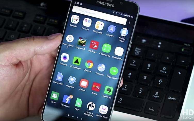
The upcoming Samsung Galaxy Note 7 has been noted many times that it will feature a new UI. Yesterday, we said it will run the new Grace UX on top of Android 6.0.1 Marshmallow according to a leak. We haven’t heard much about the user interface but we know the South Korean tech giant is working on some UI changes. We don’t know where and when the “Grace” reference started but we’re excited to know what Samsung has in store for its avid fans.
HDblog.it has just published a demo video of what’s believed to be the new Grace UI. You will notice this ToughWiz features a cleaner interface with the black and white theme with noticeable blue highlights. There’s still the app drawer contrary to what others are doing while the folders have a new look now. When a folder is opened, you will see the background blurred a bit.
The user interface seems cleaner and more streamlined. The settings will be shown as a list. The notifications feature new toggles and a pull-down to expand a list for you to choose from. Meanwhile, the toggles feature drop down buttons that show quick settings for some functions.
We can’t say this is final but like most of you, we’re yearning for a new TouchWiz. This could be part of the “New Note UX” beta program or totally a different one so let’s just wait and see.
VIA: HDBLOG.it


good lock is better focus on that