
There’s a DroidDoes graphic page floating around out there and it’s got everyone’s favorite upcoming device right at the forefront: the DROID Bionic, aka a dual-core LTE connected device from Motorola and busting out on Verizon more than likely on August 4th. It’s nothing to scoff at with a 4.3-inch qHD Pentile Matrix display, 8 megapixel camera on the back, and that fat dual-core processor from out good friends at Texas Instruments. That’s right, the TI’s OMAP 4430 1GHz dual-core processor busting out on the nation’s fastest network – Verizon’s 4G LTE. Win! But wait – there’s a mystery afoot – we see some misplaced pixels, and you know what that means – investigation time!
The thing with this listing is that while it may certainly seem like the real deal, awesome and amazing, it’s actually quite photoshopped. That’s not to say that we’ve not got a new spec with $300 as the price for this new leader of men, but the image you see above is constructed by someone with the ability to copy squares of color and paste them ever so lightly. Let’s talk about how and where, and note that as we take this image apart, so too do we take apart the culture we live in where the fact that there’s a leak supersedes the fact that most leaks are fakes, and that just ain’t right.
You can see the original image in the gallery at full yet sharp and blurry size in the gallery below if you wish. On with the evidence!
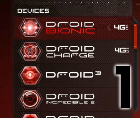
1) The first telling mistake is the DROID BIONIC logo. Where you’ll notice the craftsmanship on the Droid Incredible 2 and the Droid Charge are perfect, as per the lining up of the D and the E on Droid Charge and the D and the 2 on Droid Incredible 2, but the Droid Bionic does not. Do you really think the designers in charge of the DROID account would make such a basic graphic design mistake as this? Not a chance.
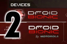
2) Another typography-related mistake is in the logo as it sits at the bottom of the page. See here that the DROID portion is suddenly much more bold than it is in the example in the upper left. Two different logos for the same product on the same page? I don’t think so, mister.
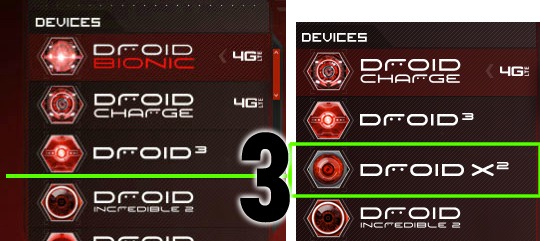
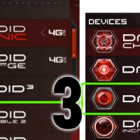
3) Unless Verizon plans on stopping production of the DROID X2, it’s missing from the list in this mocked-up design. Between the DROID 3 and the DROID Incredible 2 should be the DROID X2, but there’s nothing.
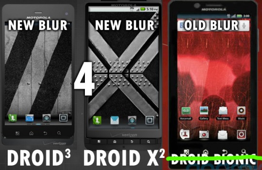
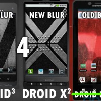
4) This new Bionic listing has an old version of MotoBlur – or whatever they’re calling it these days. The new version of the Bionic will almost certainly hold the same or a very similar version of Blur to what we’re seeing on the DROID 3 and in the landing page’s version of the Droid X2.
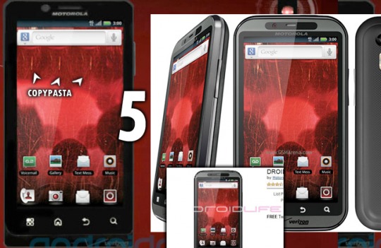
5) The UI in this image is blurry. It’s also got some sponging going on, the same pixels pasted several times. The reason for that is the image is cut from the original Bionic pics we saw back in March of this year, stretched, and pasted in a new chassis. More than likely the creator couldn’t find this clean look at the image and had to use the DROID LIFE image from eBay, needing to copy-paste out their original watermark. Furthermore, the time on the clock is even the same – 3:00.
You know what that means? It’s time to get an education because you just got schooled. Take your amateur shop’ and reasoning skills and go back to Photo 101 – ya heard?







Also at the bottom of the page you’ll see the word “Samsung” which clearly shows that the Samsung Droid Charge web page was used to create this obvious fake.
Go to Droiddoes.com and look at all of the devices, including the Incredible and Motorola devices, and you will see that Samsung is listed in all of them. If you knew anything about copyright law, then you would know that they have to put that text on every page that has the Charge name on (Which is every page in the menu)
Then I hope the 4.3 inch display size spec is bogus too I had my heart set on the 4.5″
i think you might be out of luck – the international edition is already 4.3 while the Infuse 4G is 4.5 – power or size!
i think you might be out of luck – the international edition is already 4.3 while the Infuse 4G is 4.5 – power or size!
Message from Phil AC:
See, here’s the thing about Flash pages, folks. Before you have the
final product, you have something that’s not the final product. And it’s
put together in things like PhotoShop, Illustrator, etc. And what we
have here is an early, rough mock-up.
(Hey, we said in the post it was an early version of the page. I forget how much people don’t actually read. lol)
Anyhoo, I mentioned in the post comments that we cropped something out.
Not gonna put it on the blog, but I think you guys in here deserve to
see it and draw your own conclusions.
I have a hard time believing Verizon mocked up a page and put it online instead of testing it offline in safe environment. There’s no good reason for them to do that.
I have a hard time believing Verizon mocked up a page and put it online instead of testing it offline in safe environment. There’s no good reason for them to do that.
Not trying to defend Phil but it’s not that hard to believe that Verizon would have a secure intranet for organizational purposes (like many companies do) and online internal work. If this were real, then it was obviously not meant for public viewing.
Take a look at what they called their original source – it’s a forum post with nothing but links to pages that are available for viewing by anyone. If it were from internal, wouldn’t it make more sense to say they got it from an anonymous source?
It says “thanks anon” at the end of the post.. since the OP of that thread doesn’t know where the pictures came from, my guess is that they just was using that thread as a reference to suggest that the page may be going live soon.
Not trying to defend Phil but it’s not that hard to believe that Verizon would have a secure intranet for organizational purposes (like many companies do) and online internal work. If this were real, then it was obviously not meant for public viewing.