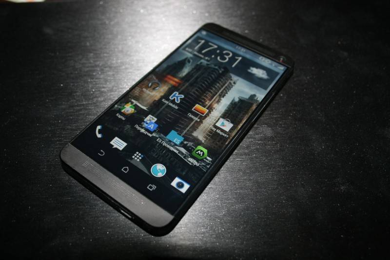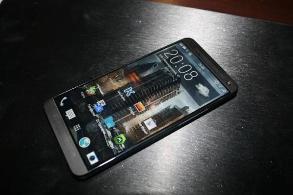
The stream of leaks about HTC‘s next big hit just keeps on flowing. This time we’re getting a peek at what is supposedly the actual face of the HTC One M8, though, of course, its veracity cannot be assured.
Based on these photos, the HTC One M8 practically looks the same as the HTC One. The only difference is that the bezel around the display is noticeably thinner, which seems to be a growing, and probably welcome, trend among high-end smartphones, particularly phablets, these days. The unit in the photos come in a black color, which somewhat goes against HTC’s previous practice of employing a more brushed metal appearance, at least at launch.

Also noticeable in these photos, or at least one of them, are the on-screen Android buttons. Previous leaks have pointed out that these new buttons are more in line with the default Android design instead of the custom icons used by HTC in the HTC One’s capacitive buttons. Interestingly, one of the photos doesn’t show the buttons. Another rumor says that, while almost confirming to the standard Android look, the navigation bar can actually be hidden by a simple swipe, definitely a deviation from standard behavior.
Of course, all we have are rumors and leaks, including a dual camera setup and even the M8 codename. Whatever the final product ends up looking like, it should probably make a big bang if HTC plans on relying on its next flagship to help it out of its current market situation.
VIA: GSMArena


I would be impressed with this version if it took away that ugly long bezel at the bottom it used to have. I would even consider getting it for it’s awesome build. I sill prefer AOSP vanilla Android aka Nexus though. Root and rom. Excited yet again to see HTC and Samsung’s new line up
My Uncle Harrison recently got Infiniti Q50
Sedan from only workin part time on a home computer… go to this website Jump999.ℂom
The phone seems oke.