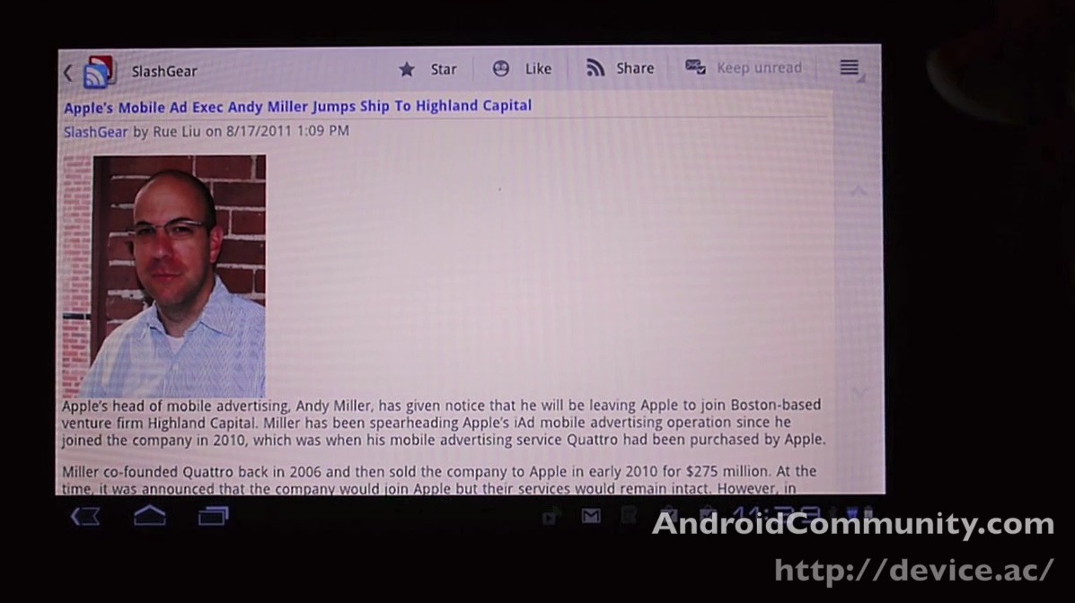
Ever have the feeling that it would make more sense for a group of developers to WAIT to release an app rather than sent it out with a less than optimal user interface? Google didn’t wait to release Google Reader back in the days when there were only handsets around, they jammed it out there and it looked pretty good, but bigger screens were directly on the horizon, and when these bigger screens arrived in tablet form, Google got busy. I mean got busy several months later, 3 quarters into the same year the Motorola XOOM was released near the beginning of, with a whole slew of tablets out ready and raring to Google Reader some feeds but having a non-fantastic official app to do it with – what’s one to do?!
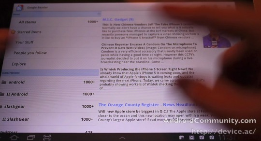
You add another column, that’s what. This application already had downloads exceeding 1 million when the update occurred yesterday, these numbers sure to continue to rise now that the already working fine version is being updated with nicer and sweeter features. This update brings you a whole new look and feel and optimizes the application as a whole to work with tablets. What we’ve discovered that this means is that tablets Google deems large enough will have a new double-column setup working with them.

This review is conducted with the Samsung Galaxy Tab 10.1 you can also see working fabulously in our full review of the same name… actually in three different versions:
Samsung Galaxy Tab 10.1 Review [Google I/O Limited Edition]
Samsung Galaxy Tab 10.1 Review [Wi-Fi Edition]
Samsung Galaxy Tab 10.1 4G LTE Review [Verizon]
[vms 600aa568390f1f1104aa]
On the other hand, smaller tablets like the 7-inch Acer Iconia Tab A100 have the same interface as smartphones currently have in this updated version: one less column. This just means that while the larger tables are able to have a list of stories to read on the left while they read these stories on the right, 7-inch devices and smaller (8.9 too, if I’m not mistaken,) must stick with either the list OR the story on the screen by itself. Harsh life!

10-inch tablet users will be able to now rejoice and be glad because this app is as close as it gets to the web-based Google Reader which, yes indeed, you can still access using your mobile browser as well. This application is [free on the Android Market] and connects directly with your Google Reader account, requiring only Android 1.6 and above to work.


I actually would prefer the phone version. You just use the volume buttons and you can shoot through your feeds like a rocket. That one looks like a lot of work.
It amazes me when someone can write an entire article and not once describe the thing they are talking about. Sure I can Google “Google Reader” but why wouldn’t you put in a one sentence description of what it is?