Time to get social folks! In just a few days time you’ll be able to get your hands all over the all-new Facebook experience on Android, simply called Facebook Home. If you want an even deeper experience the HTC first smartphone will also be available on the same day, April 12th, for you to enjoy Facebook in all its glory. We’ve had a chance to take Facebook Home for a spin lately and you’ll want to read on to see if it’s a worthy home screen replacement, or just a gimmick by Facebook to stay relevant.
This is the “Facebook Phone” only it is available for multiple devices, and more coming soon. Live at Facebook HQ last week Mark Zuckerberg announced the all new Facebook Home “their new home on Android” and along with it comes an entirely new look and feel for Android. This is one of the benefits of Android being a completely open platform, but I’m sure it will also have its downsides too. Since many of you are probably wonder what Facebook Home is all about, lets take a look.
Home
Facebook describes it as designing a phone around people, not apps, and the focus is the very first places you see when you turn on your device. That being the lockscreen. With Facebook Home once you unlock your device you’re instantly in the world of Facebook. You can use the standard Android lock option should you choose, but from there everything has been changed with your friends and social status front and center. Zuckerberg’s replacement launcher on Android brings you anything and everything from Facebook and more. With Cover Feed your friends and family in those social circles become your core menu, and Chat Heads is their new messenger service to streamline chatting with them. Apps are no longer front and center, they are an afterthought. And lets not even talk about Widgets.
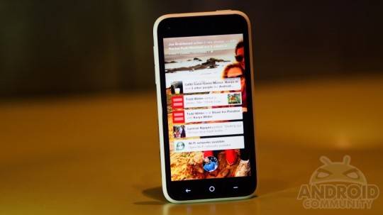
“The homescreen is really the soul of your phone” Mark Zuckerberg
You guys should all know plenty about Facebook Home from the announcement, so we’ll just share a few thoughts, details, hints and pictures while explaining who might or might not want to take their smartphone to this next level. Obviously Facebook Home isn’t for everyone, not by a long shot. Personally we know many of you Android enthusiasts are not fans at all, but don’t be so quick to judge. The mass public loves Facebook, as we all know, and this essentially makes their lives and Facebook experience dead simple – and right in front of their faces.
So while this isn’t for everyone, it clearly has a huge audience and some serious potential. One important factor in that is performance though. With their current Facebook app for Android a bit of a mess, how does Facebook Home perform? Well, pretty darn good actually. They’ve really stepped it up over there at Facebook HQ and the experience is far better than we ever expected. Everything is buttery smooth, animations are all over the place and quite fun. Right from the lockscreen with your profile picture you’ll notice the transitions and animations as you flip your profile picture around to unlock the device, enter your Cover Feed, or head to your previously opened app. The way the icons float around are smooth, and actually kind of fun.
Gone are the slow load times and ridiculous loading circles of Facebook old, and here we have beautiful HD images taking up your entire screen (if you chose) and quick alerts and status updates. Everything from HD artwork, chat heads for communication and more has all been polished, perfected, and is fast. Facebook made it a huge goal to have a fast application, and as a result Facebook Home actually loads and caches in the background. So even when service drops or gets weak you’ll still have fast load times, images covering the screen in your Cover Feed and more.
Facebook Home is only as beautiful as your friends.
One important factor is the fact that Facebook Home will only be as pretty as your friends. We know not everyone posts good photos to Facebook, or high quality ones for that matter. However, When scrolling through your feed you won’t get those terrible images on the background. Instead Facebook Home uses each individuals Cover Photo – which brings a better experience – most of the time. This enables those large and pretty images you see while you flick through the content, then images actually uploaded are neatly in a gallery instead of blasting your entire display. It’s a nice touch actually.

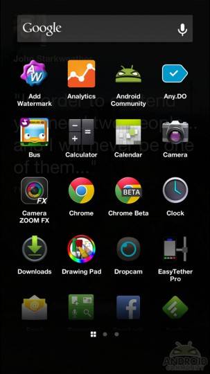
Now we know what you’re all wondering. And that is just how intrusive is Facebook Home in terms of regular things such as opening an Android app, getting to notifications, Google Now (a biggie for me) and multi-tasking. And while they aren’t as in-focus as before, they are still readily available. As you see from the screenshots Google Now is still sitting up top when you’re in the full app tray (not the quick tray), and long-pressing that circle on the HTC first brings up multi-tasking. For all other Android devices running the downloaded version of Facebook Home, it should be just fine too.
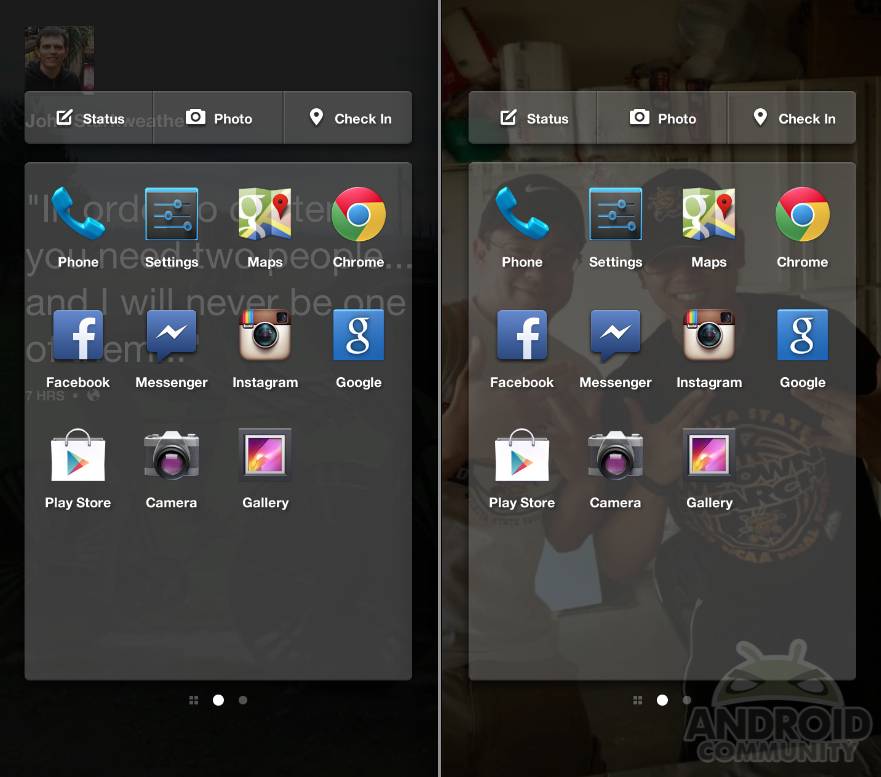
One area we really weren’t fans of was the “quick tray” for apps. While we love the idea of this essentially replacing the dock on standard Android smartphones with all your usual and must-have apps – we didn’t like the opacity. It’s see through and as a result can sometimes look a bit ugly and messy. We’d rather it be nice and clean. See below with the words getting in the way!
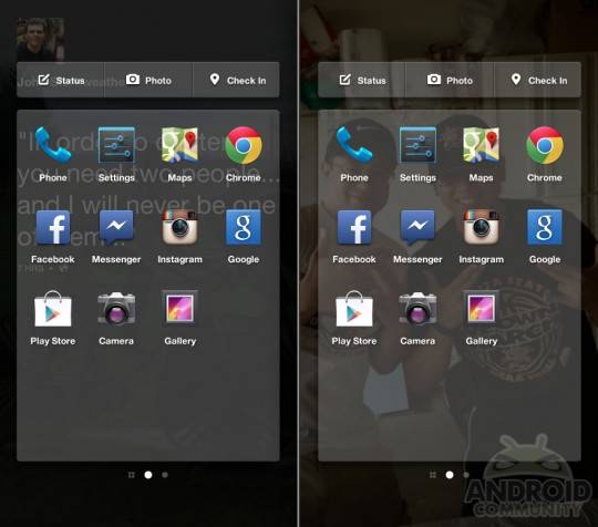
Then of course this also means doing something as simple as calling someone isn’t quite as easy as on most phones. Facebook Home is all about social networks, updates, check-ins, photos and more. Calling people isn’t a priority. Thus, you have to slide into the apps tray, find the phone icon, and make a call. with regular Android it is always front and center on the bottom. This probably won’t be a cause of concern for most, but we know many of you wonder about those regular “phone” features. After all, these are phones we are using.
Settings
Next we wanted to talk about settings. Facebook has added a pretty decent array of settings, but again this is just the initial release. Zuckerberg vowed to have updates on nearly a monthly basis with improvements, bug fixes, new features, personalized settings and more. So while this isn’t the biggest list of settings and options we’ve seen, it’s a decent start.
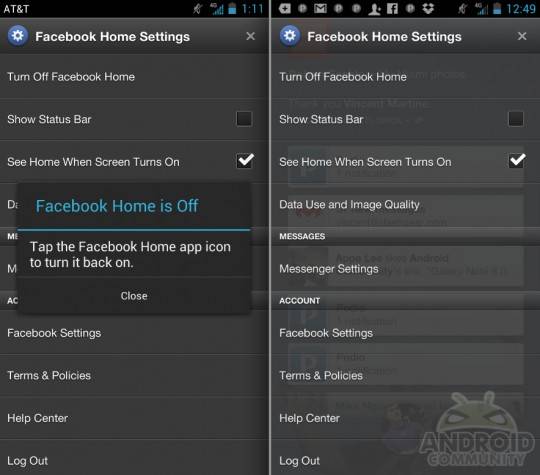
Obviously front and center is “Turn off Facebook Home” which is a major thing here. Facebook making it so extremely simple to quickly disable the entire experience and return to standard Android gets major points in my Book. Thanks for not making us jump through hoops to get you out of the way when we’d like to. This also make the HTC first a standard Android 4.1 Jelly Bean smartphone. Yes please! You can also control data usage and image quality, so Facebook Home isn’t sucking down our data limit (and battery life) all day long.
From here you can hide and completely remove the standard Android status and notification bar, but we have a feeling you’ll be keeping that present. And we’ll tell you why. What’s the difference between a Facebook Phone like the HTC first vs downloading Facebook Home from the Play Store? Find out by clicking here! With a Facebook Phone like the HTC first you get a deeply integrated experience. HTC and Facebook allow Home to access all notifications and alerts from the Android OS, and post them up in the Facebook Home Cover feed and Home experience.
If you have a regular Android phones and download Facebook Home from the Play Store, you don’t get the experience mentioned above. While Facebook Home will still curate a list of notifications from Facebook, messages, friends, and even Instagram, you won’t get all your notifications from their system. You’ll have to rely on the standard Android status pulldown bar. So that’s why we have that option in settings. Essentially the Facebook experience has a tighter grip on everything with a Facebook Phone vs downloading the stand-alone app from the Play Store. Take that as you’d like.
Chat Heads
Chat Heads is a brand new feature to make chatting and communication seamless across all means. Whether you get a standard text message or a message from Facebook Messenger they appear in small little circles with the friend or persons profile photo. They neatly appear on the side of the screen and can be present, or hidden. Facebook basically brought multitasking to chat. As you can see below you be viewing your feed, while also seeing the chat heads. Then when you get a new message you’ll even get a quick preview of the message.
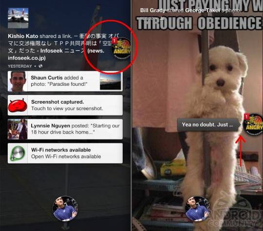
With more than one chat there’s multiple heads. And there comes the name Chat Heads. You can tap the head to keep chatting, or simply dismiss it with ease. All while having multiple conversations – and most importantly for Facebook – never leaving your Cover Flow of incoming Facebook news.
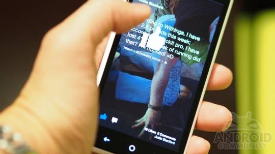
Likes. We can’t forget about likes and comments. The actual Facebook app for Android has its share of issues, and comments are certainly one of them. On mobile it seems sometimes the pop-up to leave a comment just wouldn’t ever load, and you’d need to try again for it to work. This issue seems to be gone with Home and leaving comments is now a breeze. Right on the bottom of the display instantly tap the button. You get a neat animation and can leave some words with ease. Double tapping will like a photo or post, which is nice, but I found myself doing so on accident quite often. Oops!
Wrap-Up
In closing we’re going to need some more time with both Facebook Home on the HTC first, and Facebook Home for Android phones in general before we can fully decide what we think. Facebook Home will be available for the HTC One, One X, Galaxy S III, Note II and more come April 12th – and for tablets eventually. Those will have a different experience than we had here, so we’ll update once that gets released with some comparisons.
So how do we feel about Facebook Home? Well, mixed feelings to be honest. In one sense we feel like the entire Facebook team has done an amazing job with Home, and it shows the true potential and power of the Android OS. At the same time we still feel like it cripples Android. To be completely honest though, Facebook Home is actually pretty awesome. Everything is exceptionally fast, fluid, stable, and pretty. Updates are quick, animations are beautiful, content looks great and more. That being said, it’s clearly ONLY for those who truly use Facebook often and love the social network world.
Is Facebook Home for die hard Android users or enthusiasts? Absolutely not. Will the general public love Facebook Home and use it over Sense UI, stock Android, or Samsung TouchWiz? Maybe. Depends on how much they actually care to use Facebook. Will I? Nope! I love my theses, custom options, and widgets far too much.
In the end Facebook Home is a beautifully crafted and curated experience, but it’s obviously geared at Facebook and social networking. It makes Android less powerful, throws widgets and customization out the window, and we can’t even customize who plasters our Cover Feed and home screen. Unless Facebook is a deep deep part of your life we just can’t recommend this, or see people using it day to day. This is certainly a walled garden grown, picked, and hand delivered by Facebook.


Who in his right mind WILL download something that DISABLE folders and widgets and make us jump through the hoop just to access our fav apps, to send messages and to make phone calls on a … PHONE!? And moreover, by removing folders and widgets, it removes some of the most useful feature and make is a nightmare to organised our apps in any meaningful way — just for facebook to post advertisement to us in the future? For all other things can be done using a facebook app as well.