
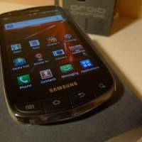
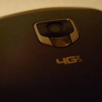
How would you like to take a closer look at the newest fabulous addition to the 4G LTE family at Verizon? We just happen to have Samsung’s DROID Charge sitting here in a box and we’d love to let you have a look! It’s a fat phone with hard plastic chassis, four physical buttons up front, a diamond-shaped housing for a camera in the back, and ultra-fast speeds inside*. The display is a gigantic 4.3-inch Super AMOLED Plus capacitive touchscreen, and you can take that all the way to the bank – brightness and viewing angles galore! So sharp you’re going to cut your eyes open on it!
*We’re going to be unable to test the LTE speeds of this device until Verizon gets its 4G network back online, but we suppose this will be very soon, soon as in sooner than our review will be popping up.
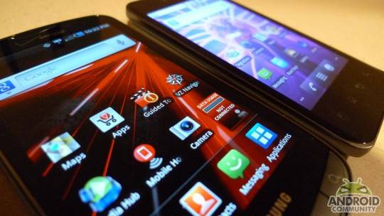
This device is running Android 2.2 Froyo with TouchWiz 3.0, Samsung’s custom user interface, over the top. I know you were hoping it’d be TouchWiz 4.0, that sweet new version with the super awesome oddities as shown off during our trip to CTIA 2011 in Orlando – thank you for the demo Philip Berne, but you’re still going to have to wait – that version will be coming out with the Galaxy S II. What we’ve got here instead is everyone’s favorite, TouchWiz 3.0, fully in tow.
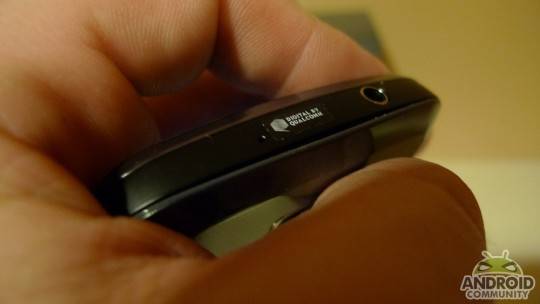
Inside you’re going to find a 1GHz single-core processor from Qualcomm, 1.10GB of internal storage and a microSD card slot under the battery cover capable of holding a 32GB card – and it conveniently comes with just that size a card, too! Handy. Up front there’s a 1.3-megapixel camera, in the back there’s an 8-megapixel camera with LED flash and 1280×720 recording – not quite 1080p, if you’re counting. Take a peek at an example photo here – shot in relatively low florescent-lit environment:
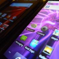
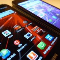
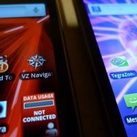
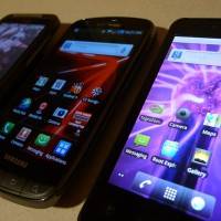
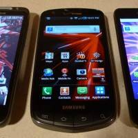
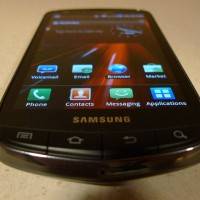
And what about the display? Is is spectacular? This question answers itself. This display is second to none. Have a look at it next to the G2x’s IPS LCD and the HTC ThunderBolt’s TFT LCD displays – kind looks sorta nice, yes? Holding any of these devices on their own will result in you loving the display they’re toting – we’re living in a really cool time in history where digital display technology is excellent all-around, but that Super AMOLED Plus – wowie zowie!
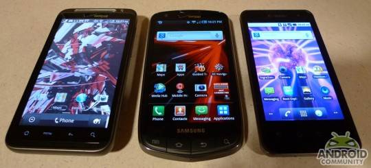
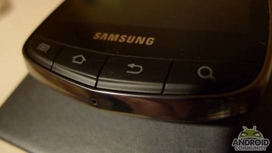
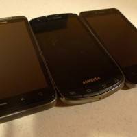
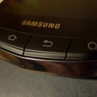
Then there’s the physical buttons. It feels a bit odd having physical buttons in this modern no-physicality world of handsets, especially when one finds that most of the time these buttons are only otherwise on lower-tier phones and physical fold or slide-out keyboards. Whether or not you find them to be a welcome change after having used a smartphone with a capacitive home-set of buttons or not is going to be completely up to you.
[vms 22a7add958f2d6b052c9]
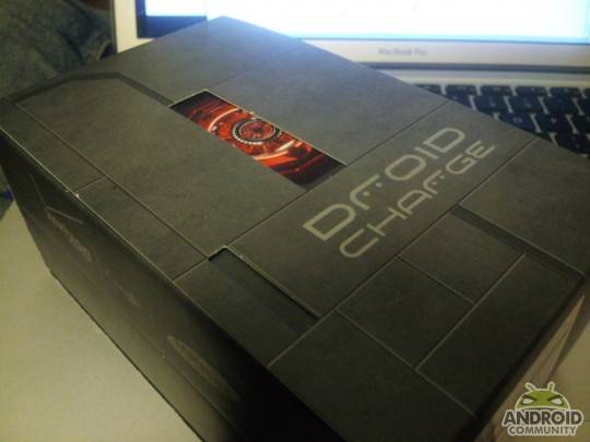
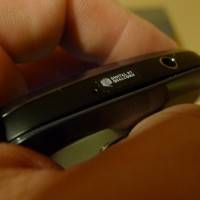
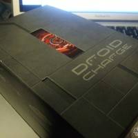
The box this device comes in really pushes the on-shelf value of the device, lending to the idea that yours truly has about the future of mobile computing. — That being that we’re going to see a much more common model of sales in the future, one where the carriers no longer hold all the power, the manufacturers do. The device itself is made mostly of plastic, with a mic hole at the top and a mic hole at the bottom for noise cancelation. On top also is a headphone jack, on the right you’ll find the power/display button and an intensely securely covered HDMI port – so tough, so rough!
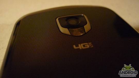
On the left is your microUSB port, fancy volume dongle, and a tiny little hole where you can run a bangle through. I’ve also been noticing these little holes what seems like more often now too – open the batter cover and you’ll find access to a stick of plastic over which you can place the thread from your bangle. If you’re unaware of what a bangle is, don’t fret – I’ll have one on the phone for the full review. Also the phone will be stocked for the review with hot high-res video and some sweet tunes and whatnot – all the greatest stuff!

Currently on the phone there’s 48 apps. This is about average for a Google-certified phone, if you’d like to know, as both Google and the manufacturer (Samsung in this case) want consumers to use their apps instead of the competition – what better placement than already stocked on the phone? Most of the apps you will not use, several you’ll find invaluable.
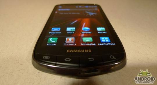
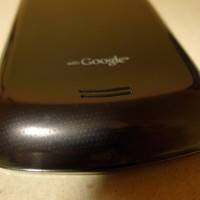
The form of the phone is nearly unique. You’ll find inspiration for the back of the phone in the Nexus S, with its ramp up the bottom. You’ll find inspiration for the battery cover in the Galaxy S 4G with its slightly unique pattern and plastic-y feel. The chrome rim around the outside front-half of the phone makes takes the mostly-plastic and lightweight feel of the phone and turns the aesthetic back over to top-tier. And it just feels like a bigtime device. Just feels like it!
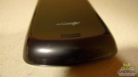
Swoop – there it is. And some keys below:
Have a peek above and below at some video and photos that’ll give you sort of a preview of our full review of this device coming your way SOOOON!




who does the “Droid” name belong to?
Lucasfilm (Star Wars, George Lucas), but it’s being licensed by Verizon.
who does the “Droid” name belong to?
The CPU is a Hummingbird. Only the radios (CDMA/LTE/1x) are Qualcomm.