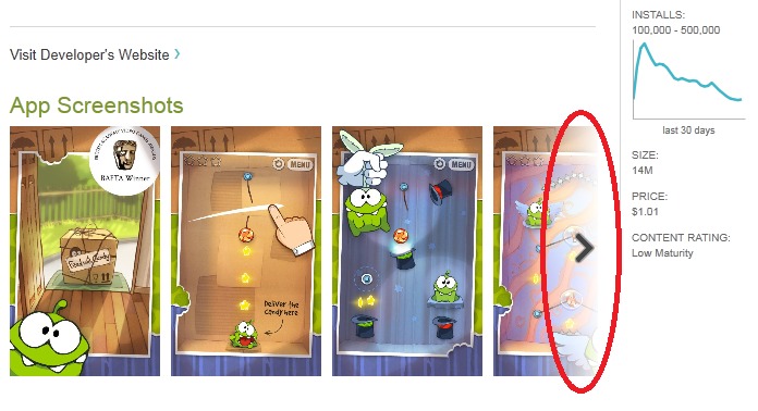
The Android Market when you’re not on your device hasn’t seen a lot of love in the past but as of late things have changed a bit. I personally use market.android.com all the time for its convenience. Just a few days ago it received a fancy update adding graphs to application download history and although small it was a nice touch. Today they’ve added some user interface enhancements for navigating screenshots.
In the screenshot above you can clearly see the new navigation arrow for scrolling through and seeing screenshots of the selected applications. This goes both directions and is a smooth scrolling interface. Before they displayed 3 screenshots of the application with tiny and hard to click dots below for viewing. While this might not be a large change or update either, its nice to see they are improving things on the web based market.
While many users might not use the web based market it really is great. Being able to wirelessly install applications to multiple devices without having them in hand, or even in the same location all from the online market rocks. I push apps to my tablet and multiple devices all the time, especially when I find a fun new Live Wallpaper.
The actual Android Market on phones was also updated as of late and it looks completely different than before. That link will also provide the updated apk if you’ve yet to receive the new market on your mobile device and would like to manually update. For now I’m enjoying both the web and device markets and hope Google continues to update them as frequent as they have been.
[via Android Police]


