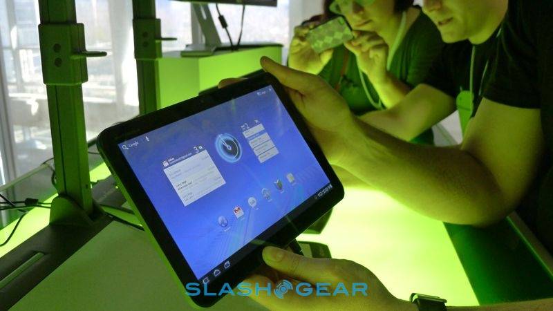
Today we hung out at Google’s Android 3.0 Honeycomb event and got the chance to wrap our fingers around a real live Motorola XOOM, a tablet with a fully functional and official version of Honeycomb running on it. This is a tablet-centric OS working on what Motorola and Google are saying is THE device it was optimized for. This device is roughly the same size as the iPad with a 10.1 inch display with a rounded corner, straight edged design, perfect for working with one hand holding and the other tapping away.
This isn’t the first time we’ve gotten to peek at the XOOM and even hold it, we had one experience with it back at CES 2011, but this IS the first time it’s been seen running a full version of Honeycomb. The combination of Honeycomb and the XOOM tablet made for an extremely smooth ride, blasting past Froyo and leaving the Samsung Galaxy Tab behind in the dust. The user interface is what they describe as “Holographic,” of course, and is exemplified by the many 3D rendered graphics such as scrollable pockets of images, galleries that swoosh back and forth, and flipping between screens in new and exciting ways (and super quick.)
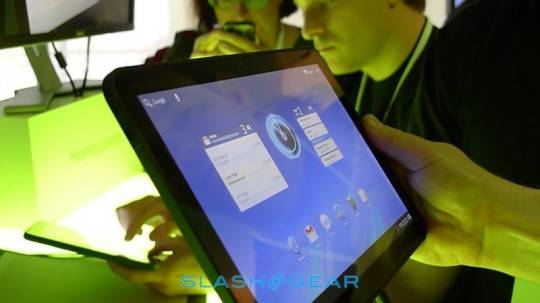
The Action Bar can be found at the top of the screen, while the System Bar is found at the bottom. The Action Bar contains contextual menus and quick access to widgets, while the System Bar shows notifications and soft navigational buttons – since Android 3.0 Honeycomb no longer demands the use of physical buttons on the device you’re running it on.)
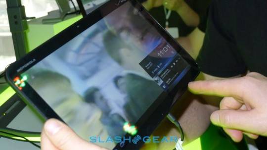
The much more giant display shows how Android functions even better in a big environment, this new space allowing Honeycomb to focus on multitasking. A Recent Apps option in the system bar pulls up thumbnails in this version of Android rather than the old icon-driven app switcher of old. The notification system further blurs the different between pop-ups and widgets as things like Twitter or Google Talk IMS show text and image as they pop up while music tracks are able to be accessed from basically any screen.
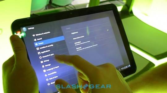
Gmail works perfectly well on Honeycomb, as Google’s new paneled UI – aka “application fragments” are a good show of the capabilities of the new OS. Controls are pushed up to the Action Bar, and once the display is split into multiple pieces, each piece is rendered individually. The UI can work at basically any scale, suiting different devices (other than the XOOM) as dynamically as it does transition between screens.
[vms 3b03ae6d3f8540cd6362]
Honeycomb’s 3D engine and Render Script make this new system seem completely new, like older versions of Android were just early iterations of this, the real thing. The apps already in the Android Marketplace work excellent in this new space, a good example being the Android Community app which scaled up to the XOOM’s bigger screen with no problem at all. Google Body and Google Talk video messanging work amazing as well, standing up solid against opposing tablet’s similar offerings.
Take a peek at the hands-on videos above and below as well as the photo gallery below to get a better idea of what we’re all about to be working with, and take a long, intensive, extended look at and study of both of our extensive guides to Android 3.0″
Android 3.0 Honeycomb Full Preview Guide [DEVELOPER FEATURES]
Android 3.0 Honeycomb Full Preview Guide [USER FEATURES]





Release date or pricing yet?
yeah: mid February possibly around the 17th.
also for the latest Xoom updates check out the http://XoomClub.com
Yeah, I was just hoping for a more solid time frame. Thanks anyways.
Release date or pricing yet?
Oh for heavens sake, why do everybody have to plaster their videos over with text – remove the damn crap. If you are so afraid someone will “steal” (everybody else is showing) then put a logo in a corner or something.
The bezel is too small. I’m not buying a $700 tablet just to gently grasp it with my fingertips. It’s a tablet, not a cell phone. Let me hold onto the damn thing! Hopefully the G-Slate or Toshiba will do better…because the form factor needs more work.
why I can`t connect my tablet Xoom with Mac?