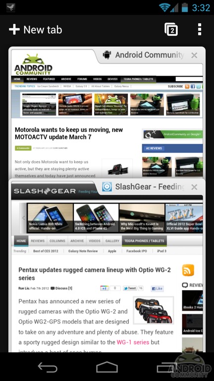
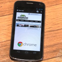
Google has released their first ever version of Chrome for Android today. Bringing their full-fledged browser to the world of Android smartphones and tablets. While currently only available for Android 4.0 Ice Cream Sandwich devices (and a beta) we were excited to give it a quick try. Below you’ll see our first impressions, hands-on pictures, video, benchmarks and more.
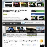
To start I’d like to mention again that this was only released today. It is still in beta although is widely available to the public right now in the Android Market. This is a great start but in some ways it does feel a little like a beta product, but we have a feeling it will grow into much more and soon replace our stock browser for Android. First the bookmark icons don’t display much and the UI is extremely ugly. On the other hand you toss it on a tablet and it looks amazing.
So yes this is very much still a beta (and you see what I mean when it crashes in my video) but for a first try and initial release it’s pretty freaking awesome. I’ll start with the video below in which you’ll see the Galaxy Nexus and ASUS Transformer Prime giving Chrome for Android a try. I cover a few neat new features, the “cards” style tabbed browsing and more.
Chrome for Android Beta hands-on
[vms 63c6848a1d760f26c28a]
First, lets talk about Sync. The fact that we can now seamlessly sync from device to device, and from computer to device is awesome. I’ve waited for something this simple for a long time and so far it works great, but I don’t see any settings to tweak this option. In the video you can see it shows the sync between the Prime and the Nexus — showing it was just synced 5 minutes ago. This is awesome and highly impressive. Not only does it show me what I was browsing on the other device, but it loads them in the background and I just tap “devices” and chose what I want. You can run out of the office and be right where you were in a few seconds flat.
Other browsers offer this and Honeycomb sort of had this where it backed up bookmarks, but this real-time live sync is convenient to say the least. I’ve not found a way to get it to manually sync but it seems to check every few minutes. Hopefully more options will be adding to that later.
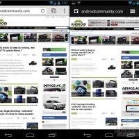
Next I want to compare a little between the stock Android 4.0 ICS browser, and Chrome. Both are very similar, and are about the same in regards to look, feel, and speed although both have their advantages and disadvantages. Here is a side-by-side comparison.
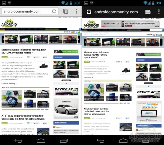
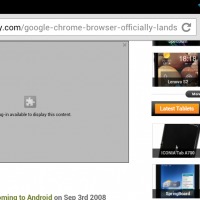
For one, Chrome doesn’t support Flash as we mentioned earlier today, so that might be a concern for many users. HTML 5 support will continue to grow but in the meantime no flash here, so you’ll have to use something else on mobile if that matters to you.
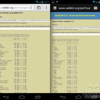
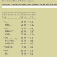
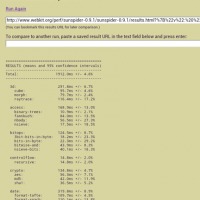
We also ran a few Sunspider benchmark tests just to see how she performed and I was actually quite impressed. Between Android 4.0 Ice Cream Sandwich and Chrome we scored under 1,900. Most devices in the past struggle to get under 2,100. The screenshot below again shows Chrome for Android on the left, and stock ICS browser on the right (full size images in the gallery below).
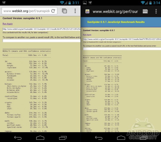
Chrome scored 1880 while stock ICS was at 1912. So pretty dead even. Performance across the board seems to reflect a similar result with actual real-world usage too. Overall the stock Android browser has a better and more friendly UI in general, but the few tweaks to tabbed browsing and the “cards” effect in Chrome are awesome. If we could have a nice blend of these two I’d be in heaven. I have a feeling that is exactly where Google is headed — so it’s only a matter of time.
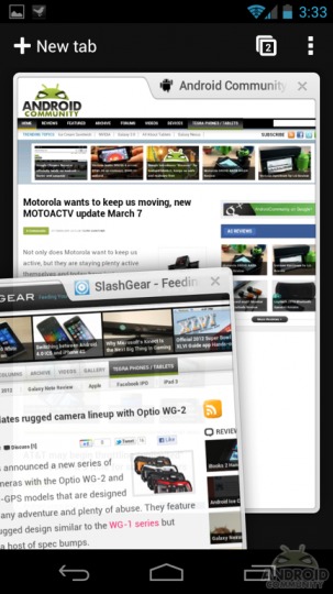
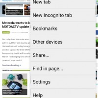
Now to wrap things up I want to mention the lack of “Quick Controls”. A feature in the labs section of the Android browser that I’m missing dearly. Obviously Chrome is its own browser and not integrated into Android, but we have a feeling it will be the main browser in the future. Same goes for the UI. While it has some extra polish, smooth animations, and a decent design it doesn’t resemble Ice Cream Sandwich other than the menu layout. Hopefully this will get blended together.
We have a few issues and shortcomings so far but the awesome features and overall polish make this my new default browser. Syncing everything from my PC over really has sealed the deal for me. Once they work out the bugs, make things a bit prettier, and enhance the overall experience nothing will come close and all those 3rd party browsers will be permanently replaced for me.
Get the Chrome for Android Beta in the link below, and check out the gallery for the rest of our images. Feel free to let us know what you think in the comments below. Do you like Chrome? Will it replace your stock browser on mobile?




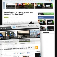


If you had the Galaxy Note, which interface would you get? The tablet interface or the phone interface?
I’m curious how it decides which interface to display.
I like chrome and i use google chrome on the pc a lot..but it will not replace my phone’s stock browser since it does not support flash..what a failure for a browser that doesn’t support flash =( It will give me the feeling as same as the iOS which i dun like..
I hate that google chrome does not work on the Thunderbolt. I really like google chrome