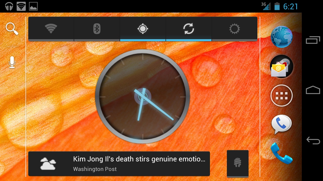
No doubt about it, the fancy new launcher is one of the highlights of Ice Cream Sandwich’s revised user interface. The default launcher has plenty of new animations, a revised app drawer that combines with a widget placement engine, and automatic folders that make grouping your apps easier than ever. But it’s still extremely light on customization, just like all the stock launchers beforehand. Enter Nova Launcher, a quickly-created customization of the launcher found in Ice Cream Sandwich’s open source code.
Nova Launcher looks almost exactly like the Galaxy Nexus stock launcher, but brings a host of options and settings to play around with. There’s the ever-popular landscape mode, a scrolling dock to allow more than just 5 pinned applications, and the ability to resize all widgets – not just the ones with the feature baked into ICS. I’m a big fan of the ability to remove labels from icons. Since ICS goes without a menu option on its native interface, the settings menu is moved to the app drawer.
You’ve got two options for installing Nova Launcher: download the APK file from this XDA-Developers thread, and install it like any non-Market application. Or root users can flash a ZIP file with ClockworkMod. The only difference is that root users will get the nifty widget menu as part of the app drawer. The app relies on various Ice Cream Sandwich APIs, so unfortunately there’s no way for Gingerbread users to join in on the fun. If you want to approximate ICS on an older phone, try the latest version of ADWLauncher EX.
The developer is already updating quickly, and a few of Nova Launcher’s early bugs have been squashed. You can now treat the formerly locked Google search bar as any other widget, for example. Try it out on your new Galaxy Nexus or an ICS ROM, and tell us what you think in the comments!


What is the most important thing in Nova Launcher is the fact, that you can send the fixed google search bar at top of every home screen to the hell :).
That or long press on-screen gives you widget adding options n stuff again instead of just wallpapers
How do you get to the nova settings?
if you remove the search bar. How do you use the voice commands?
1) you have a setting to show a small bar on side only in landscape mode, where it is not so annoying
2) you can still put a google search widget on any page.
The issue with the standard launcher is the fact, that the search bar is on every page, and it is not removable, so it takes up valuable space. You need the search, you can put the widget anywhere. But why have the search bar on every page ? What is the point of that ?
Isn’t this what Touch Wiz does, the same touch wiz that everybody’s always complaining about?
TouchWiz is a system-wide modification that adds (mostly) unnecessary bulk and resource usage across the OS. That’s something that most advanced users, i.e. the prime target for the Nexus line, don’t want. And what’s even more frustrating is they don’t get a choice. You want a Galaxy S II? You HAVE to have TouchWiz, or kiss your warranty goodbye.
when I got my Galaxy Tab 10.1 it came with stock Honey Comb. touch wiz was an option. I chose to update and get it and immediately noticed a huge speed increase. I didn’t like the visual changes to the UI but being able to finally do screen captures and a giant speed increase was worth the trade off.
on my Galaxy S II, I find touch wiz equally pleasant. Ive compared the Sprint & AT&T GS2s and my AT&T version beats them hands down.
I can understand why some people might not want it but after years of cat and mouse with apple and jailbreaking I grew tired of iOS and its boring and stale interface and I love Android very much.
Nice launchers suggestions i have also found some nice nice
collection of launchers over here. do check it out
http://enzag.com/technology/android/top-5-android-launchers-for-home-screen/
does anyone have a link to the wallpaper in the screenshot in the article???