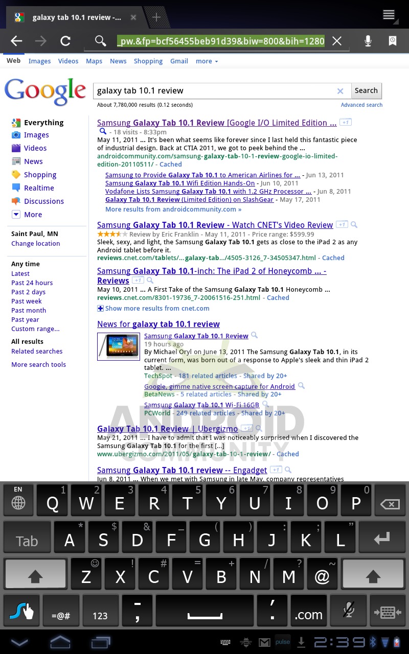
We’ve got our hands on the brand new Swype 3.0 as it exists in beta, up for testing for Honeycomb devices. This beta is available to everyone who signs up for the program and you’re freely welcomed to try it out for yourself at your own risk through Swype’s own homepage. That said, let’s have a demonstration / review look at this newest edition of the system and decide whether it’s up to the task, the task being screens as big as your head!
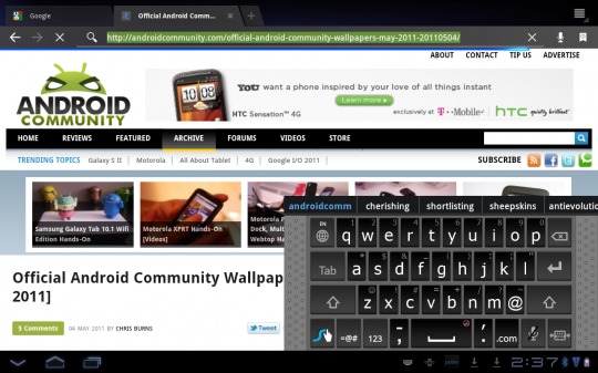
This version of Swype supports multiple resolution sizes including qHD, HVGA, WVGA, QVGA, WQVGA, WSVGA, and FWVGA. You’ll be able to type in both landscape and portrait orientation and you’ve got a brand new option to turn the keyboard into a tiny version that you can drag anywhere, left to right, on the bottom of your display. Let’s have a look, shall we?
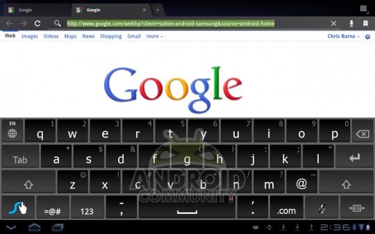
You’ve also got predictive tapping, a horizontal word suggestion bar, and lots of options for making your Swype library learn new words. Words like lyfe, schnizzle, and dinglefritz. Before we continue to decide whether this version of Swype is all the hype, let’s get to the hype! What you’re about to see are two very fabulous demo videos of the system in action, direct from the team at Swype for your pleasure:
What we’ve experienced thus far in the beta version of this newest Swype is a slightly buggy but overall very promising future for the group and the app. While we’ve tried essentially every 3rd party and stock mobile keyboard in the book, Swype proves again here why they’re the people’s choice. Options on top of options, keyboards in several locations so that you might choose the best location for you, and a real understanding of how a keyboard on a tablet is used, for all sorts of different users. What the folks at Swype appear to be doing here is working with real users to find what keyboard they want to use the most instead of forcing a new user interface on the user each time they’ve picked up a new device.
You’ve got the same Swype you’ve been using for the past few months (and years, for some of you,) with improvements galore, making this transition to Honeycomb a seemingly flawless and natural transition for the team. We look very much forward to the full version when it’s ready.
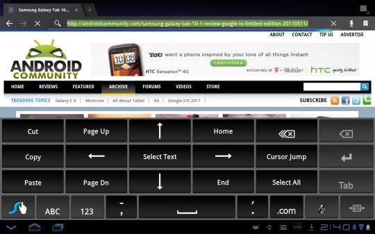
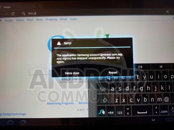
NOTE: this version of Swype does indeed include some bugs as noted, one of these being a pretty constant force quit through the stock internet browser, but because we’ve experienced no such errors in later editions of earlier versions of Swype in the past, we’ve got to give them the benefit of the doubt that they’ll have these all sewn up by the time it’s release day.
Now behold the video piece of the review, in patented middle-of-the-night dark style with our excellently bright TFT LCD screen on the Samsung Galaxy Tab 10.1, a device which we’ll be reviewing this week and reviewed a limited edition of back a few weeks ago.
[vms 724229175b8ef8b4585a]
Oscar winner video!


Would be nice to see them add a “thumb type” keyboard for tablets as well. Then they would have all bases covered.
how do you mean – split?
Like the thumb keyboard
SlideIT has had tablet support, resizing and predictive tapping for months, not to mention a “horizontal suggestion bar”, which is so trivial it is not even listed as a “feature”. They can even combine tapping and swyping. I always feel that Swype is one step behind them and is just looking at what SlideIT does and coping it with a fancier look. Sorry, but the original is usually (and this is no exception) better.
Thanks for the info, does seem slower than the phone version, but quirks great
Typing this using my tab and swype
why is the video talking about thumb typing when reviewing swype? you don’t type on the swype keyboard, you play connect-the-letters.