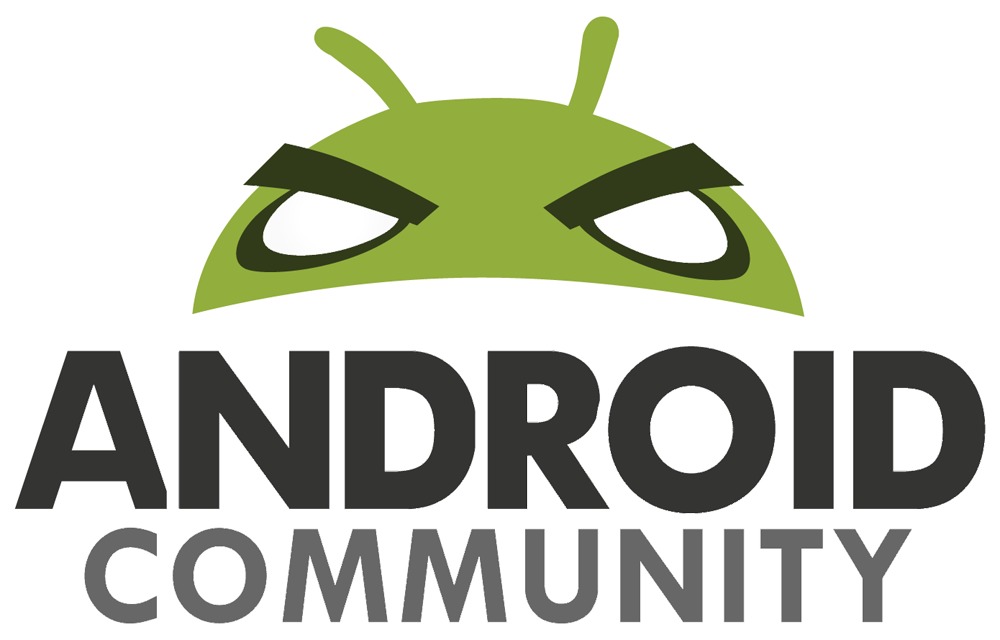
It’s one of those times, ladies and gentlemen, where we rip off our proverbial mask and reveal that we’ve actually got a whole different look up in here. By the time you read this post, you’ll surely be privy to Android Community’s new set of marks – and the brand new representation of the Android Community Android. Expect this new little fellow to be going on many adventures through the Android landscape as we continue to work with YOU to make the greatest Android Community we can!
You’ll see this logo set showing up on our main news feed here in several places, including the top of the page, perhaps on the side a bit, and definitely in watermarks across all of our lovely photos and leaked pics, and prominently peering over the discussion forums. Then you’ll also see he and/or she popping up on our official Facebook page and Twitter, plus some more physical places as well.
Expect this punchy little boxer to be showing up on every corner of all the major cities and towns also as we ramp up our street team and start really plastering the walls for the love of the mobile OS. We’d like as well to thank the massively talented designer Rue Liu, whom you may know from our sister site SlashGear where she not only writes, she not only does the weekly roundup in a super amazing video series, she also does a comic line that takes our culture and blends it until jokes come out!
Thanks Rue, and thanks to you, Community, for your continued participation in this tech culture we call home!
[Update] Here are two quick examples of how the new Android Community logo will be used in video watermark. When you see our “Android head” you’ll recognize that it’s our original content you’re watching. -Vincent
[vms 9ed80337f27127a9f1d2]


wait. isn’t this the angry birds eyes?
looks kinda similar i suppose http://www.technama.com/wp-content/uploads/2010/12/AngryBirds.jpg
Angry Droid!
This new logo looks great, mad props.
Can you change the front page to not be gray on white when quoting?
when quoting?
We haven’t started “redesigning” Android Community yet. The logo is only the beginning. Please post your suggestions and we’ll take consider everyone’s feedbacks.
Can you change the front page to not be gray on white when quoting?
Not sure about the redesign. The web is awash in light letters on white and well, content has been scarce talented or not, Rue didn’t get the job for her skills alone.
That maybe fine for the 18-24 demo but I don’t like rich white men telling me what to do anymore than I like primped, styled, so-in-vogue-Asian women doing the same.
I’m sure everyone else will love it so what’s the point in having standards, right?
Peace out.
what the hell are you talking about?
excuse my language.
I think Cory is referring @CeeDee, it’s a bunch of gibberish. I’m on the border of marking it SPAM.
yeah i was too, his comment just got plopped between
Just another reason I don’t bother coming back here much.
Say anything that critical at all – even in jest – and the hipster d-bags get their panties in a bunch.I STILL don’t like the re-design. I am sick of the non-original written content and the lack of substance that the Android Community (in general) has become.For the Chris, Vincent and Cory I will spell it out for you – try and pay attention.”That maybe fine for the 18-24 demo” – That would be you three”I don’t like rich white men telling me what to do anymore” – That would be Steve Jobs & Apple”primped, styled, so-in-vogue-Asian women doing the same” – That would for Rue Liu. Sex sells you dolts and study show she was more than likely picked for talent and looks equally or looks first.”I’m sure everyone else will love it so what’s the point in having standards, right?” – Point proven, thanks guysTry and keep up next time eh guys, I’ll be back in a few months to check on ya.Don’t let me down 🙂
the entire second half of your post is gibberish.. Just confused on why your so angry
new logo is not very good…it just doesnt work…of all the things to do to the android guy, you guys took a happy little dude and made him pissed off at god knows what…typeface is fine, its generic and un-original but it doesnt bother me as much as the logo
We were going for powerful or authoritative and could come up with to many visual representations to suffice. We were hoping that bad ass kind of came off with the logo approach as well. Hopefully that makes sense.
Who the hell cares?