Welcome to the device that expands Android beyond the hand-written letters it’s been in the past and turns it into a full-fledged book of a device. Optimized for its size, power, and intended set of purposes, this Motorola XOOM tablet has been fitted with Android mobile OS version 3.0 Honeycomb, that being the first version of the operating system made specifically for the tablet environment. What we’re going to be doing in the following post is breaking this device and its installed operating system into questions and answers so that you the potential user and Android enthusiast can get a grip on the next generation of Google-powered devices.
Our first thought was to break this post down into operating system and device, but we got wise real quick – as Motorola worked so very closely with Google to make this tablet the optimal environment for Android 3.0 Honeycomb to shine, the hardware and the software are inextricably dependent upon one another in that we’ve gotta keep both in mind when explaining this device and reviewing it at the same time. That said, let’s begin.
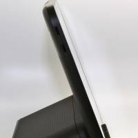
How does the XOOM feel in your hands, how heavy is it, and will it compete with the iPad as far as form?
First of all, yes, this tablet will go into direct competition with the Apple iPad as far as form goes. This tablet (depending on which version you’re getting, of course,) weighs exactly the same as an iPad, and is just as easy to wield. Motorola and Google are going right into the battlefield with this one, right next to the iPad on the racetrack to glory. We’re going to go ahead and steer slightly clear of comparisons to the iPad for the rest of this Q&A as that’s a discussion for another day, but for now, let’s just say that it and the XOOM are definitely in the same contender ring.
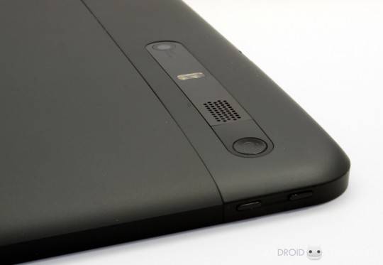
The Motorola XOOM is heavier than we’d like, but then again, we’re in an age where we wish everything was perfect as we see it to be, and this is the first larger tablet to come out with Android on it. It’s the first try. We cannot expect perfection the first try, but why not wish? On the other hand this device is not difficult to handle, regardless of its weight. We can, in fact, hold the tablet with one hand and work with the display with the other.
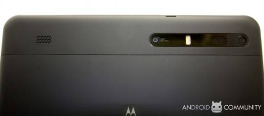
When we attempted to do the same thing but with a camera in our hand, this proved a bit more difficult, but surely the tablet wasn’t built with the intention that people would be propping it up and filming it and controlling it all at once while they’re running around Mobile World Congress 2011. Instead it’s clear that this tablet was made to be sitting in one’s lap or laid flat on a table while the user works with it during a moment of downtime.
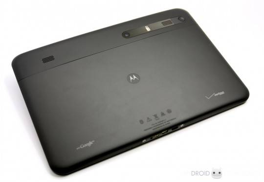
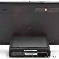
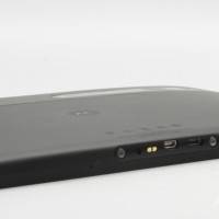
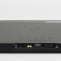
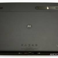
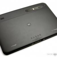
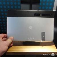
The tablet, both the USA black-backed version as well as the EURO silver metal backed version are both pleasing to the touch. This absolutely is not the sort of situation where the hardware came second to the software, no way. This tablet is as much about ease and comfort in use as it is about the newness and excitement of the operating system. Of course it is difficult to escape the excitement of using this first big step into the Android tablet world, but Motorola’s made sure the journey is done in a solid set of shoes
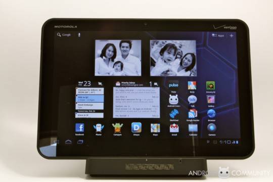
Will I have trouble adjusting to this new version of Android?
If you expect this version of Android to work based in the Froyo/Gingerbread world, then you might have a bit of a hump to get over as far as comfort goes. While we found it rather easy to slide around in the system, it became much easier once we let go of the fact that this was an Android system. What I mean is that if you expect a relatively easy to understand experience here, you’re going to get it, just so long as you don’t expect know this user interface from top to bottom just because you’ve used Android before.
This version of Android has been built from the ground up. Not COMPLETELY from the ground up, but it’s certainly not just a re-hashed version of the smartphone OS you’ve grown so accustomed to. There are a slew of new elements you’ll have to allow yourself to be comfortable with before you come to realize how well implemented they are.
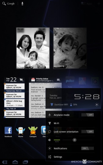
How do I get around in this new system?
Along the lines of “new elements,” you’ll be dealing with two new features which will be guiding and informing your experience from start to finish. One of these features is the Action Bar (which is at the top of your screen,) and the other is the System Bar (which is at the bottom.) These two elements are very often, but not always, utilized by whichever part of the system you’re in. They’re also available to developers to utilize inside apps, but again, they’re not always there.
The Action Bar, the one on top, is a replacement for the overflow dropdown menus of the past, made to essentially be available to developers who wish to utilize it. You’ll find this element appearing in apps (and on your homescreen) in many different forms depending on how the developer chooses to use it. We find this to be a magnificent example of the open source “use it if you want, if you don’t want it, don’t worry about it” nature of Android.
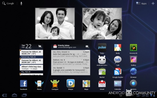
The System Bar, on the bottom, takes on many of the functions that the Notifications Bar of the Android mobile OS currently still has on smartphones. This System Bar is similar to the Action Bar in that it can appear anywhere inside / outside of apps at the request of each app. Along with this feature comes notifications pushed to sort of “poofs” which can appear inside of apps without disrupting function or gameplay. For the most part during these first few months, most apps will be working with the “Lights Out Mode” meaning the notification bar will be gone completely as optimization for Honeycomb will be a gradual process for most developers. On the other hand, we’ve heard that the next big version of Android’s mobile OS (Ice Cream) will take into account features such as the System Bar in Honeycomb and integrate them back into the mobile version of the OS. Should be interesting.
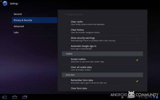
Where are my Settings?
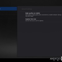
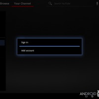
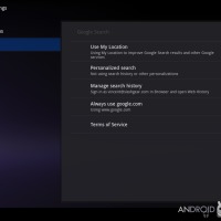
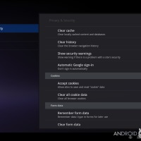
To access your settings, you’ve only to tap the clock in the lower right hand side of your screen, (in your System Bar,) then tap again to get to settings. You can also access your settings via the Settings thumbnail available right alongside the rest of your apps. — and while we’re on the subject, check out the Auto Google Sign-in option. Turn it on or turn it off.
Will I want to download a homescreen replacement app right away?
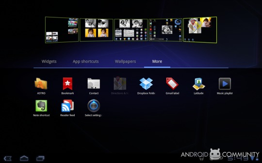
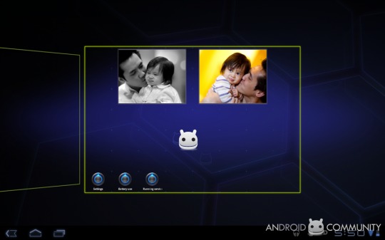
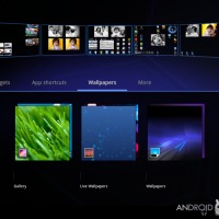
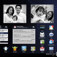
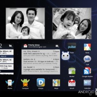
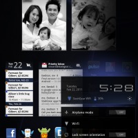
You might not want a 3rd party homescreen customizer at all. Homescreen replacement apps of the past wont exactly become extinct, as completely and utterly changing the way your system functions on the front end will always have a warm place in the hearts of the developer community, but have a look at the advances Android has made in customization options. Each one of your home screen panels can be handled differently. Where in the mobile version of the Android OS you’re only allowed a single wallpaper for your entire set of panels, here you’re allowed to customize each panel as you see fit. Out of the box you’re allowed 5 panels, each of which can have app shortcuts and widgets, but also a dedicated visual layout mode – at the most basic level, this means that each panel can have its own wallpaper.
Does my apps drawer look the same as it does in the mobile OS?
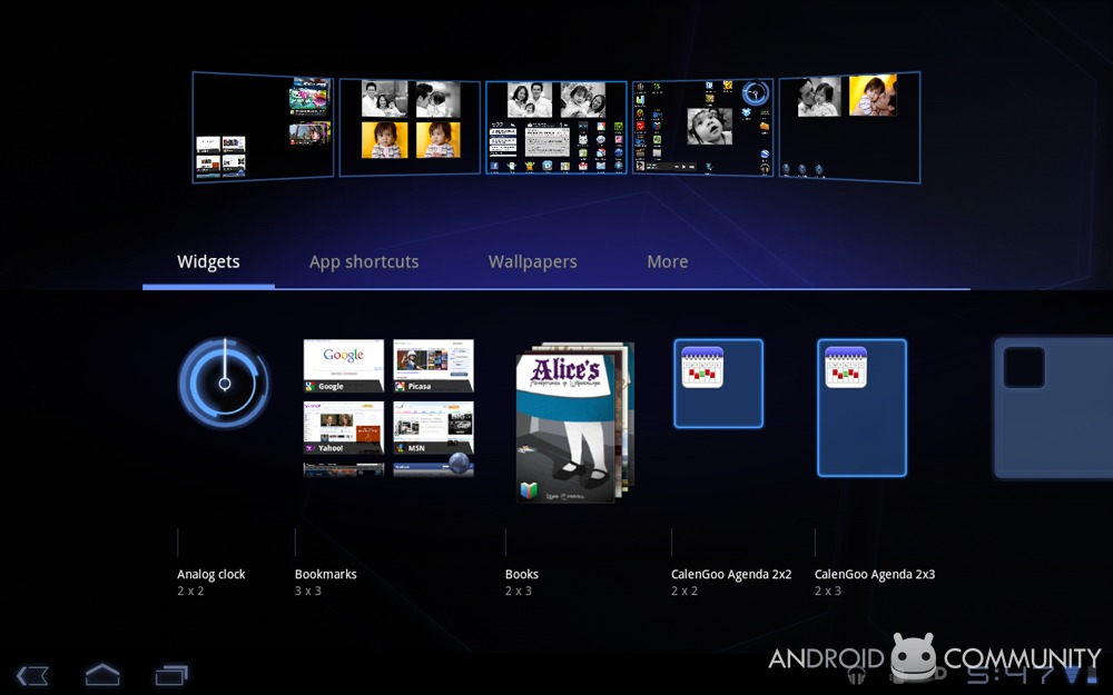
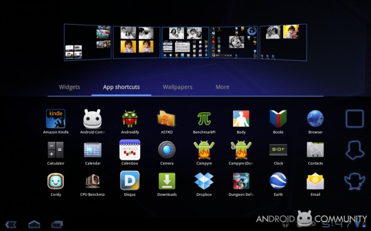
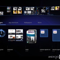
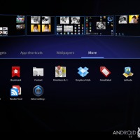
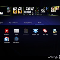
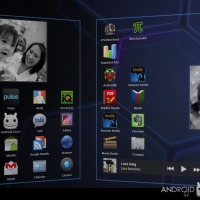
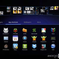
Instead of simply having a drawer for your apps, you’ve now got a Launcher. What this Launcher does is allow you access to everything you’ll need to set up your homescreen panels the way you like in order to get you the experience you want. In the Launcher, you’ve got several drawers with items for customization of your homescreen panels. You’ve got Widgets, App Shortcuts, Wallpapers, and More. Each of these contains elements you can drag to one or more of your homescreen panels. I say “or more” because you can place any number of instances of each item (except for wallpapers, of course,) in each panel. When we were checking out the XOOM Euro Edition in Barcelona, the demo units were FULL of clocks – people had dragged the same clock to every panel, and several times for each panel.
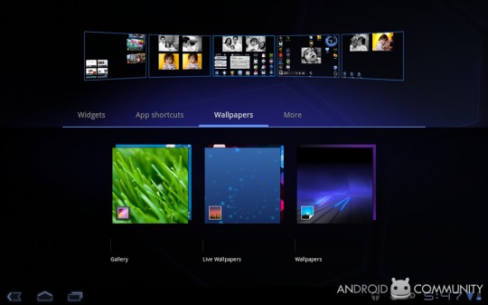
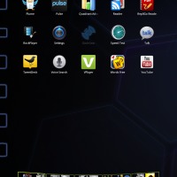
Wallpaper is self-explanatory – one for each panel if you like. App shortcuts work the same as they always have, each of them sitting neatly wherever you’ve placed them on a panel. An interesting addition to the display of masses of icons here though is the off-screen row. As you can see, the first row that’s not quite visible is instead set to a sort of outline in blue to give you a hint of what it will be once you pull it into view.

As far as widgets go, each one is displayed in your launcher exactly the same as it’ll appear once you’ve activated it by moving it to a panel. If you’re unsure of how many rows and columns each widget will take up, no worries, it’s listed below the title of each widget. Drag each widget to the panel of your choice and there it will plop! You can do this as many times as you like with each widget, though we’re unsure of how multiple instances will function or if they’ll be useful in any way yet.
NOTE: depending on which panel you entered into the launcher with, a single tap on a widget, wallpaper, or app shortcut adds each element back to the panel. If you want to add an element back to a different panel than the one you came in through, you’ve got to press-hold and drag.
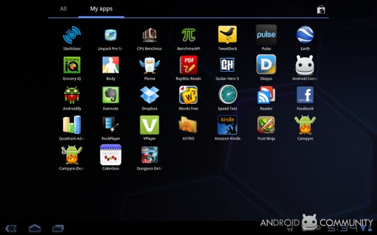
May I access apps from this launcher?
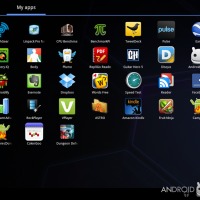
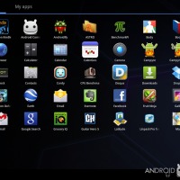
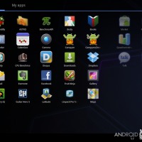
No, launcher is just for adding app shortcuts to your panels. You’ve still got your app drawer separate from this. Your app drawer contains every single app you’ve got on your device, which can by daunting, but that’s what the panels and “my apps” are for. This new app drawer has the ability to serve as another launcher (in that you can press-hold and drag icons to your homescreen panels if you wish,) or as application uninstaller.
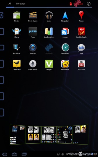
In a move that seems like it should have been implemented generations ago, a press-hold gives you the option of uninstalling an app as well. It appears that the app drawer will finally be the place where you can not only access and activate your apps, but also work with them and delete them as well. The Tron-outline effect is again active here for slightly-offscreen icons. This Tron-outline also appears whenever you drag an icon from its resting place. A fun effect and well-played by Google.
NOTE: Android Marketplace is always looming overhead while you’re in your app drawer – up in the right hand corner is that familiar shopping bag, a single tap will bring you there instantly.
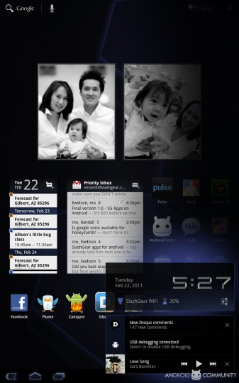
How about quick-access settings like Wifi and brightness?
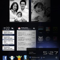
Options including Airplane mode, Wifi, Lock Screen Orientation, Brightness, and Notifications (off/on) are all offered in a single click of your clock down on your System Bar. You’ll also be able to see recent notifications down there, a place to control your music player, battery life, and Wifi network and health. From here, again, you’ll also be able to access the rest of your settings. When you’ve got this tiny panel of quick-access settings open, a dark haze oversets the rest of your homepage or whatever you’ve got open. Do not worry, it’s not locusts, it’s just an aesthetic choice made by Android to direct your eyes down to the options at hand.
What happened to the “big four” buttons?
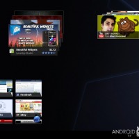
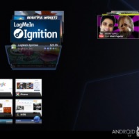
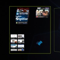
As you’ll notice right away, your Motorola XOOM tablet does not have dedicated physical and/or touch-sensitive buttons. Where before you had Home, Back, Search, and Menu buttons on essentially every single Android device, now you’ve only got back, home, and a “Recent Apps” button. This button brings up a thumbnail list of apps you’ve been to recently, allowing you to switch back and forth between them with ease.
What if I want to search?
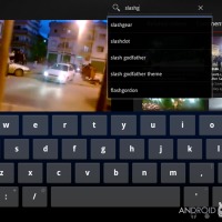
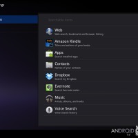
Your search option has not disappeared, it’s simply been relocated to the top of your screen, now a part of the Action Bar where it’ll appear if functionality within the app you’ve got open allows it, invisible if it doesn’t.
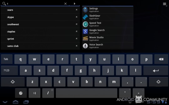
How’s the new keyboard work?
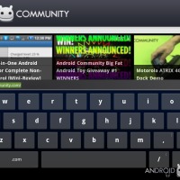
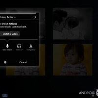
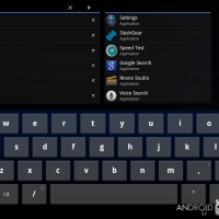
It works well. It’s optimized for this larger environment, obviously, and because its so much closer to a full-sized standard keyboard, we’ve been making essentially no mistakes in keying in words and phrases and whatnot. New keys have been added to bring you closer to a full-functionality keyboard, keys like TAB for all your standardized space needs. Touch-hold comes up several times in this new keyboard environment, activating alternate keys and activating/deactivating voice commands and input.
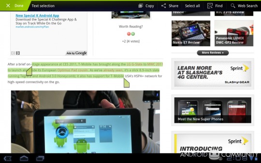
Can I copy and paste?
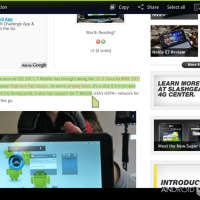
Of course you can! Although it’s not entirely new that you’re able to select and copy and paste text, you can now do more things with it in collaboration with your Action Bar. You may now copy that text as normal, but you can also share or search with it as well.
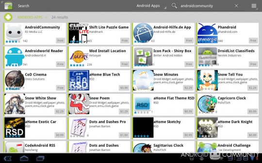
How’s the Android Marketplace look?
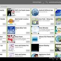
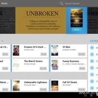
It looks bigger, obviously, but appears to currently only be working in landscape mode. We’ve been racing back and forth through the market to find any Honeycomb optimized apps and, sure enough, there doesn’t really seem to be any – but we needed some other apps anyway, like the Android Community app for all our up-to-date Android news from across the tech landscape, so no big loss!
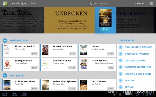
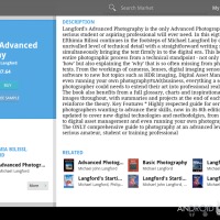
And wait a second, what’s that? Could it be a brand new section in the Android Marketplace, one with books? Indeed it is! A couple days ago we found out that the Android Marketplace would be potentially growing to cover Music, Movies, and Books and that Honeycomb had already dipped its bear-claw into the pot. Is this a power-play by Google to take over the media selling business? You betcha.
How large are the homescreen panels?
Each panel is 56 squares – 8 columns wide and 7 rows deep. Each application shortcut takes up one single square. You know what that means? One heck of a lot of icons per page if you want, or a bunch of icons and a few widgets. If you’re a fan of widgets and flipping your homescreens from side to side, you’ll also notice that the transition is much smoother than ever before.
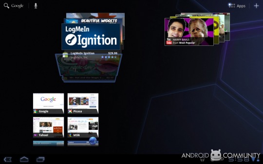
Have widgets been improved?
The number of ways a widget can function has been increased, and the “Holographic User Interface” of Honeycomb intends to make your widget experience as magical as possible. Developers have been given the following functions to work with for all their brand new widgets for homescreens: 3D Stack (for tiny, flippable galleries,) Search Box (improved over previous models in some way or another,) Date/Time Picker, Number Picker, Calendar, Popup Menu, and additional options not yet revealed.
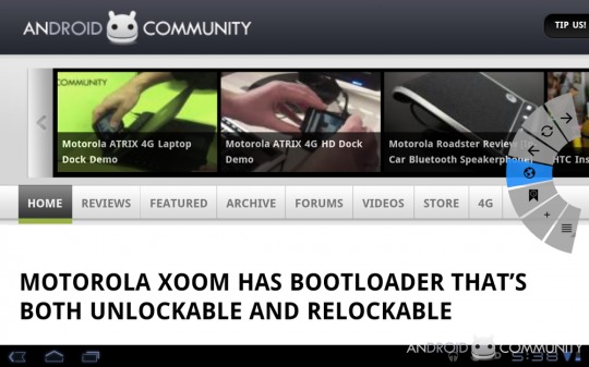
How’s the internet browsing experience?
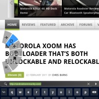
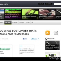
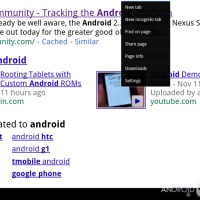
It’s both minimalistic and futuristic. As you can see above and below, this browser is both bringing you the internet essentially un-framed so that you’ll have the purest experience you can get, but then there’s that bonus feature. What bonus feature, you ask? Well the swipe-in control panel, of course! This control panel features buttons that I’m sure you’ll recognize, this whole panel appearing whenever you swipe in from any corner. The buttons are thus: forward, reload, back, address bar, bookmarks, add bookmark and menu! Ease and simplicity.
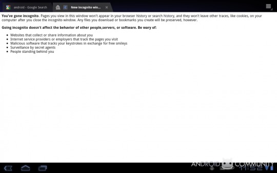
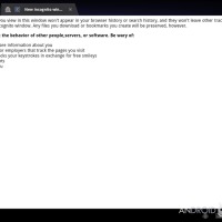
There’s also a super sleuth incognito mode:
Can I view flash content?
Not right this instant, but apparently very soon after the official launch of the tablet. By the time you read this sentence, there’ll probably be flash, is what we’re saying here. Take a peek at the original announcement of no flash back [here].
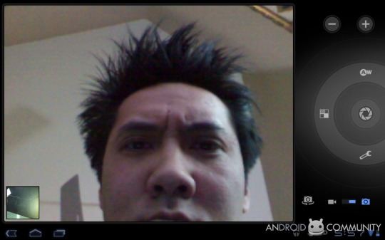
How is the photography experience?
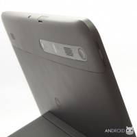
Let’s talk about the photography and video recording experience at the same time. It’s a bit odd collecting content in this way with such a gigantic panel as a camera, but as it turns out, the photos are OK and the video is great! On the other hand, having such a gigantic viewing area and set of buttons all on hand at once really has potential to improve our photo-taking skills. It’s certainly a unique experience, that’s for sure.
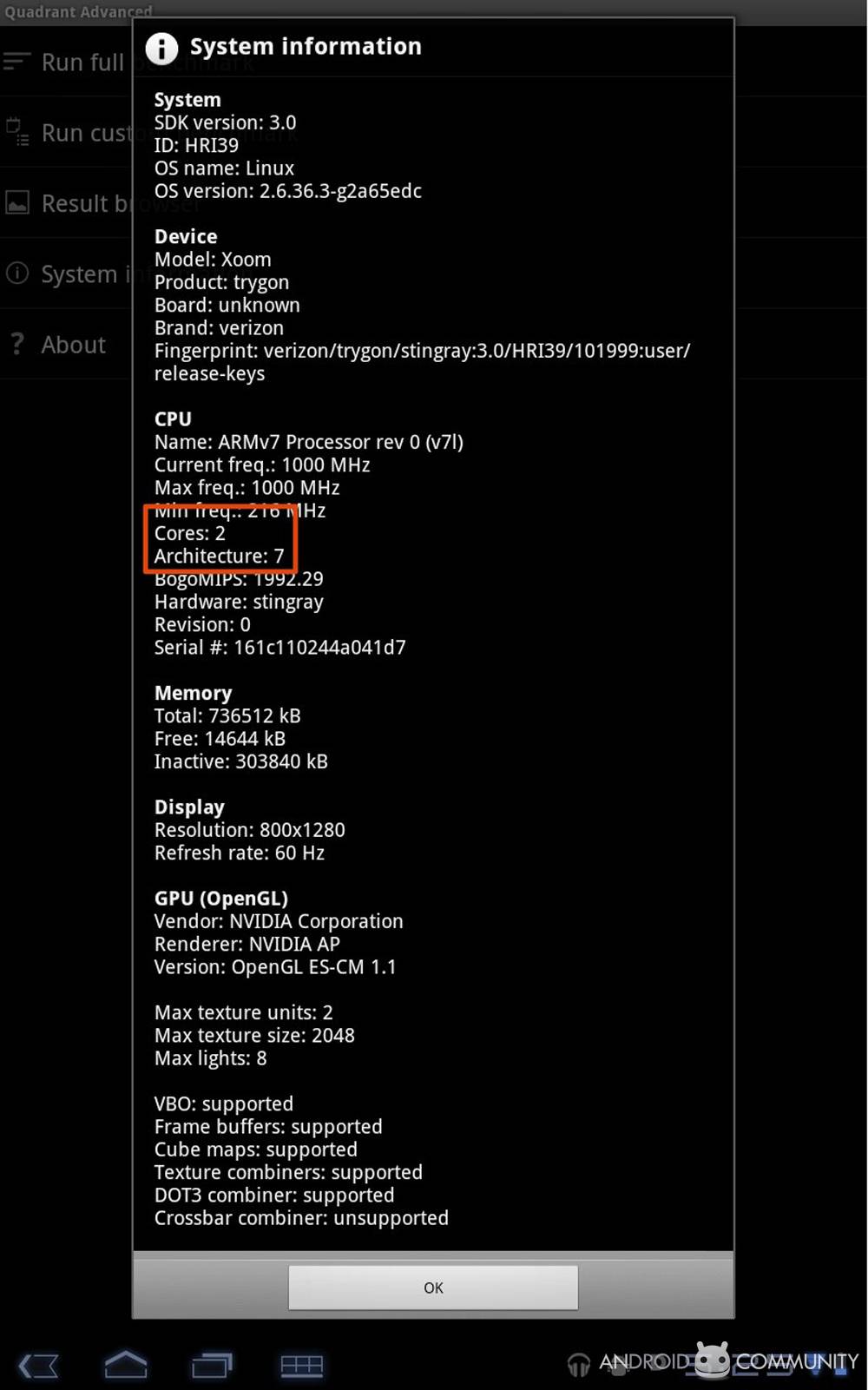
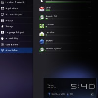
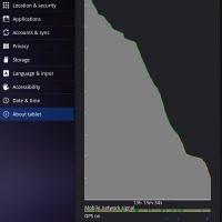
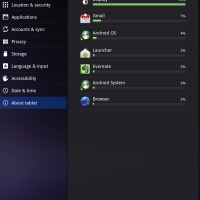
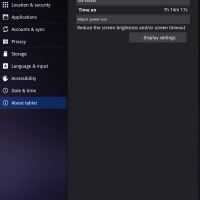
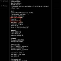
May I see the System Information to look at all the important info?
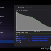
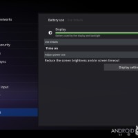
Sure, buddy! Have a look here:
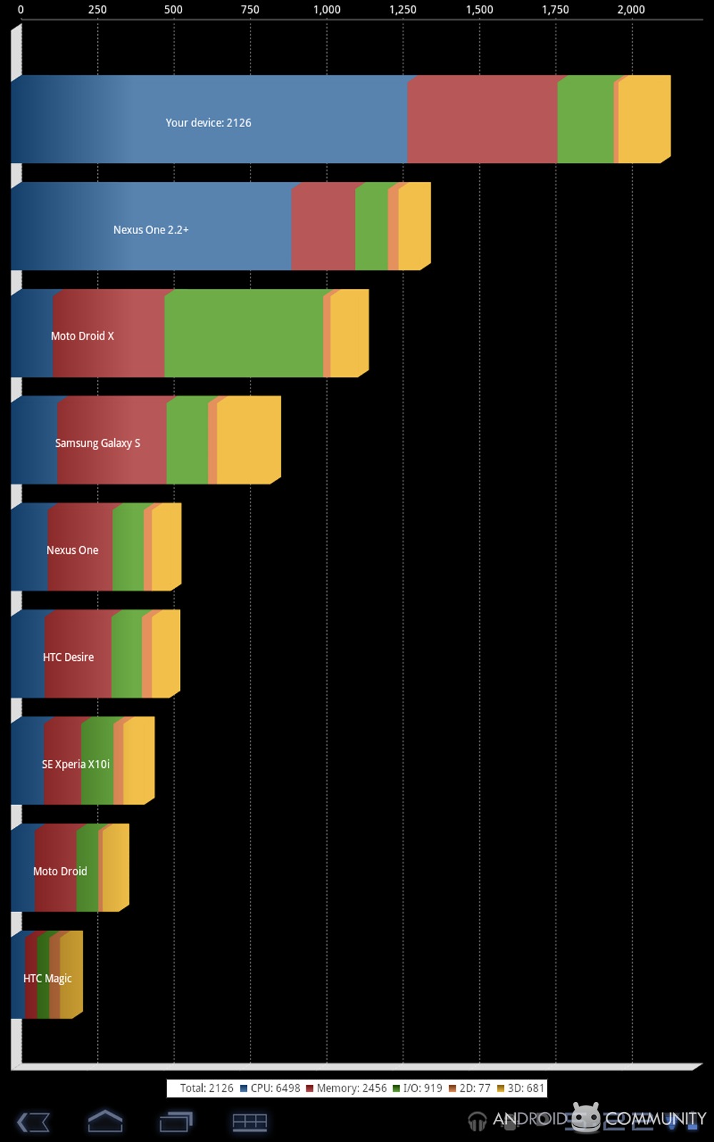
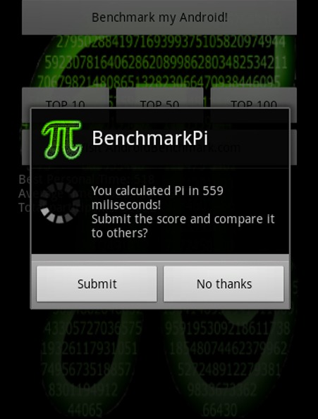
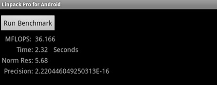
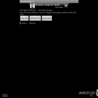
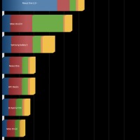
How about some benchmarks, have you run any benchmarks on the XOOM with Honeycomb running?
Of course we have, dear reader, of course we have:
Have there been any improvements made to out-of-box apps?
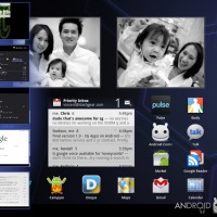
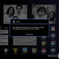
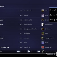
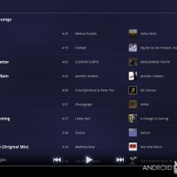
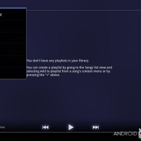
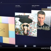
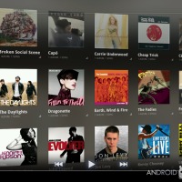
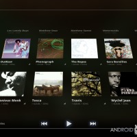
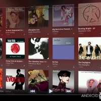
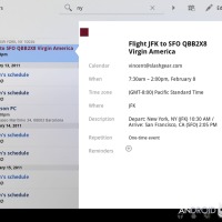
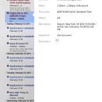
Sure there have been some improvements, of course there have been. First, when you’re in your expanded calendar app, you can search through your future and past events with keywords. Lovely! There aren’t too many big huge improvements made to the music player, and it does appear to be pretty much exactly the same as the last time we saw it. Pulse isn’t out-of-the-box but it’s definitely been optimized for the larger screen with an article preview for each post and much bigger everything to not only accommodate the extra space, but to use it for its own.
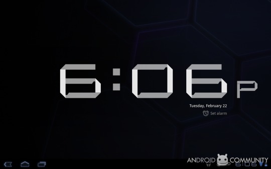
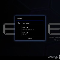
What’s that big fat clock I keep seeing?
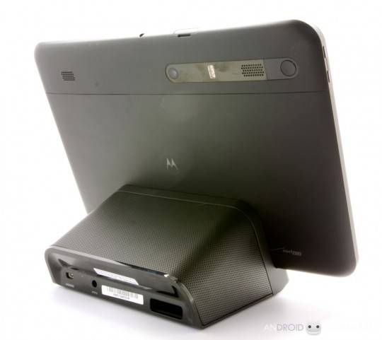
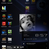
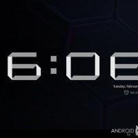
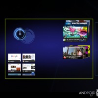
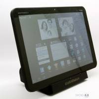
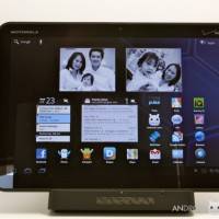
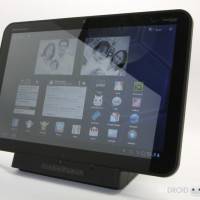
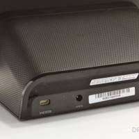
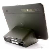
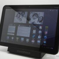
That big fat clock is what you have the option of displaying when you’ve got the device docked. It’s the user interface for when you’re asleep and plan on waking up again someday. Don’t you just adore the font?
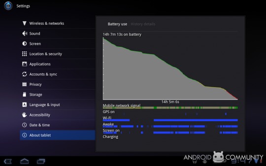
How’s battery life?
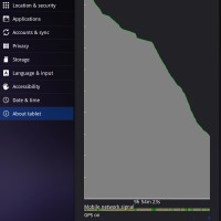
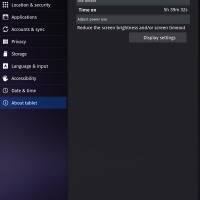
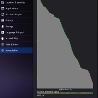
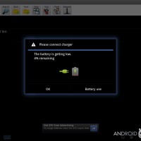
We’ve used the device for over 14 hours with around 8 of that using it heavily. That’s over 8 hours of HEAVY usage from us, and you know that when we say heavy, we mean heavy. Heavy metal. Upon reaching the 4 minute mark, the unit shut itself off as if it were never on.

And the video playback, how is that?
With a 10.1-inch capacitive touchscreen display operating at 1280 x 800 pixels, this display essentially can’t go wrong. It looks great, it’s sharp, it’s bright.
What kinds of video can I view?
The following video codecs, or formats, however you might want to say it, play back with ease in this version of Honeycomb: H.263, H.264, MPEG-4 and VP8, in .3gp, .mp4 and WebM. Of course there’s always workarounds – we’ve been using RockPlayer and vPlayer, both of which can be found in the Android Marketplace, to play videos that wouldn’t work in the stock video player.
How do I load media onto my XOOM running Android 3.0 Honeycomb?
If you’re using a Windows machine, all you’ve got to do is plug your device in via USB. If you’re using Mac OS 10.5 or later, you’ll need to download “Android File Transfer” which you can get free here: [androidfiletransfer.dmg] – this is an abnormally simple application to use in that you’ve only to drag it to your applications folder to install, then upon inserting the USB cord attached to your device to your computer, just open the app one time – from then on, it’ll open automatically.
How long does the XOOM tablet take to charge?
The XOOM tablet goes from zero to full in around 3.5-hours. Impressive!
What’s under the hood? Is it fast?
How about the dual-core 1 GHz processors coupled with 1 GB of RAM? We’ve been told by Motorola that Dungeon Defenders and the game Cordy are good games to test out the processor power of the XOOM tablet running Honeycomb – we have – it rocks.
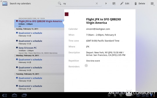
Any improvements to the calendar system?
Oh yes, there’s essentially been a complete overhaul on aesthetics and user interface, with a fabulous search function leading the way to great planning for your everyday life.
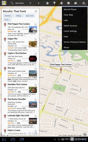
Anywhere else search is improved?
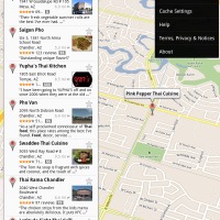
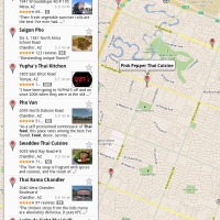
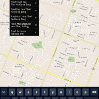
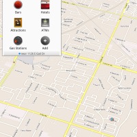
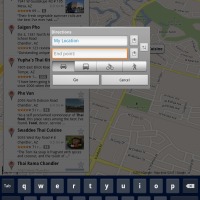
Yes, in Google maps your search is not only integrated better, but improved in ways we’ve not even begun to scratch the surface of. Fabulous!
Anything else?
Of course! We’ve taken days and hours to create this question and answer session, and this IS everything the average person could ever want to know and more, but we’ll never be satisfied! We’ll be adding to this guide all the time – as Honeycomb expands, so shall we!
While you wait for us to dig deeper and deeper, have a look at our sister-site’s take on the tablet and the OS in two reviews, one for Honeycomb, the other for the XOOM!
























Will it work with European 3G network?
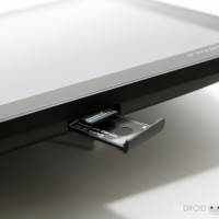
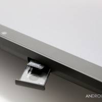
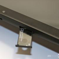
The European version of the Motorola XOOM will work in Europe.
Is there any version which works in US and Europe?
We’re not sure yet – maybe the magical Gold Limited Edition version!
WANT
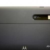
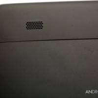
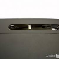
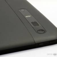
Is the back rubbery, or is the back metal? Also, is this black version easier to carry around than the Euro silver metal back version?
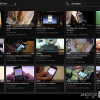
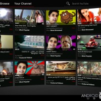
Does YouTube work out of the box? When will flash be coming?
you can see youtube on there i bet it works
youtube works right away, flash is coming in a few weeks
How productive is it???? Is it just a big multimedia device or can I use it in a college course like taking notes and recording lecture?
Android devices can be very productive but that all depends on the device and dock.
Android allows the use of a keyboard and mouse, therefore you can use it just like a netbook with the proper dock. A good example of this is Asus’ Transformer due out this summer–it’s the tablet I’m waiting for.
Other tablets have good hand writing recognition software and I’m sure there will be apps in the market for that, if not now soon. I’m sure you could record a lecture easily with any decent Android device.
As for the Motorola Xoom, I’m not sold on the keyboard setup for it. Like you, I want something that can be very productive as well as a great tablet & entertainment device, therefore I’m waiting for an Android Honeycomb netbook/tablet hybrid.
Just get a bluetooth keyboard. They are relatively cheap now and easy to pair with the device, and can be used or not used, as opposed to having a keyboard always there with a full touchscreen interface.
Android devices can be very productive but that all depends on the device and dock.
Android allows the use of a keyboard and mouse, therefore you can use it just like a netbook with the proper dock. A good example of this is Asus’ Transformer due out this summer–it’s the tablet I’m waiting for.
Other tablets have good hand writing recognition software and I’m sure there will be apps in the market for that, if not now soon. I’m sure you could record a lecture easily with any decent Android device.
As for the Motorola Xoom, I’m not sold on the keyboard setup for it. Like you, I want something that can be very productive as well as a great tablet & entertainment device, therefore I’m waiting for an Android Honeycomb netbook/tablet hybrid.
Will I be able to bring this thing along with me on a plane across the USA and watch a couple of movies, or will it run out of power in 3 hours then?
Looks like reviewers are seeing around 8 hours of video playback on a charge.
Of course, general use will have a much longer battery life.
thank you acupunc, you are correct
thank you acupunc, you are correct
does the dock charge the unit as well, or just keep it powered while it plays music and video?
yes it charges it like a credit card
yes it charges it like a credit card
answer more questions!
never!
never!
please do a demo of some games next – i care most about games, then everything else second. cant wait for the games market to take off with these big panesl
we will!
we will!
Does it blend?
i want to know too
me too
me too
send me another one and we’ll test it out
send me another one and we’ll test it out
Can I get one for $499 like the iPad? No? Never mind.
harsh! you can a couplemonths down the line i bet
Can the iPad suck more than it already does? No. Never mind.
The iPad sucks and it still sold over 15 million. The Xoom doesn’t suck so I’m can’t wait to see how many it will sell!
The iPad sucks and it has sold over 15 million. The Xoom is way better than the iPad, I can’t wait so see how many this things sells. Android 3.0 FTW!
Lol you are one delusional android fanboy. What happened to the idiots saying galaxy tab was ipad killer? Xoom can barely conpete with ipad, never mind the ipad 2. Get real kid.
People are not going to buy a device that is 800 dollars and rushed to the market. Flash does not worth currently, same with SD card. Motorola will cut its prices in the upcoming weeks just like samsung did.
I conpetely, Flash does not worth currently.
How is babby formed?
“We find this to be a magnificent example of the open source “use it if you want, if you don’t want it, don’t worry about it” nature of Android.”
That is not an example of open source. That is simply an example of providing an optional API, whether that is in open or closed-source product.
Here’s a couple of questions.
1. You mention video playback is good but not all codecs are supported. What about supported container formats? Have you tried, say, a 1080p mkv file in both the built-in and third party media players? Does it work with any of them, and if so, how well?
2. The device really seems geared towards landscape use, which seems like it would be awkward for use with one hand holding the tablet and the other using the screen. Does the homescreen work in portrait mode or have it as an option, or is it landscape only?
Sorry if these have been covered elsewhere.
2. homescreen works in portrait, but everything is definitely geared toward landscape.
1. we’ve not quite done extensive testing with video formats yet – hope to do so sometime next week!
Thanks. The video codec thing is the biggest issue for me. I have a lot of hi-def mkv’s, and being able to watch those without transcoding would be a huge selling point for me. Not sure why more companies don’t support popular formats like that.
Thanks. The video codec thing is the biggest issue for me. I have a lot of hi-def mkv’s, and being able to watch those without transcoding would be a huge selling point for me. Not sure why more companies don’t support popular formats like that.
2. homescreen works in portrait, but everything is definitely geared toward landscape.
1. we’ve not quite done extensive testing with video formats yet – hope to do so sometime next week!
go away!!!!!
Will it work in a corporate environent using a Proxy and MS Exchange
not sure – we’ll try if we can
not sure – we’ll try if we can
Is there a screen capture feature or does it still have to be connected to the debugger/PC for screencaps?
try ShootMe
Shootme only works on rooted devices as far as I am aware. I wanted to know if the Xoom had a screencap capability without having ti be rooted.
older versions of shootme worked on android handsets without rooting, the newest version does not. we’ve yet to try out the oldest versions of shootme with this tablet – soon!
doesnt work
doesnt work
older versions of shootme worked on android handsets without rooting, the newest version does not. we’ve yet to try out the oldest versions of shootme with this tablet – soon!
I can’t get my MS Exchange e-mail to work. If I use the e-mail icon that comes with the xoom, I can’t get connected to my work e-mail, after filling in all of the information it comes back as unable to open connection to server. I have the Driod phone and am able to use outlook web access, outlook web access does not work either it just keeps prompting me for my user name and password. I downloaded firefox, it works, but not very well. Any suggestions?
sounds like beginners bugs to me – have you been trying to connect via 3g / 4g/ wifi?
sounds like beginners bugs to me – have you been trying to connect via 3g / 4g/ wifi?
2 weeks ago Motorola has acquired 3LM, a stealth startup that develops security technology for phones running Google’s Android mobile operating system. HTC is 3LM’s client too.
Android for Consumers and Business! Android for all. Thank you for the excellent review.
I love Android every day more and more=)
Out of the 4 Android devices I’ve owned in the last year and a half the Xoom is by far my favorite, the capabilities of it are just incredible its all around an amazing device.
Can I create folders like in Windows to store word and excel files
I’ve had trouble with finding a video app to play videos on Xoom that aren’t either small or not grainy. Do I have to only download 1080HD movies to see in good quality full screen on Xoom?
What does it mean when my “notification led” is blinking?
What does it mean when my “notification led” is blinking?
What does it mean when my “notification led” is blinking?
Can I play Sony .MTS video files on a Xoom????
Here is a question I don’t think you have gotten before. Is the memory on the Zoom for Email, Contacts, and Calendar limited more than you think? On the Samsung Galaxy Tab you have ONLY 81.26 MB of space to contain all your emails, all your contacts, and all your calendar events, even though it has 2GB of internal memory and a 32GB SD card.
This is not in the manual, on Samsung’s site anywhere, nor Verizons and no reviews that I have read, and I have read many dozens, have ever mentioned this.
I would like very much to know if there is some similar limit on the Motorola Zoom for what Samsung calls “Personal Data”? If it has such a ludicrous limit on these, the most important data a person can have on a tablet or any other mobile device, then it is not work even considering. I don’t know if this limit on the Tab is a Samsung thing or a Verizon thing. Does the IPad 2 have such a unimaginable limit? Looks like a possible class action law suit against Samsung and/or Verizon. Clearly a misrepresentation of the Tab to say the least.
One other question you may not have gotten, does the GPS work on the Zoom with only WiFi on? The Samsung Galaxy Tab will not lock to GPS if the Verizon cell network is turned off? You MUST have the cell network on for GPS to work on the Tab. If the Zoom is similar, than these WiFi only models make Google Maps and Navigation pretty much useless.
Thanks
Omegaman69
I have lost the notification bar in the lower right of my xoom screen. Any idea how to get it back?
I have lost the notification bar in the lower right of my xoom screen. Any idea how to get it back?
Okay, I did a force reboot and the navigation bar is back. Not sure what happened to it but a reboot took care of getting it back. Sorry for the post, I found my own answer.
Okay, I did a force reboot and the navigation bar is back. Not sure what happened to it but a reboot took care of getting it back. Sorry for the post, I found my own answer.
My xoom is stuck. How do I unstick it?
When will video Skype be available on the xoom?
If the battery goes flat on the Xoom will it retain the contacts in the memory or are they lost
Can I do a select all on my email for deleting?
I can’t seem to find a way to transfer files to my Xoom. When I attach a flash drive or a card reader to the Xoom I see no recognition. Help