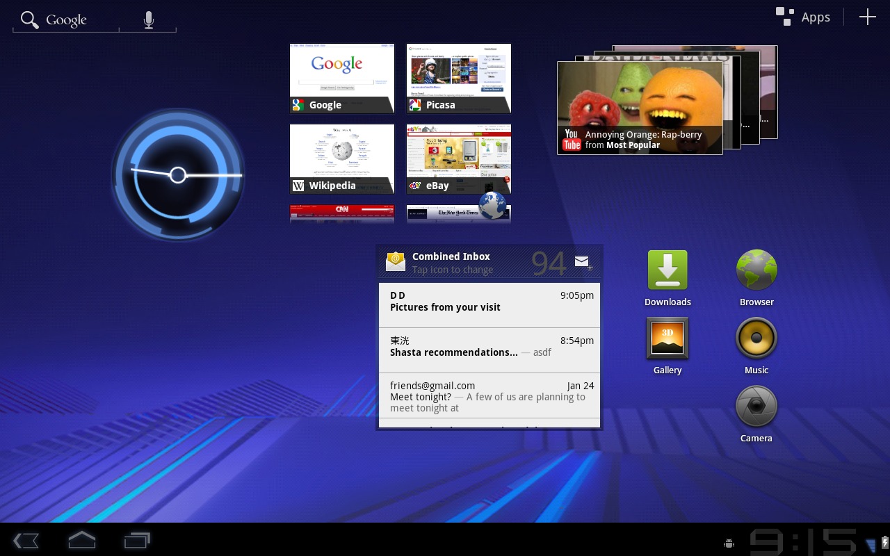
Hello there and welcome to your full guide and preview of Google’s new Android operating system version 3.0, also called Honyecomb, also known as Android’s first tablet-centric OS. The first of two main points we’ll be going through here are is New User Features. The second of two points is covered in a second post – New Developer Features. We’re going to break it down for you in both technical terms and layman terms so everyone can have a crack at understanding what’s going on here. Shall we begin?
NEW USER FEATURES
First we’ll be going through User Features – what’s this mean? It means that this is the part that anyone who DOESNT plan on getting into developing apps, games, or hacks will be seeing and using. Everyone should pay attention though, as this is the face of the future of tablets in Android, and everyone knows that the face is half of the body.
New User Interface
The folks at Android are saying they’ve designed this new UI from the ground up. They’ve optimized this system to work on devices larger than your average smartphone, the same way you design a giant poster different than you design a business card. More space, different design. In doing this, Android has introduced a new “holographic” UI design (which we’ll get into later) as well as a content-focused interaction model. This means that while smartphone versions of Android did have content on them, apps, games, this tablet is living in that world wholeheartedly. Android versions of the past, on smaller devices, devices that still have their hearts in communicating with other such devices, this Android is made to be utilized as a fuller work and play machine. A comparison can be made to a letter and a book, if you catch my meaning.
Android 3.0 claims to be refining such things as multitasking, home screen customization, widgets, and notifications. All of these items in Honeycomb have been looked at, poured over, and modified – integrated and expanded into this new 3D experience, one that will seem at first to be brand new, but will quickly feel familiar, even when you’ve got your fingers on features that are completely new. Apps written for earlier platforms should translate perfectly well to this new environment, and new apps will have the opportunity to make use of a new set of UI objects, new media capabilities, and more powerful graphics.
![]()
Action Bar — Application Control — TOP
At the top of your screen in every application, the Action Bar will give you access to contextual options, navigation, widgets, and more. This bar is of course controlled by the open app rather than the system, just adding another component for developers to take control of an use to add functionality to their apps. For example – Android supposes this feature will be used where apps otherwise used overflow dropdown menus written individually for each app – now there’s no longer a need for that.

System Bar — Global Status and Notifications — BOTTOM
At the bottom of your screen always*, apparently even while you’ve got apps open, the System Bar will be open, sending you notifications, system status, and some soft navigation buttons (back, home, menu.) *The one time this bar will be invisible is “Lights Out Mode” which is essentially a “full screen” situation for when apps and movies wish to take up the entire real-estate.
Customizable Home Screens
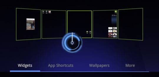
If you’ve never customized the way your home screens look, you’re in for a treat. Where apps such as ADW Launcher EX are used for home screen replacement now, on Honeycomb that sort of functionality will be built in. Honeycomb allows you to have five customizable home screens (that means each screen can be whatever you want it to be, where home screen replacements now only do universal changes.) Each of these five screens can have widgets and apps as normal, but also a dedicated visual layout mode, wallpapers, and more.
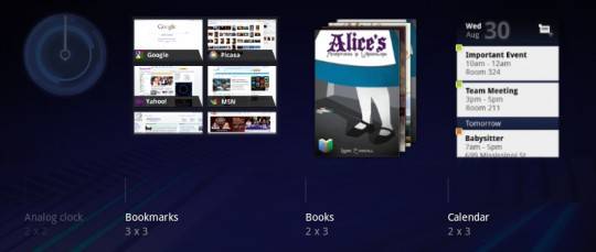
Lots of shadows and subtle visual cues help improve visibility while layouts of both app shortcuts and widgets are being arranged. Each individual screen also offers access to your launcher (with all of your apps) as well as a search box for universal searching of apps, media files, web, contacts, and more.
Recent Apps
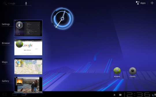
A feature everyone in the world uses 100 times a day, recent applications, is available here now to help you rock and roll with speed to the apps you use most. This feature is in place to help you multitask by rapidly finding the app you need by showing you a snapshot of the actual state the app was in the last time you used it. How helpful! This feature can be found in the System Bar.
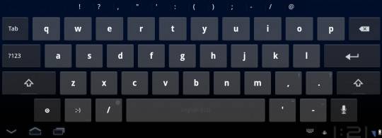
Keyboard
Of course you know the keyboard would be enhanced for this larger world – each key has been reshaped and repositioned for what the folks at Android have found to be the optimal location location and tapability, for speed, for accuracy. Furthermore, new keys have been added such as TAB to make your keyboard experience a totally awesome one. This new keyboard works together with the System Bar, the bar having touch-hold buttons that bring up menus of special characters and switch text/voice input modes.

Text Selection / Copy Paste
Not entirely new, but improved is the ability to select, copy, and paste text. Just press hold in an area you plan on copying and two selection arrows will appear. Adjust the location of these arrows, seeing the text highlight as you do so. Once you’ve got what you want selected, the Action Bar will allow you to copy, share, paste, or search with what you’ve copied (or of course paste over what you’ve copied.)
Connectivity
You’ve got a new set of options as far as connecting with Honeycomb. Connecting to Media/Photo Transfer Protocol will allow you to sync your media files with a USB-connected camera or desktop computer without the need to mount a USB mass-storage device. Someday we’ll be able to do away with cords altogether, but not this update, so says Android.
This new set of connectivity features also works with full keyboards, allowing you to connect one via USB or Bluetooth, should you have a keyboard that does such a thing. As far as Wifi goes, there’s a brand new combo scan which reduces the time you’ll be waiting to scan across bands and filters. Then there’s improved Bluetooth tethering offering you connections to more types of devices than ever before.
Standard Apps
Amongst the standard apps improved for this larger tablet environment are Browser, Camera, Gallery, Contacts, and Email.
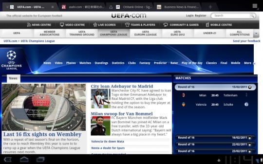
Browser
Tabbing is now implemented on this standard browser, an excellent addition considering the fact that pressure has been put on Android to do such a thing for several cycles now. Also included is “incognito mode” which will allow you to browse the internet without the places your going being added to your browser history. History and bookmarks are now both presented and managed from a single page, making it easier to work with both.
Google is put at the forefront of your browsing experience with an easy sync with your Google Chrome bookmarks and an automatic sign-in for Google sites with a supplied account. Multitouch support is updated for working with JavaScript and plugins, and users will have a nicer time browsing websites not optimized for non-desktop use with improved zoom and viewports, overflow scrolling, and support for fixed positioning.
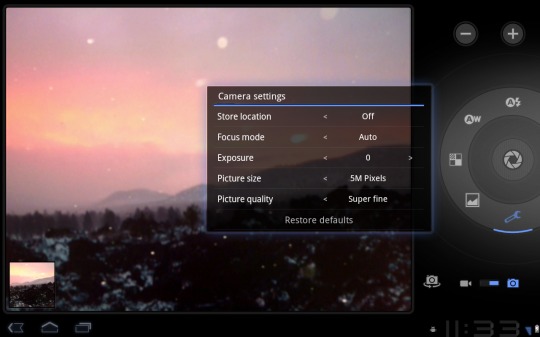
Camera / Gallery
The camera has been reworked for a larger screen, offering quicker access to features such as zoom, front-facing camera, focus and flash, and more. Gallery has been similarly reworked for larger screens, with a very similar look other than a slightly optimized interface.
Contacts
The app you use for collecting and viewing your contacts now works with a two-panel user interface. You’ll quickly scroll back and forth, up and down between contacts, easily organizing and creating them as usual. Improved formatting allows for international phone numbers and more user types based on country, international number, and etc. Contacts are now presented in cards making it a more familiar place to browse colleagues, friends, and family.
Wrap-Up
This is only the beginning. We can’t stress this enough. In a couple days we’ll be at the Honeycomb special event in California and we’ll be able to give you a much more full account of what’s going on this this new version of the Android OS. The stuff you see above is just the basics, just the preview. It’s going to be a whole lot bigger than this.
Also, take a peek at our post on the rest of the new features in Android 3.0 Honeycomb from the Developer side of the equation. Gain a deeper understanding of what you’re looking at from the outside by having a peek from the inside.


@androids and @slashgear teams will be onsite next week to cover Google’s Honeycomb press event! Make sure to post your questions or requests of what you want us to demo.
Android Honeycomb Event Announced by Google
http://androidcommunity.com/android-honeycomb-event-announced-by-google-20110128/
we’re gonna be on Honeycomb like we’re Pooh Bear
awesome! can’t wait for the android event!
yep, we’ll be all over it.
is it only landscape or can we use it on portrait mode as well. So far all the videos and pics i’ve seen are in landscape mode only. fishy!!!
is it only landscape or can we use it on portrait mode as well. So far all the videos and pics i’ve seen are in landscape mode only. fishy!!!
I believe both landscape and portrait
it’s gotta be both. one way only would be absurd
I just bought an ASUS EEPAD with Android 3 in it and I must say it was the worst decision I have ever made regrading a new computer. There is no description whatsoever on how to get things done with this operating system. It is nothing like a Windows or OSX type operating system. That is in itself would not be a problem, except without any description it makes it almost impossible to use this machine. For example I prefer to use Firefox browser. I successfully downloaded it to the EEpad, but it does not install, and crashes the machine all the time. I have no idea how to remove this from the machine. The Android 3 should not have been released without an user manual that tells the windows savvy user how to accomplish a task in this very different environment. Is there no-one at Google who can think the way customers think?
use dolphin hd browser i prefer firefox but find this a much more suitable alternative
I totally agree –the Instruction manual names the parts of the tablet and dock and nothing else.
I have searched for a comprehensive Eee manual to no avail.
After hours of searching I came to the conclusion that Asus expects all purchasers of their Pad to be cognizant with the Android OS.
I have a friend who laughed when I told him I bought this Asus Eee Pad –he then went on to show me how simple it was to work on his iPad2. What a bloody fool I was!!!!
I have spent about 3 days with my new Xoom. Nice piece of hardware, but I will probably use my Acer netbook more as I find Android a royal pain. The screen on my Xoom is actually slightly larger than my netbook, yet so much stuff is configured for a cellphone. I want to see normal browsers, normal web pages, an actual directory of files and programs, etc. Android is so non-intuitive and non-computer like it’s ridiculous. This may be Google’s view of the future, but it is not mine.
Manual? Really just advertising..! No detail on how to actually use the system..!
can’t believe an o/s has been designed that makes it so hard to perform a simple task like deleting a file…looks good…..really isn’t
can’t believe an o/s has been designed that makes it so hard to perform a simple task like deleting a file…looks good…..really isn’t