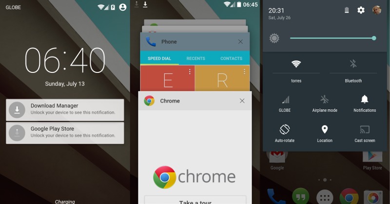
It’s been a little more than a month since Google let the cat out of the bag and gave out the developer preview of Android L for developers to test and curious but daring onlookers to try. While the preview wasn’t made for end users to enjoy, it does bare a few markings of what awaits us in the next Android release. So what have we liked so far and what do we hope Google will get to fix before that expected day?
5 Things We Loved
1. Battery Life. The improvements that Project Volta brought is nothing to belittle. On a dosage of mobile data, browsing, and multimedia, the battery lasted longer than a day on the same amount of use when using KitKat. Crossing our fingers that Google has already been working on even making it better by the time Android L rolls out.
2. Do Not Disturb. A much needed feature that adds a bit of smartness to our notifications, now finally built into Android itself. It’s quite basic but for majority of the cases, basic is more than enough. No more need to be jealous of similar OEM features or custom ROMs.
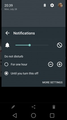
3. Search in Settings. Yet another OEM idea that has thankfully made its way to the core Android experience. Granted, a vanilla Android on the Nexus doesn’t have much settings to wade through, but it’s still a lifesaver if you don’t know the exact path to a particular seldom tweaked option. The one caveat, it currently doesn’t work well, sometimes not finding settings you already know do exist.
4. Material Design. Beauty is in the eye of the beholder, but at least in our eyes, Material Design is refreshingly beautiful. As a design language and guiding principle, it seems to be much more consistent and well-thought. The only problem, at least in this developer preview, is that it isn’t yet applied consistently to Android’s core. We expect things to be more seamless later this year.
5. ART. The new Android Runtime. Perhaps it is only subjective, but apps do start faster, run smoother, take up less space. They do install slower though. Most of the promised benefits, and drawbacks of ART. The true litmus test will be when everyone jumps into the pool, whether they like it or not, and there are times when they won’t.
5 Things We Did not Love
1. ART. Yes, ART appears twice. This is more of a growing pains issue and not entirely Google’s fault. App developers will have to work double time to make sure their wares will work once Android L is released, otherwise expect a less than painless transition, with crashes or incompatible apps. Plus the ever looming threat of non-working root apps and methods make us await this new feature with a bit of anxiety.
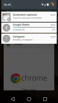
2. Still no “Clear All” button. It’s 2014 and Google still won’t give us a convenient way to banish all notifications or clear the recent apps list. Perhaps it is a bit more debatable on the Recents view, but in this day and age where users get notifications left and right throughout the day, it boggles the mind why such a feature does not exist by default.
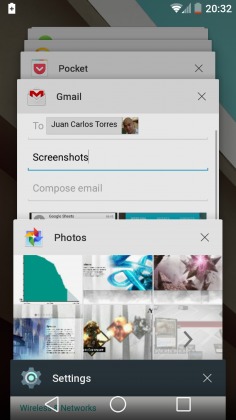
3. Recents redesign. No doubt it is pretty, but is it the most efficient way to present these recent apps? The app thumbnails take up majority of the screen, instead of being herded to one side in a line, but as far as practical information density goes, nothing has changed. You practically really see only three, at most four, of those most current apps, and can only swipe away those. Perhaps a more compressed tickler visualization would be better. But, still, it really looks nice.
4. Still no battery percentage in status bar. Maybe it’s considered a power user feature, but is it really? Considering how small the battery indicator is, it is not so easy to determine from a quick glance really how much battery is left. And since that sometimes crucial information takes a few taps to reach, it is quite strange that it wouldn’t be there to greet you, optionally at least if not by default. Not even in the expanded notification panel.
5. Inconsistent Material Design. Again, growing pains. Or to be exact, half-baked pains. The Android L Preview wasn’t really meant for end users anyway, so it’s not surprising that even core pieces of the Android UI don’t adhere to it yet. It should, however, not be an excuse for app developers not to ensure that their apps will be Materialized when the time comes.
Ready to Jump to L?
Nothing in these two lists are set in stone and things are bound to change, hopefully for the better, by the time Android L, whose real name still remains a mystery, gets released later this year. Google is undoubtedly already working on addressing many of these issues, and might finally be giving into some of the most requested features. Unfortunately, neither developers nor adventurous users will be able to taste those changes like this again, as Google might not be releasing an updated preview image anymore..
Have you tried out Android L for yourself? Is there any feature that stands out to you, either in a good way or not? Let us know your thoughts on the next major Android version in the comments below!


You understand that it is good to have an idea of what it offers and does not offer Android L, but this is no time to evaluate it, and is the first preview version; effectively where there will be many inconsistencies.
That’s exactly why it’s the Dev preview. They’re meant to keep that in mind, but a lot of people somehow overlook that.
Seems like it may be the only preview before official release.
That is true, and I’ve stated that as well. That said, it is also a “preview” that gives us hints at the direction that Android L will be heading. Of course, until the final version comes out, it is free to change directions. And in some cases, we hope it will.
And yes, this is apparently the one and only preview version. Hopefully Google will reconsider as developers might need an updated one to make sure bugs they’ve run into and reported have been squashed.
As an android developer, I tell you that your first reason not to like android L is wrong. You do nothing to extend support to ART runtime. It is a lower level feature that has to do with Google. Once ART goes official, the Google libraries that developers use will be fully compatible with it.
That may be true for most cases, but not for everything. There are currently some apps that either advertise that they are not yet compatible with ART or they just plain crash in Android L preview. They might, however, just be corner cases. Jolla Launcher Alpha explicitly says it doesn’t work with ART and won’t even install. MX Player crashes with some videos, though there could be other factors at work there as well.
That said, it is the situation with root that is probably the most worrying aspect of ART for now. But I have no doubt that the Android developer community will eventually be able to address that soon enough. It now all hinges on the final Android L release.
I think perhaps the lack of a clear all is a “safety” measure against someone hitting said button just as a new notification comes in. End result would be that the notification would poof before the user gets a chance to look at it.
Its on 4.4.4 on my Moto X so i doubt that is the case.
I tried it for two or three days, and even though I quite enjoyed it overall, the camera app was too buggy (veeery slow HDR capture) for me to keep using it on my Nexus 5 indefinitely (I use the camera too often). It would be great if they released a second preview image fixing some of these bugs.
Kit Kat has a clear all button in the notification shade, are you sure there isn’t one in L?
eh he did show a screenshot and it wasn’t there. Are you sure kitkat had it? Was it an OEM added feature or available on stock Nexus devices?
It’s on my stock Galaxy Nexus. It could just be exclusive to the AOSP ROM I’m running I suppose, but it’s the Shiny ROM, which aims to match OTA and the dev rarely puts in anything that isn’t in stock.
It’s not exclusive to your rom, it was build in by Google. It used to be a little “x” in the corner and then either in the move from 4.0 to 4.1, or from 4.1 to 4.2 it was changed to the three lines that like like stairs.
Of course stock Android has a dismiss all button AS soon as there are more than one notification in the drop down menu. Pretty sure it has been there at least since Jelly Bean
Yes, KitKat does have a clear all button for Notifications, which is why it is a bit puzzling why it isn’t there in Android L. Hopefully it will be added back later.
However, neither KitKat nor L has a clear all for the Recents view.
The battery life is keeping me on L. Before it, my N5 could barely make it through a day even with charging top-ups. Now it makes it just fine.
The GPS dropouts under clear blue skies I could live without.
But this is also a PREVIEW! None of this is to be taken as final. The inconsistent Material design I’m sure will be fixed. Art is also not done yet, so we’ll have to see how it evolves.
And now the upgrade lottery begins place your bets on which phones and tablets will be upgraded. Which Sammy LG HTC and moto phones will survive the L cut. My apologies to the companies I left out.
Clear All Button has already been acknowledged by Google to be a mistake in the Preview that will be corrected by the final release
Yeah it definitely felt like that. And glad to hear that it’s confirmed. Now the only problem left is waiting for the final release since Google might not roll out a new dev preview.
Thanks for the heads up!
Samsung has the clear all button and battery percentage ever since.
Ever since I’ve had my Htc One M8, I’ve used the ART Runtime, and everything has appeared to run fine, and faster too. Even after a few master resets, in which you have to reboot back to ART each timd(one reset to re-customize my phone, another from an accidental failed encryption, and yet another to reset security certificates), . When I bought a gold version, it too ran with ART. I had 250-380 apps at any one time.
Great to hear that. So absolutely no problems with any apps? By any chance do you use MX Player? On Android L it consistently crashes on me with some videos but not on others. Hopefully it’s not because of ART.
I haven’t, but I’d be willing to download it and give it a shot.
I can’t wait to dump touchwiz on my att now 3. Already rooted and waiting.
I have a Note 3 as well and have been using Samsung devices for quite some time now. I wasn’t really bothered by TouchWiz before, but after this, I’m hoping like hell that Samsung won’t mess with Android L too much. Not likely though.
Thanks for the tip! Yes, there are many apps like this and fortunately some like this don’t require root. I still wonder about Google’s reasons for not offering the option in the first place.
Android L should be called Android Look after a somewhat obscure but tasty candy bar.
i definitely noticed that apps would open up quicker