With today’s update to Google+, there are some new features that count on how you interact to gain your affection. Stories wants to bring you a kind-of “autoawesome” movie of your pics, while Motion and Mix hope to make you GIF-y. It’s a bit more of the same from Google+, and along with their UI tweak, could signal additional changes afoot.
The Stories feature is neat, wherein Google takes a series of photos — like those you’d snap on vacation — and makes a slideshow/movie from them. Their Google+ feed is ripe with example of why this is a good thing, and how unique a feature it is. That’s a clever way to get you to keep your digital snaps with them, and makes it more convenient to share them with friends and family. Motion and Mix simply aim to make GIFs of your photos, which is a social media dream come true.
Larger photo galleries get support as well, whereas many of those with big archives still relied on other services. Chopping it all up, Google+ seems to want you traveling, snapping pics, and storing them with Google. That’s nothing new, and the added features, while clever, are almost expected.
Then you see the new UI.
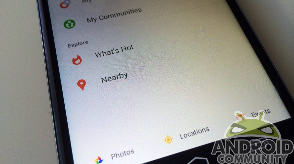
The slide-out menu, of which Google+ was among the first Google apps to get the UI feature, is gone. Taking it’s place is a — wait for it — drop-down menu. Yes, the very thing Google wants to see less of is now the only way to get around using Google+. Not only that, it comes to you via a sub-header bar that sits just under the striking red header pane — so you also have less screen real estate when browsing.
The new menu isn’t much different from the old in terms of content, but for a service so hell-bent on making sure your photos are gorgeous, they’ve given them a diminished spot in the new menu. At the very bottom of the menu sits photos, locations, and events. Prominently displayed are your circles, What’s Hot, and Nearby.

Google wants your photos, and they want to make them great, but they’re not too keen on you finding them. Sharing them is still pretty easy via the pencil floating around (which takes away from screen real estate, too), but actually getting to them from within the app isn’t straightforward for a service dedicated to making your pics better than you could possibly take them.
Does this suggest Google is readying a split? Are they taking Locations, Photos, and Events away from Google+, and putting them elsewhere? Photos is already a standalone app, and Locations could go right back to being just a Maps feature. Events, well, those are among the more annoying Google+ features anyway, and should probably just be housed in Calendar.
I’m not saying Google is decommissioning Plus. I am saying these moves don’t strike a cohesive balance, and don’t suggest a strong path forward. Rumors of Google+ teams splitting from the service abound, but there’s no official word on any of that — even if it is true. When an update hits, it’s really work from months ago, so consider that moving forward with regard to teams leaving and the service “dying”. This update seems to be a fork in the road, giving way to the next update deciding the fate of Plus more than any before it.


What initially drew me to Google was how it reminded me of graduate school, lots of ideas and innovation from many facets. What has been driving me away from Google is its ending of valuable services, Google’s disconnect from its users, and what I now see as a lack of direction. Like in graduate school, it’s time to turn in the goddamn thesis and either pursue a PhD or get a real job! Google, either shit or get off the pot.
Nate, the drop down header disappears when you’re browsing down so it doesn’t take any more realestate. In fact it makes the entire thing completely full screen with nothing blocking it. Then when you scroll back up (even just a little) the header comes back into view.
Maybe it would have been a good idea to actually _use_ the App before writing about it?
“Not only that, it comes to you via a sub-header bar that sits just under the striking red header pane — so you also have less screen real estate when browsing.”
However you feel about the sub-header, that statement is simply untrue. It automatically gets out of the way the very moment you start scrolling down the stream, leaving you with exactly as much screen real estate for “browsing” as the previous version of the App.
I actually enjoy reading strong opinions, but they should be grounded in reality…
It’s fine for Google to offer these new features. Now if they had a way to disable/uninstall any Google app. They are taking away our choices.
This seems like the halfway point between this and Android 4.4.3
This is how the stream looks once you start scrolling down.
As you can see, everything goes away – including the Action Bar (the thing that’s now coloured red) and the pencil icon.
The Action Bar never went away when scrolling in the previous version.
-> With the update, you have MORE screen real estate for actual content than before.
It would be impossible not to notice that if you had actually scrolled down the stream just a tiny bit.
There is only one logical conclusion: You wrote all that without ever actually using the App.
Shame!
Forgot to include the link to the screenshot: http://m.imgur.com/2etHy0b
It will be interesting to see what happens. The Locations feature was better in Maps. With it and Google+ (obviously) being Google products, I’m sure locations could be pulled in to G+ from Maps. When it absorbed into G+, my contacts didn’t so that became useless and other apps filled the void.