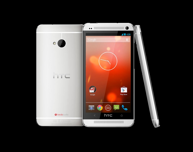
Those who are fans of the Nexus line and the HTC One received some good news earlier this morning. Just in case you missed it, Google and HTC announced a Google Edition One. The handset will be similar to the Google Edition GALAXY S 4 in that it will be sporting the same looks as the regular carrier model, but that it will be running a vanilla Android installation.
With that in mind, lets follow along with the title of the post and take a look at what the Google Edition HTC One will give and what it will take away. We are also a bit curious to see how many people will be willing to make a purchase given the price ($599). But first, lets discuss what the handset will give.
Updates
The Google Edition One will launch with Android 4.2.2 and similar to the other Nexus devices, this handset will receive prompt updates. Aside from the bit about the Google Edition One not having any carrier installed bloatware, the prompt updates will likely be a big perk for most, if not all of those who make a purchase.
This is where the other side comes into play though. As the Google Edition One is running a vanilla Android 4.2.2 installation — it will not have all of the same features as the model with Sense. Without mentioning every single feature tied to Sense, some of the highlights here include Zoe and BlinkFeed. There are also some points worth mentioning when it comes to Beats Audio, the UltraPixel camera and a question dealing with the IR blaster.
Camera
HTC has confirmed that some of the Sense camera features will not be included. The items that will be missing from the Google Edition One include Zoe, Highlights and the living gallery. In fact, the Sense camera UX will be missing. On the flip side, those purchasing this handset will find the regular Android camera setup which means goodies such as Photo Sphere.
Looking back to the earlier statement from HTC and it was said the Google Edition One will have the “low-light capabilities of the UltraPixel camera.” Basically, this sounds like it means the handset will have the same stock Android camera experience, but that it will have low-light performance that is above what a regular Nexus handset will have.
BlinkFeed and Beats Audio
As far as BlinkFeed goes there isn’t much to say other than given this is built deep within Sense — it will not be on the Google Edition. The handset will retain the Beats Audio support (and branding on the backside), however there will be one key difference in that users will not have the Beats visual indicator in the status bar. On the flip side, the handset will arrive sporting the same dual front-facing stereo speakers.
IR Blaster
Another item worth mentioning is the IR blaster. In the case of the HTC One, this handset has a blaster as well as a receiver which means that it can send codes and also learn codes. The point here, HTC has some integration and in fact, the power button on the top of the One is where the sensor can be found. As the hardware remains the same the IR functionality will still be available. The one catch is that users will have to head into the Play Store and grab one of the available apps.
Button Configuration
The final point mentioning here deals with the button configuration. Again, the hardware is the same which means the buttons will all be the same. In fact, with this the functionality will remain the same in that a short press of the Home button will bring you Home while a long press will launch Google Now. Additionally, a double-tap will take you to your Recent Apps. This one should go without saying, but the Back button will still take you back.


What about CDMA versions? I’m on Ting (MVNO on Sprint) and I really don’t want to switch providers. Google really isn’t showing the CDMA love… what gives?
CDMA needs to die..
That’s because CDMA technology is dead. Only a fool would invest in them further.
I wish it had a MicroSD card slot like the Chinese and Japanese version.
If only it had on screen keys.
why would you want to lose screen real estate and why would Google confuse users with two operating rows?
16:10 aspect ratio is ideal for 90% of phone usage scenarios and for the 10% where 16:9 is better, those keys hide. If you’re confused by 2 rows of keys on a phone, you’re probably better off on an iPhone.
Not really though,