Watching Google I/O from a distance and much of the focus seems to be on the keynote and the freebies that are given to attendees. While it is easy to be a bit jealous of those receiving a free Chromebook Pixel, there are other reasons to be jealous. For one, Google I/O also has these sessions called fireside chats. The nice part about these, the topics are focused and given by those who are regularly working with that particular item, whether it be hardware of software.
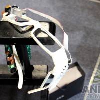
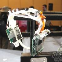
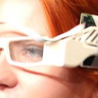
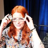
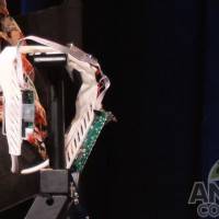
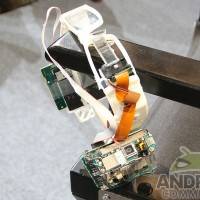
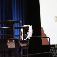
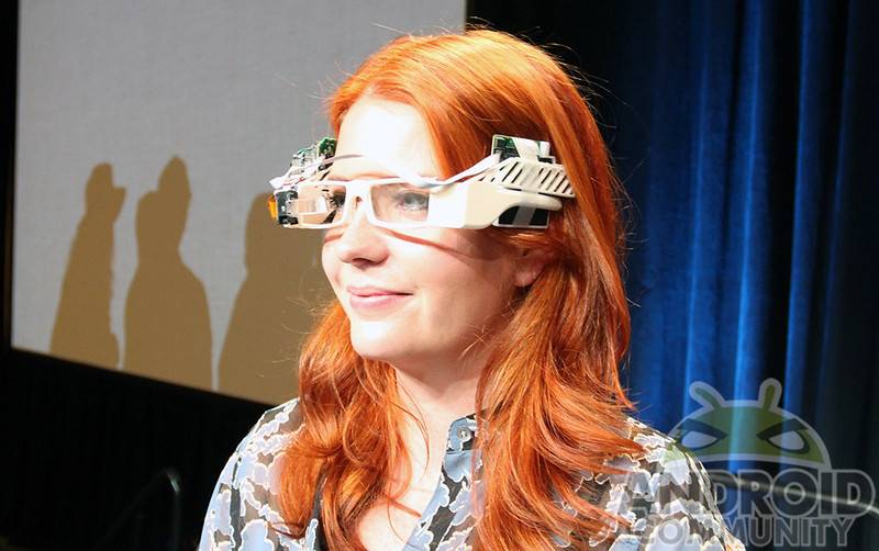
In this case the fireside chat was dealing with Google Glass and thanks to lead industrial designer Isabelle Olsson, we spent a bit of time looking at an original prototype. And for those who think the current iteration of Google Glass looks dorky, you should be thankful for the current design. As you can see from the images here in this post, this prototype was certainly not what one would consider to be stylish.
Of course, to be clear, these were just a prototype and Olsson did make it clear that they were just the beginning. The prototype was built on a full set of white frames which were completed with exposed wiring, some boards and even a bit of tape to hold them together. Using these as a starting point, Olsson spoke about how they went from the prototype to where they are at this point in time, noting that they took a “reductionist approach.”
“We removed everything that wasn’t absolutely essential. And then in addition to that, I formed three principals to guide the team through this ambitious, messy process.”
Those three principals were lightness, simplicity and scalability. Touching on the simplicity aspect, Olsson had mentioned that when she joined the project, they thought they needed 50 different adjustment mechanisms. Of course, as was pointed out, that certainly does not make for a good user experience and was later reduced to one.
The interesting part here, while the prototype looks very different as compared to the Google Glass we know now, the functionality is very much the same. Anyway, you can get a good look at the prototype in the images throughout this post. There is also a decent look offered in the video sitting above. Of course, prototypes aside, it is nice that we are beginning to see additional Google Glass apps come available.


