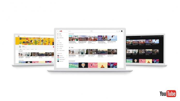
When you go to YouTube to watch videos, you probably don’t care about all the other things that are around except for the video you’re actually watching. Sometimes some of the elements are particularly distracting and not even helpful for when you’re browsing for your next video. So now it looks like finally Google wants to simplify things for you as they’re releasing a preview of the new look and feel of the video sharing network. If you’re not part of the randomly selected testers, you can still try it out at youtube.com/new.
It’s actually strange that YouTube is only now applying most of the aspects of Material Design since we’ve had this design sensibility for a couple of years already. But better late than never yes? The new design focuses on simplicity and so the visuals that distract us from browsing or watching are finally gone. The content itself is the main focus. The design is also aligned across all Google platforms, whether you’re on your browser or on your Android smartphone.
They are also using a new and supposedly faster framework called Polymer which will allow them to quickly develop more features in the future. One of the new things that Polymer brings is the new Dark Theme which will turn your background black, in case you are bothered with all that white space that comes with the simplification of the design.
So if this new design doesn’t automatically come out for you, you can manually try it out by going to youtube.com/new. You are of course encouraged to give your feedback that is why it is still in a preview version.
SOURCE: YouTube


