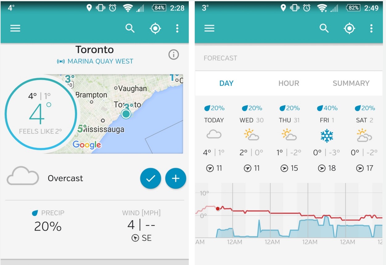
When it comes to weather apps, we mostly just rely on the built-in weather app of our devices. However, if you want something prettier and more comprehensive than just finding out if it will rain or not and what the temperature is out there, you have a few choices on the Google Play Store. One of the more popular ones is Weather Underground, and now the app has brought it in a visual overhaul with its latest update, including applying the Material Design guidelines.
It is the weather app of choice because of its fairly comprehensive features, which includes current conditions from your local weather station (temperature, wind speed/direction, humidity, dew point, visibility), as well as hourly and daily 10-day forecasts. It even has interactive maps, crowd sourcing, customizable widgets and push notifications, among other things. With version 5.0, the app has undergone extensive remodeling, which includes following the less cluttered look of the Material Design.
Aside from the new look and feel of the app, you also can now view more than just one weather station per city, and in fact, you have access to any of the 140,000+ stations all over the world. They’ve also added a hurricane tile for when you know that something is coming near you or near your loved ones. The update also brings a new tile that reports on weather factors that can directly affect your health, like air quality, UV risk, local flu outbreaks, etc.
If you don’t have Weather Underground yet, you can download it from the Google Play Store for free, with in-app purchases available. If you already have it, don’t forget to update it so it’s like you have a brand new app.


I don’t like the updated app at all. It’s optically pretty, but annoying at the same time. The old version was better. The acid test is, how often do I use the app? I’ve noticed I now use it nowhere near as often as the old version, maybe 1/10 as much, and I’ve even noticed that I *avoid* using it. I’ll probably end up uninstalling it and using someone else’s weather app.
I was interested to read that the redesign was based on Google’s “Material Design” guidelines. I actually find a lot of interfaces designed by Google to be exceedingly frustrating, and I tend to avoid them as much as possible. For really, really simple stuff they’re OK, but as soon as you have an app or webpage that’s used for something more complex or detailed, Google design principles do more to get in the way than to help me get anything done.
The appeal of Weather Underground is that it targets weather geeks who want something a bit more involved than your typical, dumbed down weather info. That right there is the problem: Google’s design principles aren’t really compatible with anything that isn’t dumbed down.