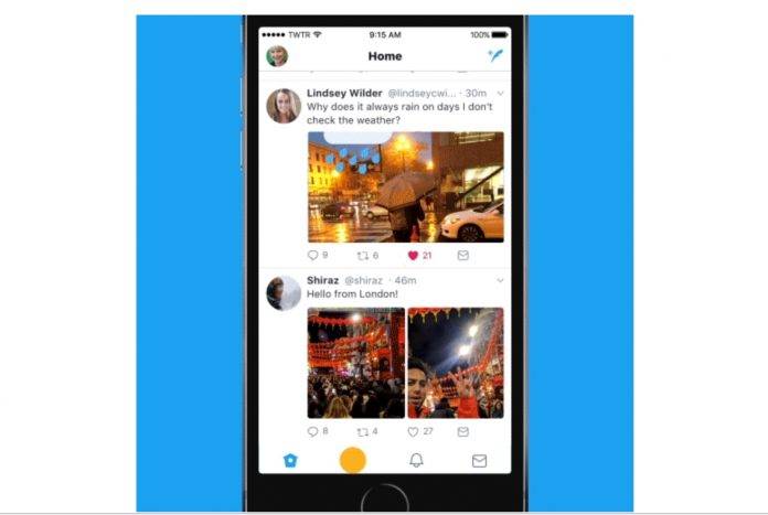
How do we solve a problem like Twitter? The micro-blogging network, previously seen as a social media superpower, has been losing luster the past few years, and has failed to monetize on their brand, leaving investors unhappy. They’ve been trying out a lot of new things lately, but now for their latest update, they are rolling out their new look and a few UI changes. We’re not sure if this refresh will affect their stocks or if it will draw more users, but a new sometimes feels like you get a new app (whether that’s a good or bad thing, it’s up to you.)
The most noticeable change is something that most Android users have already been experiencing for some time now, but has now rolled out to other platforms and to all users as well. Your side navigation menu has all that you probably need (profile, settings, privacy, additional accounts) so that there’s less clutter and fewer tabs at the bottom.
You will also notice that Twitter now has rounded profile photos, bolder headlines, and more consistent typography so it should look better. Even the icons are now more intuitive, like the reply button is now a speech bubble. The icons are now also lighter “for more seamless interaction”. You can also now see the reply, retweet, and like counts as they happen, except if you’re on twitter.com and Twitter Lite.
The update to the Twitter app (and some for the web version as well) is rolling out to Twitter for Android, TweetDeck, and Twitter Lite. But if you don’t see it yet, the rollout will be coming in the next days or even weeks.


SOURCE: Twitter


