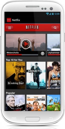
We heard word a few days ago that Netflix would be bringing a new tablet-like user interface to its Android app, and it looks like that’s officially a go. Netflix detailed the new interface on their blog, mentioning that the new UI borrows heavily off of their tablet UI that they released last year.
The new user interface squeezes in more movies and TV shows onto your screen and fits them into a nice scrolling UI, while still providing personalized suggestions towards the bottom. Your recently-watched content now shows up at the top of the list, while your Instant Queue is shown on the home screen just under the Top 10 list.
The browse menu provides you with a list of genre galleries that show tons of titles organized into categories. There’s even a family and kids gallery with movies and TV shows categorized by age. A single finger tap on a title brings up relevant information, while a double-tap actually starts playback of the show. You can also utilize the search function anywhere in the app.
To be honest, we’re really excited that Netflix brought over their tablet UI to Android smartphones. It’s been a long-time coming, since Android phone users were forced to deal with the old user interface for a while. We simply cannot do without our streaming shows and movies, so this update was a welcomed one.
[via SlashGear]


