


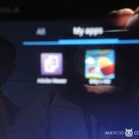
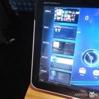
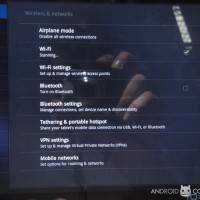
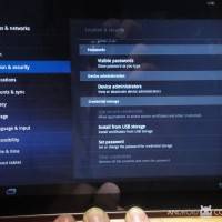
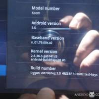
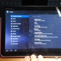
We’re at Mobile World Congress 2011 at the Motorola presentation and we’ve been given a very basic rundown of some of the features you’ll see with the out-of-box build of Motorola XOOM’s user interface. This tablet is of course the one Google worked most closely with as far as Android 3.0 Honeycomb goes, so what you see will for the most part be the most pure version of everything Honeycomb has to offer. NOTE: the tablet this presenter is showing us has clearly been on display for a couple of days, as the screens are filled with videos, widgets, and a ton of instances of the same Honeycomb clock. Very messy!
The interesting thing about the clock being in several places is how it IS there several times, and on one screen. In the video you’ll hear me ask if multiple instances of a single app widget are allowed on the same page – she says yes.
[vms 20cd0fe646d38bc2145c]
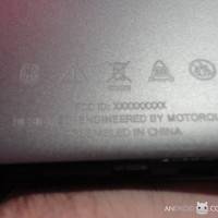
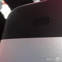
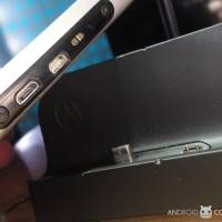
The other thing that’s interesting is of course the silver metal case, a version of this tablet we’ve not yet seen in the USA. Very lovely – definitely’d be out choice if we’d have to choose. What a boggling experience that’d be. Have a look below and above at the lovely batch of photos we’ve shot, and once we get these internets to go faster than a snail’s pace, we’ll have the presentation video for you here too.


SWEEEEEEEETTTTTTTTT
Can not wait for the Video. Man I WISH this would just come out.