One of the coolest things about the Moto 360 smartwatch is that it has a round face. Most all of the other devices on the market have square or rectangular designs making the round face of the Moto 360 a selling point.
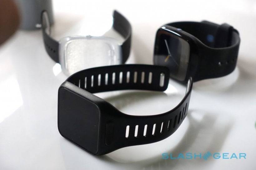
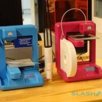
That round face also makes the Moto 360 more like a traditional jewelry watch. However, that round design wasn’t the first that Motorola tried for its wearable, it originally built several prototypes that all had a traditional square design. The square prototype of the smartwatch was unveiled when sister site SlashGear went on a tour of the Motorola design team facilities.
According to the design team, the square screen smartwatches worked perfectly, but they were deemed too much like a gadget, and not enough like a mainstream jewelry watch. Moto designers feared that the traditional square smartwatch design would relegate the Moto product to niche status.
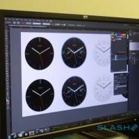
Once the round face was chosen, several designs were tested including one that had external lugs for the band, which is typical of watch designs. The choice to go with internal lugs for the band made the watch fit better on smaller wrists. Be sure and check out the photo gallery for more images from behind the behind the scenes tour of the design factory. Be sure to check out our coverage of the Moto 360 and its Android Wear OS.
SOURCE: SlashGear










omg a square watch… clearly Moto is copying Apple /sarcasm
Moto had a square watch before smartwatches were cool. Motoactv.