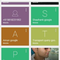
Leaked screenshots purportedly show the new Android dialer, which is expected to become available in version 4.4.3. If the shots are really from the new dialer app, it seems we’re getting away from the slightly clumsy interface we have now. Rather than a mix of tiles, banners, and list tems, we’ll now see a lot of colorful tiles.
The cards on display are a mix of bright colors, flat in design. Much like we see with Gmail, if there is no contact picture, the first letter of the contact’s first name is displayed front, center, and big. If a picture is available, the dialer shows it, though it looks as though it may be a zoomed image. What type of number is being displayed is listed just under the contact name.
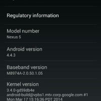
The accompanying screen shot shows that the dialer shot came from a Nexus 5, and it looks as though the person responsible is a Googler. The contacts list a few “Google” contacts, and the Kernel version hints it’s internal.
We should also point out that the bottom bar is a bright blue, which matches a previous leak we saw. The dialer app details we saw prior to today noted a lot of blue toward the top when in a call, and that bottom bar matches the color scheme there. While the aesthetics may have changed, it doesn’t look as though the bottom action buttons have.
Source: XDA


Is the Update coming for Nexus 4