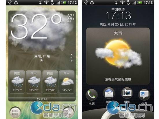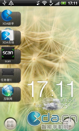
We have been hearing from a few different sources that a new HTC Sense UI 3.5 is headed to a few upcoming smartphones from HTC. One of those being the HTC Bliss we showed you again yesterday. While the leaked photos didn’t show us the new user interface, today they have leaked for your viewing pleasure and we have all the goods after the break below.
The problem with HTC Sense UI 3.5 is it had hardware requirements that came with it making a few older phones or ones not as “capable” as HTC said, be able to run the new UI. With Sense UI 3.5 those elements will all be added into a more refined experience and will be able to run on more hardware like the mid-range HTC Bliss linked to above. So far I’m liking what I’m seeing thus far, but you never know until it’s finally released what it will really look like.

If the new icon idea in the image above is the new look, I’m totally liking this. Getting rid of the ugly curved bar on bottom that launched the app tray or phone dialer seemed old and out of style in my opinion. This new icon on each side looks sharp, clean, and new. Something the Sense UI has been needing for a while. The weather widget looks a bit large and covers almost the entire screen its being used on, all the way down to those new buttons below.
Our sources did state this was a beta build of the new Sense UI 3.5, we are already liking what we’ve seen so far and can’t wait for more screenshots that should be coming shortly.
[via XDA.cn]


Is it me or does it look like two style options for the lockscreen?