Just as we have seen with previous versions of the HTC Sense user interface, screen captures for the next version have been leaking. These latest are for Sense 5, which is expected to get an official unveiling alongside the HTC M7 at Mobile World Congress. We have already seen a few images of Sense 5, however this time around, the leak comes courtesy of xda user mdeejay and brings a few additional pics.
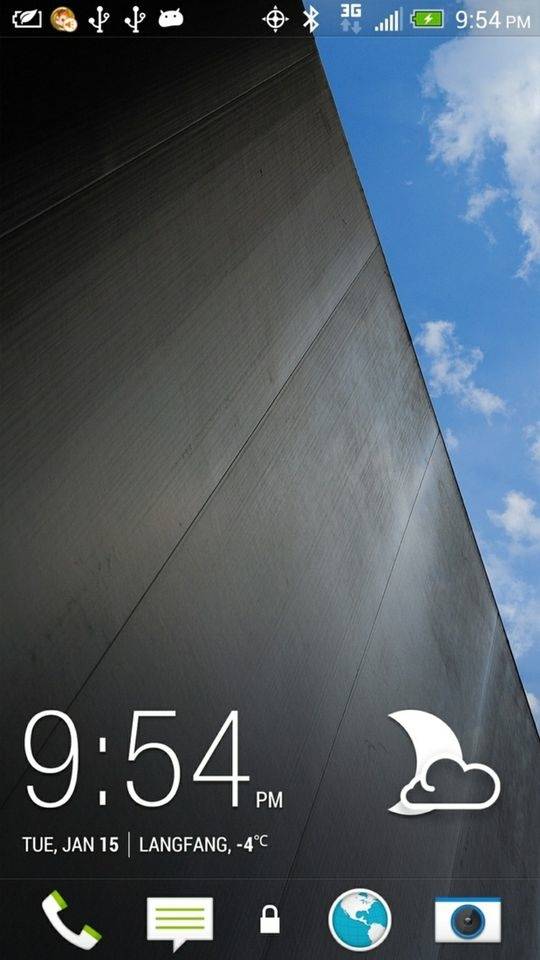
And nicely done, it looks like HTC is taking a simpler approach. Things appear to take shape right from the looks of the lock screen which appears to be sporting a much simpler clock and weather widget. You can also see the placement of four app icons with the unlock sitting directly in the middle. Without getting hands-on, we have to assume that a swipe of the lock icon will unlock things.

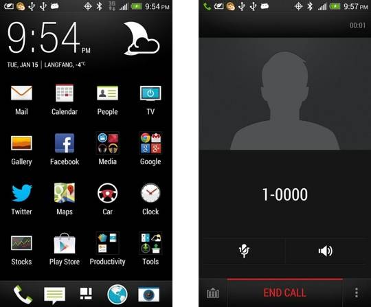
Another screen capture includes a look at the home screen, which gives us another look at the clock and weather widget. We have to say, it is nice to see HTC shift away from the giant flip-clock and weather widget that took up a good portion of the home screen leaving little room for app icons. The icons are flat, they all appear to match and look good together and the font seems to have been improved.

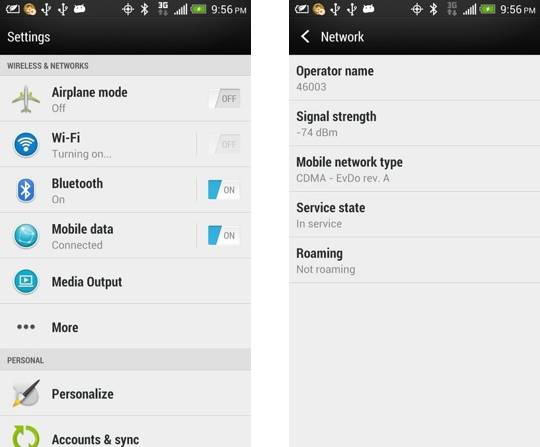
The remaining screen shots offer a look at the call screen and some settings screens. Similar to the home screen and lock screen, these both seem simpler and cleaner. Bottom line here, it looks like HTC is taking Sense 5 in a new direction style wise. Of course, while we may like what we have seen up until this point, we do have to remember that this is clearly not the entire picture. But we do expect to see that picture during MWC which takes place at the end of February.
[via SlashGear]


I never used the flip clock on my home screen, but I dont like the look of the new sense, if this is the final (or close to) final product. It looks TOO simple.
I want to see the weather animations, as I use that as my wallpaper.
Since my HTC One S upgraded to jelly bean a week ago – HTC Sense has crashed 3 times!
Not trying to be rude, but what does this have to do with the topic at hand?
I’d rather have simple and working than fancy and confusion.