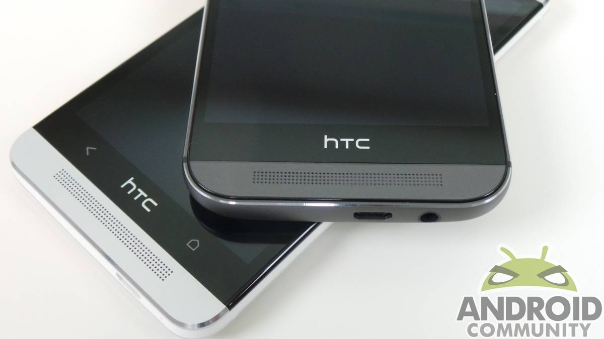
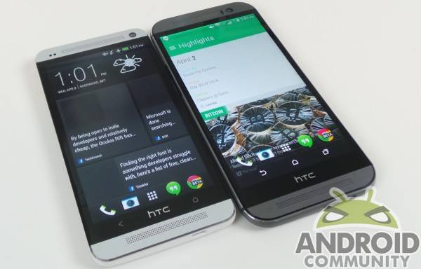
With the HTC One (M8), we got an updated version of a device that captured our minds in 2013. Though it failed to recreate the magic of the first One, the newest flagship from HTC brings in some unique changes, making us consider just whether or not it’s worth an upgrade. Though the newest is exclusive to Verizon right now, both Ones are still on offer. We’re likely to see both available with carriers for some time, so what should you do when faced with the choice? We go hands-on with both.
Software
We’re starting here because this is where the experience is different, but also the least of your concerns. HTC has committed to bring the updated Sense UI to the older One, so in a few months’ time, this will matter very little. HTC is also splitting apps from the main OS, something we saw Google do with their services.
Blinkfeed is the easiest to notice, with the updated version bringing a lot more customization. The ability to add custom sources and track certain topics is a neat upgrade, and one we really enjoy versus last years’ variety. Gestures are also recognized with the latest version of Sense, and are something we find ourselves using quite a bit. Unlocking the device with a few taps is nice, and one we liked with LG’s latest. Truth be told, we think the double-tap on the HTC One (M8) is better than on an LG device; it’s more responsive, and wakes faster.
Camera
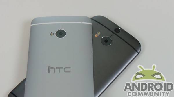
The main camera on the new One is the same as last years model. Keep in mind we’re talking about the main camera, not the camera setup, which has changed quite a bit. The newest One has a secondary rear camera to gauge depth, adding a host of editing features after you take a picture. The front camera is also upgraded to 5MP, which is great for those selfies you are taking.
When it comes to the rear camera, we’re a bit surprised it wasn’t upgraded, but we’re not so sure it needed to be. Time after time, we test devices and cameras, and the One (2013) held its own against upstarts and newer flagships alike. Which is best is always debatable, but the Ultrapixel camera on the One — either of them — is just fine.
The secondary depth-sensing camera is neat, and we’re currently testing it thoroughly. We like that it adds something not had on last year’s device, and the editing features are also pretty cool. Is it necessary, though? We’re not so sure. We won’t call it silly, but we’re not seeing a whole lot of reasons to seek it out just yet.
Hardware
By now you might be wondering what you’d really be missing getting the older version of the One. New software is coming, and the main camera is unchanged! When you get down to the hardware, though, that’s where you find the real differences.
Internally, we find the normal host of current flagship specs: 5-inch display, Snapdragon clocked at 2.6GHz, 2GB RAM, etc. The internals are an expected update, here, so really not necessarily surprising. They do, however, make the device hum nicely. It was very rare for us to notice even the slightest of lag in day-to-day use, which is a testament to the overall quality of the device.
We like the screen quite a bit better, too. It’s bright, responsive, and dense. We played games, watched videos, and generally tried to find fault with it, honestly. We can’t, really — it’s wonderful. Color reproduction is phenomenal, and it’s a true uptick from last year’s display.
Design
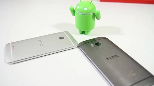
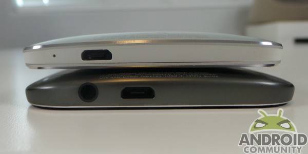
Above all else, this is our reason for preferring the new One over the old. The 2013 version brought some sharp edges on the sides, and while they don’t cut — they do nick. Many times we’ve shoved a hand into the pocket for our One and come back with marks from the edges — again, not cuts, just marks from hitting a rather sharp device. It’s one thing that makes the device stand out aesthetically, but it can make it a bit awkward in the hand.
The One (M8) solves that, as the corners and edges have been rounded nicely. In hand, it’s a joy. Comfortable and sleek, the new One is a true modern device. On several occasions, I was asked by some unwitting people if I had the new iPhone (the metal iPad looking one that’s been rumored). when they found it to be the One (M8), the disappointment quickly turned to curiosity about a very classy looking Android device.
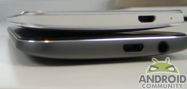
The buttons on the side also make themselves known, and are easily found with a drag of the finger around the edges. The One (2013) had very flush buttons, and if you forgot where something was, it could be difficult to find it without craning your neck around. The power button isn’t quite as steady as we’d like on this new One, but it’s easier to find — and that’s pretty great.
One thing we’re not crazy about with the new One is the huge space toward the bottom. the 2013 One had buttons there, while the One (M8) leaves it blank. We’re going to give HTC the benefit of the doubt and assume it was a choice made to accomodate internal components, but it’s still not something we like. The bezels are also as noticeable as last year, and we just think they can do better. When you look at ither device head-on, you start to notice how much real estate isn’t screen. That may be okay for an iPhone, or on last years’ One, but in 2014 we can (and do) have better.
Conclusion
When it comes to performance and in-hand feel, the One (M8) is a clear winner. While we prefer it for a variety of reasons, the older One is still a very capable handset. Verizon has the newer listed for $199 on contract, with last year’s variety at $99 with a two-year agreement. For $100, it is likely worth it to just get the newest One.
If you’re on the fence about an upgrade, or just can’t swing an extra Benjamin for a new phone, don’t fret. The One (2013) is still good, it’s just not as good as the newest — and the differences are immediately noticeable. At the end of the day, we recommend the new One, but that’s really because the design has been refined.


Good grief! I can’t believe you left out the game-changer for a LOT of people, including myself; expandable microSD card slot. Up to 128GB supported.
Other than the M8 being 20 grams heavier it’s a better phone all around.