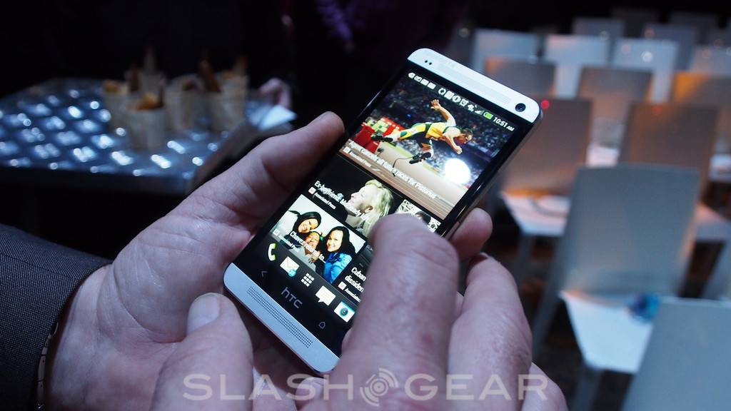
Look out, Samsung, because HTC is gunning for you in 2013. The HTC One takes a sensibly non-traditional route to success, opting out of the megapixel race for one, and instead focusing on where, the company insists, users will actually see the most benefit. That’s not to say superlatives are in short supply: an incredible 1080p 4.7-inch display, beautiful aluminum construction, and swift 1.7GHz quadcore all take their place inside the cool, crisp chassis.
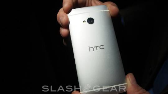
HTC has a track record of solid phones, but the One kicks it up a level. We could tell you about the incredibly time-consuming and complex production process – which starts off with a chunk of aluminum alloy HTC has specially created for its purposes, then runs it through several stages of CNC machining, pauses to inject matte-finish plastic (white for the silver One; black for the black One), and then finishes off with a final shaping to ensure both metal and plastic are perfectly aligned – but it’s how it feels in your hand that’s most memorable. HTC points out that metal has a privileged place when it comes to how we perceive value, because of the headaches inherent in refining it and the fact that it’s cold to the touch, and that weighty, premium-feel mass adds up to a handset that’s great to hold.
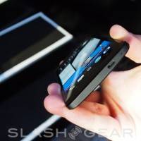
It’s also not too big, despite the 4.7-inch screen. HTC has kept the 1080p resolution from the Butterfly and DROID DNA, but the LCD panel itself is apparently brighter and sharper; it’s also more comfortable to use, and the minimal bezels – with just a little space reserved underneath for the capacitive Home and Back keys HTC insists on using – mean it’s not too great a stretch to reach across with your thumb. The precision drilling we’ve seen HTC use before makes a reappearance on the One, now punching out holes for the stereo speakers that flank the display.

HTC is particularly proud of those speakers, which have clever floating membrane drivers that automatically adjust power depending on how close to distortion the audio is. They also get roughly twice the space to work in than rival phones, thanks to extra large speaker chambers; in fact, HTC claims, they’re around 4x as loud as some other handsets. We had a chance to try the One out ahead of today’s launch, and they’re certainly powerful, with a surprising amount of bass: HTC has fitted a pair of Beats Audio amps, one for the speakers and one for the headphone socket. Yes we still have Beats!
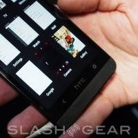
It’s tough not to be impressed when you look at the One’s display, even if you’ve spent some time with the DROID DNA. The slight reduction in size doesn’t impact usability – videos and webpages still look great, and sufficiently vast – while colors are bright and accurate and viewing angles incredibly broad. Sense 5 has been polished back to 2D iconography, ditching most of the extraneous 3D effects and layering that had come to clutter more recent iterations of the HTC UI, and the One is all the better for it.

HTC has stuck to Google’s UI guidelines, so there are pivots where tabs once were, and a healthy dose of Roboto font, most noticeably in the new BlinkFeed homescreen. Although we were dubious of that initially, it’s actually quite a good distraction during those moments of downtime: more important alerts, like messages, missed calls, new emails and the like, are still flagged up in the traditional way, in the Android notification bar, but more ephemeral things such as Twitter and Facebook content simply gets spooled in with the flow of news.
Without offline caching – HTC says it’s coming, but currently BlinkFeed auto-refreshes every couple of hours when you’re on WiFi and manually when you’re on cellular data – BlinkFeed isn’t going to help you out when you’re suddenly left offline on a plane or in an elevator; the full body of the news isn’t downloaded until you tap it, only the headline and the image. Still, the whole thing is responsive, thanks to some server-side processing on HTC’s part, and we can see ourselves flicking through a few screens of BlinkFeed content when we’ve a couple of minutes to kill. It’ll be all the more useful when other apps start feeding content into it, and when HTC gets Google+ and Google Now integration up and running. Google Now’s suggestion tiles would be particularly welcome, for instance.
Then there’s the camera. HTC is taking a big risk with 4-megapixels, betting that its “UltraPixel” explanation that more light is of greater importance than more pixels will convince would-be buyers enough to give the One a chance. We spent some extended time with the phone ahead of today’s launch and, even on non-final software, the potential for lower-light photography with the One is clear. In side-by-side conditions with some of the best-selling phones out today, the One showed how it could take shots in poorly lit rooms and still show clear detail, whereas its competitors struggled to climb out of the murk.
We’ll need more time with the One (and final software) before we can come anywhere close to a final judgement, but the principle HTC has gone with is certainly solid. In just about all of our recent smartphone reviews we’ve praised regular light performance but bemoaned the quality when things get dim – even if you’re just moving indoors – and so anything that addresses that we’re hopeful about.
Zoe may well be a harder sell, if only because explaining why people might need brief video clips along with their burst photography is going to be tough. As a gimmick, it’s eye-catching, and the effects you can do with the cluster of stills – such as picking out faces from different images and then piecing them together with everybody’s best expressions – are handy, but it’s really the sort of thing that requires an extended play to see the appeal of. Maybe we’re easily impressed, but the One’s ability to create an instant, automatic mash-up of your photo, video, and Zoe content, and re-edit it on-the-fly, complete with music, effects, and transitions, is impressive, considering it’s all being done on a smartphone. If your friends and family are anything like ours, thirty seconds of highlights from our “great weekend away!” is probably just about all they can stomach.
Less convincing is the TV app, which serves as a reasonable universal remote though lacks finesse in its first iteration. If your viewing is limited to what’s on live TV, then it works well – being able to hide channels you never look at is handy, and it certainly saves scrolling through channels or memorizing their numbers – but it ignores everything on your DVR, and you really need a MediaLink if you want to mix on-demand shows in there as well (and even with that there’s no Netflix support yet).
Nonetheless, we’re mighty excited about the HTC One overall. The phone looks great, feels great, runs fast, and has just about every feature we could demand of it, bar wireless charging (which still, we have to say, feels like a gimmick). Sense 5 finally feels like a return to original form – adding something other than just aesthetic change for its own sake – and HTC’s decision to buck the trend with the One’s camera, although making its marketing message a whole lot tougher, looks set to pay dividends where it matters: in the photos and videos it actually shoots. HTC will need to stay sharp if it wants to compete on promotion (Samsung and Apple have the big wallets there) but if ever there was a device we really wanted to see succeed, the HTC One is probably it.
[device id=4676]



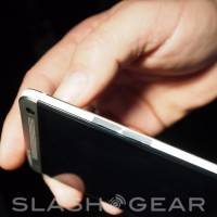


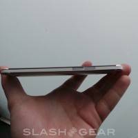

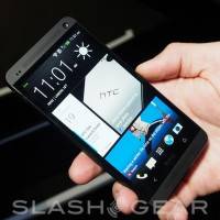
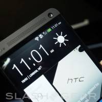
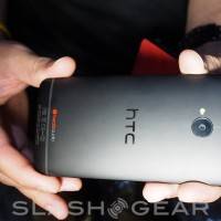
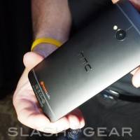
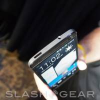


the real problem with this One is that its FRONT and its BACK look different.
Absolutely different, it’s 2 different smartphones if you see only its FRONT or only its BACK:
1) industrial minimal FRONT
2) yesterday generic and weird plastic-ish BACK
its FRONT and its BACK look so different that they are rather parts from different smartphones visually.
I DON’T like its BACK. That pillow is ugly. What HTC has done with ALUMINUM doesn’t look right.
It’s aluminum, but it’s NOT aluminum.
NO.
Wont update until octa phones come! I love my Nexus 4!
I may have just found my next phone. 3 Years of Galaxy replaced by One.
Thanks for giving us the rundown on the new HTC One, Chris! There’s a lot of features on this phone that I’m drooling over, but its BoomSound and that new screen that I want to check out. I am a huge TV and movie buff, but between working at DISH, and going out with my friends, I’m rarely home to sit on the couch in front of the TV. So, I use DISH Anywhere on my phone to stream live TV and DVR recordings to keep up with my shows; I really want to see how well this app and a few others perform on the phone.
The HTC Blinkfeed is annoying. It is just like Flipboard. According to HTC, it can not be turned off but can be moved to another home screen.
As a current HTC phone owner, I do not like Sense, My next phone will be a nexus