When T-Mobile announced the myTouch 3G, it was almost immediately welcomed warmly into the Android family. With the exception of, perhaps, the name, the myTouch 3G saw a wide adoption, as people jumped on board the Android train. And now that it’s been out for some time, and it’s seen a couple of “refreshes,” T-Mobile and HTC have seen fit to add a new model to the family. So here we are with the myTouch 3G Slide, which adds a bigger screen, a bit more bulk, and a physical keyboard. But, with all those additions, does the Slide hit the nail right on the head, or is it not enough to be a warm new welcome to the family name? Find out below.
The Body
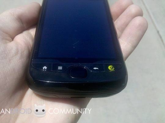
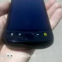
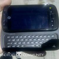
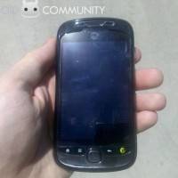
The first time you pull the myTouch 3G Slide out of the box, the first thing you’ll notice (with the battery installed), the phone is heavy. And, given the plastic aesthetic to the device, it can be quite deceiving. However, past that initial shock, the phone actually feels quite nice in the hand. The added bulk (due primarily because of the hardware keyboard) and weight go a long way to make the phone feel more reliable and sturdy. As for the general look of the device, it’s almost identical to the original myTouch: the curves, lines, and even the general feel of the device feels reminiscent in a very good way. The main differences would be the hardware keys just below the screen, and the inclusion of an optical trackpad (we’ll cover these a little later). Truth be told, the device is very pocketable.
Taking the device in your hand, you’ll notice that the Slide fits right in with other touchscreen devices: the 3.4-inch display takes up the majority of room, leaving just enough space for the earpiece and “myTouch” logo at the top, and the standard Android-based physical buttons. The screen’s resolution is 320×480, but don’t let that fool you: the colors (especially when the screen’s brightness is all the way up) are fantastic. We know that has a lot to do with the customized User Interface, and its closeness to HTC’s Sense UI, but we can’t sit here and tell you that the screen’s size or resolution are a bad thing. In fact, we enjoyed both of them a great deal, and felt that the 0.2-inch difference between the original myTouch 3G and the Slide is a great (and much needed) improvement.
Unfortunately, its these physical keys that put a big damper on the general good feeling of the Slide. They’re shoved between the screen and curved bottom edge of the device, but they’re actually flush and not raised at all, making it somewhat difficult to press them if you’re not actively paying attention. Furthermore, they have very poor feedback and travel, and they’re lack of separation from one another makes it easy to hit the wrong button in your efforts. It should also be noted that there’s actually not a Search key. Instead, T-Mobile and HTC decided to focus on the “genius” button, which we’ll cover a little later. But we will say that we found ourselves wanting the Search key back, as we didn’t use the genius key nearly as much.
As has happened with every other major handset release from HTC, the company has decided to drop their trackballs, and adopt the optical trackpad. The Slide features one of the best we’ve ever used, as its responsive, and big enough that using it isn’t a pain. However, we will say that HTC’s decision to also make it flush with the handset, and therefore make it feel just like one of the hardware buttons was a mistake. It’s very easy to hit the trackpad instead of Back or Menu, or vice versa, which causes undue stress and frustration.
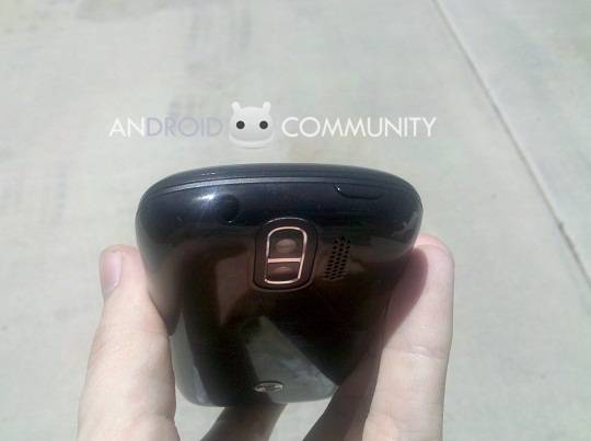
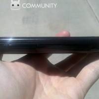
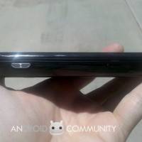
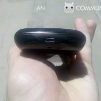
Looking at all sides of the device, you’ll find the microUSB port on the bottom. Along the left side, only the volume rocker is present. Much like the European HTC Hero, the rocker is pretty much flush with the side of the handset, making it initially hard to find. However, just like the Hero before it, we very much enjoyed this design decision, as we’re not fans of buttons sticking out of the sides of our devices. Once you learn where they are and muscle memory kicks in, it’s not a problem finding the rocker at all. Along the top-left, HTC installed the power/lock key. It is barely raised from the device, and therefore very difficult to find right off the bat. The travel and feedback are also poor, so activating it is quite the nuisance. On the top-right is the 3.5mm audio jack. And on the right side you’ll find the hardware camera button.
There is a slot for a microSD card, but it’s under the battery cover. Thankfully though, it’s not actually under the battery, so you don’t have to pull it to access the card. We would have preferred had HTC installed it on the side, but we’ll take what we can get.
Now for the main event: the slider. When we first tried it, it opened up fine. There’s a noticeable spring-assist, so there’s no problem with the slider actually opening. However, the more we used the handset, the more we realized that there’s some plastic-on-plastic grinding happening, and it just felt a little bit too plasticky, making it seem like engineering in this department wasn’t the focus. Unfortunately, in just a short amount of time, it’s not all that smooth.

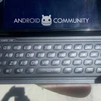
However, once you do get the device open, you’ll be greeted with an expansive, nice looking keyboard. It’s a four-row keyboard, but that doesn’t mean there’s a dedicated row for numbers. While we would have preferred this, we don’t always get what we want. However, what’s more frustrating, are the alternate keys, and how they are represented on the keyboard. Unlike every keyboard before it, where the numbers and symbols may be a different color, or smaller than the main letters on the keyboard, that’s not the case with the Slide. Instead, you’ll see keys like: R4, E3, O9. It’s not really an issue with the symbols, mostly because they’re different enough that it’d be hard to misinterpret them for a letter, but if you’re in a hurry, the keyboard can be more frustrating than anything else.
On the contrary, and maybe even the bright side, the keyboard is comfortable, well spaced, and the travel and feedback of the keys is nice. There are dedicated keys for Back and Home as well, so you don’t have to press the physical keys below the screen if the phone is open. There’s also dedicated keys for the period and comma, which we’re thankful for. We will admit that the keyboard is definitely one of the more defining features of the device, and that’s a very good thing, all things considered.
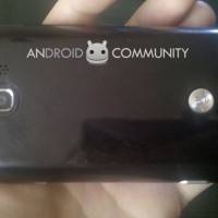
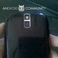
On the back of the device you’ll find the 5MP camera and LED flash. The set up is right at the top-center, so it may not be the best placement for a phone camera, as we would occasionally find that our finger would slip into the frame. However, just like anything else, once you get accustomed to its location, you won’t think twice about it. Right next to the camera and LED flash, there’s the speaker. It’s loud enough, and using calls on speakerphone went without a hitch. Near the bottom of the device you’ll find another myTouch logo, but this one’s a bit like brushed metal and slightly protruding off the cover.
When it comes to the hardware of the Slide, it’s one of the better features. While we do wish those physical keys were a bit easier to press, especially considering their integral part of the Android platform as a whole, we’ll ignore them for the rest of the device. The keyboard could have been the feature that made or broke the Slide, and we can thankfully say that if you’re in the market for a physical keyboard-based device, the Slide can easily fill that need for you.
The Software

When you turn on the Slide, you’ll find yourself wondering if HTC have indeed put HTC’s Sense User Interface (UI) onto it. Well, we can confirm with you right here and now that it isn’t. T-Mobile and HTC worked together to create an amalgamation between Sense and stock Android, and the result is something that’s different enough to be its own UI, but also familiar enough that navigating through isn’t a hassle. As for the software itself, HTC and T-Mobile thankfully made sure the Slide was updated to the latest version of Android 2.1, and we imagine that that has a lot to do with the performance of the device.
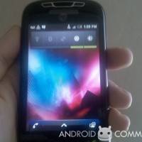
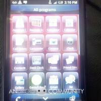
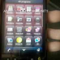
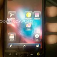
The Slide has, initially, five customizable homescreens in the standard fashion of Android. You’ll have access to live, dynamic, and static widgets, as well as the standard application icons. This is where you’ll notice the first major difference between stock Android, and even HTC’s Sense UI application icons. The ones on the Slide are actually “on” opaque squares, and not free-floating as was traditionally customary. It doesn’t actually do anything to improve touch accuracy, nor does it make the icons any easier to see. Just an aesthetic approach that we imagine HTC and T-Mobile decided on to make their handset just that much more different from the pack.
We were curious as to why there were only 5 homescreens, so we began digging. Sure enough, there is a way to change this. You’ve got two options: 5 or 7. We will warn you, though. While adding 7 screens might sound great, because you get more room to add stuff, you probably won’t want to change your mind and want to go back to 5 after you make the switch. Transitioning from 5 to 7 homescreens is fine, and will only kick you out to the myTouch logo for a moment, before you’re brought back to your homescreens with the two new additions. However, if you want to change from 7 to 5, you’ll need to do a factory reset. Yeah, a real pain, and we honestly can’t tell you why this is the case. But, you do have the option, so keep that in mind.
At the bottom of the screen, and will follow you from one homescreen to the next, is the application drawer. You can press this to access the full list of applications, both proprietary and third party, installed on your device. From here you can put those same application icons on your homescreen, or activate an application. On either side of the application drawer are two permanent icons. The one on the left is for the phone, while the one on the right is for the “Faves” application. While we were fine with the phone icon, we wished we could have switched the Faves one, as we would have preferred something like “Messaging” or “GTalk” to fit right there. But, we know this is just a personal thing, and there will be many of you out there that will like the Faves access point so handy.
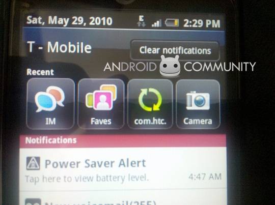
Probably the most notable difference, other than the application icons, is the fact that T-Mobile and HTC have altered the Notifications Shade. It will still show you icons for your notifications, just like any other Android-based handset, and you can still pull it down to access more information on the go. However, now installed at the top of the Shade, once you pull it down, is a list of your most recently used applications. So if you used Messaging, Peep, and Weather most recently, the appropriate icons will be listed above the notifications. We weren’t necessarily big fans of this feature, especially not when the device had its keyboard showing, and the screen was transitioned into landscape mode. Due to the “recent applications” icon list, the notifications shade is practically unusable in landscape mode.

As we said, T-Mobile and HTC worked together to create a new breed of Android, but they chose things that worked well for each application. For example, you’ll find HTC Sense widgets installed. The Messaging application has the same widget you’ll find in HTC Sense, which means it’s an active and dynamic widget. You’ll be able to scroll up and down, or “flick,” if you like, to read the last text message you received from a contact. From there you’ll be able to delete a single message, reply, or start a new text message. Other widgets include Weather, as well as the integrated Twitter client, Peep. (Which, for the record, has a blue bird instead of green. Very strange. Until you realize that most of the software has been altered to reflect “blue,” more than “green.” Even highlighted text comes up as blue.)
Another addition to the marriage between T-Mobile and HTC is the genius button we mentioned up above. While it may just seem like any other button, if you hold it down, you’ll notice that it actually serves a purpose. Powered by Dragon Dictation (which is a pretty popular app in Apple’s App Store), you are able to use your voice to do quite a few things. For instance, call a person. Or, dictate to your phone your next text message or email. While speech-to-text may not necessarily be new, we were pretty happy to see that it’s such an integral part of the device. However, we will say it again: we want our Search key back.
As for social networking, which is becoming a paramount feature with many handsets (and especially Android), you’re covered. You’ll have access to the FriendStream application and dynamic widget, which you can place on your homescreen for easy viewing. FriendStream is a quick and easy way to aggregate your feeds from Twitter and Facebook into one location, but if you’ve got a lot of updates from any one site, more so than the other, it can become quite troublesome to keep track. You’ll also find dedicated applications for Twitter (called Peep), but you won’t find a pre-installed application for Facebook. You’ll have to go and download it from the Marketplace if you’re interested in that kind of thing.
As for alterations to the system past what we’ve discussed above, there are a few minor tweaks, like to the music player, but nothing major or noteworthy. One of the coolest features from HTC’s Sense makes an appearance on the Slide, though. If you’re listening to the integrated music player, you can hit the lock screen button (which is also the power button, at the top-left of the device, as we mentioned earlier) and have access to music controls right from the lock screen. This is a huge feature that’s missing from stock Android, and so that’s one up that the Slide gets, amongst the others.
The software isn’t anything groundbreaking, especially when compared to Sense UI, but it is different enough that it will attract some eyes, and it does look very, very nice. It’s remarkably responsive, which we will cover here in a moment. We will mention right here though, that the Slide doesn’t show off either HTC’s Sense keyboard, nor Android’s stock keyboard right out of the box. Nor is it a variation of either of the two. It’s actually the Swype keyboard. Meaning, you can draw lines from one letter to another to write your words, instead of typing them out individually. A nice addition if you ask us, but one that can seem quite confusing right off the bat if you’re not paying attention. However, you are able to change to the Sense keyboard, through Settings. So while Swype is automatic, you have options.
Under the Hood
So, what’s powering the Slide? A 600MHz ARM 11 processor. We can see some of you out there squinting, debating with yourself if picking up this device will just mean you get a laggy monstrosity. Well, we can assure you of one thing: the Slide is ridiculously responsive. So responsive, actually, that it constantly surprised us, day to day. Switching from one homescreen to the other is quick, easy, and painless. Opening applications is quick enough, but don’t think that the moment you touch the icon, it’ll pop right up. And going from an application, to Home, and then into another application does have the ability to slow the device down, but it’s quick to get back on its feet.
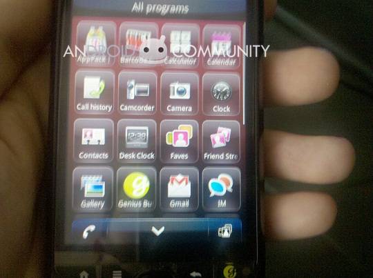
The application drawer isn’t of the 3D variety, so it didn’t slow down at all, no matter how many times we opened it, closed it, and repeated the process. And, as we said above, while we give a lot of credit to the processor under the hood, we believe that the system’s performance has to be mostly chalked up to Android 2.1. In the end though, it doesn’t matter why it’s responsive, just the fact that it is responsive is all that matters. Truth be told, the Slide won’t disappoint you in this area.
The Camera

It’s a 5MP and has an LED flash. With that in mind, don’t think that this is going to be the cameraphone that replaces your current point-and-shoot. While the camera is good enough for its market, we weren’t all that impressed with it. Shots did come out with some good definition, but only if there was optimal lighting. And the LED flash did well enough for image optimization, but trying to snap a shot in the dark didn’t pan out so well. There is autofocus, and you can manually zoom. This may not be the one deciding factor when choosing the Slide as your next device, but we can’t say that it will prevent you from buying it, either.
The Battery
Whether it’s a good or bad thing, that’s up to you. But the Slide’s battery is pretty much standard for an Android device. Before we installed a lot of third party applications, and had the standard email being pulled from the cloud, Google Talk on in the background, and doing some marginal web browsing, text messaging, and voice calling, the battery would last a full day. However, once we started doing more data sessions, answering more Instant Messages from a third party application, and watching videos, the battery took a severe dive.
The battery is something that will vary from person to person, based on usage. As we mentioned, the battery did quite well for itself when it wasn’t put any long-term pressure. So, as long as you’re not going crazy with long data sessions, or running a lot of third party applications in the background, you should be fine.
In the End
Right from the start, as soon as we pulled the Slide out of its well-crafted box, we knew that there was something interesting about this device. If not downright special. And the more we used it, all of that came true. From the physical body, to the software that powers it, and even the processor that keeps the device chugging along, the myTouch 3G Slide is a very, very strong addition to the myTouch family. If you’re in the market for an Android-based handset with a physical keyboard, we can honestly say that the Slide is one that you should give some serious thought to. As it stands, it’s one of four favorite Android handsets altogether. We’ll have to wait until about mid-June before the Slide hits retail availability, and if it remains at that $149.99 price point, then it can be a real contender in the market.
[vms 290fa60eb31b5fc917ad]







respected sir i have and htc my touch 3g slide but it is lock and i want an unlock code for all networks please help me my iemi number is 35181004063901
omg this is so retarded i asked for stuff i can do not pictures of it i know what it looks like i hold it every hour!!! -dumb
I like this phone, I have a htc hd now. nice item
looks great!
but I like iphone most of all..
it can be a real contender in the market.
Classic type! I’m going to have one.
Classic type! I’m going to have one.
HTC myTouch 3G Slide wooo…
it’s a very nice android phone……
i want one HAHA>..
I can’t view my video files even I downloaded it to the SD card in my HTC My Touch 3G Android Phone and even editing pictures its not showing the option settings.
I hate the effen phone dont ever get it well they dont have anymore thats how old thease phones are so thiz is y im getting the sidekick 4g with andriod invovled
This phone breaks so easily! If you have too many txts, too many pixs, too many videos or too many songs, the touch screen locks down (or vibrates endlessly!) Ive replaced mine five times in this yr alone!