Aside from Android N, Google has also been working on several updates for Material Design. It’s about time the tech giant releases improvements on the design guidelines because the New York Cheesecake is about to be served. Okay, we’re not sure if it’s the next Android dessert but it’s good that the company updated the specs and requirements that Android app developers need to follow. This means those apps that already have Material Design elements will be updated in the coming months.
If you’re an Android app developer, you need to check the updated spec guidelines and apply them on your apps. The latest Material Design library by Google is expected to make all apps look similar and very distinctly Android.
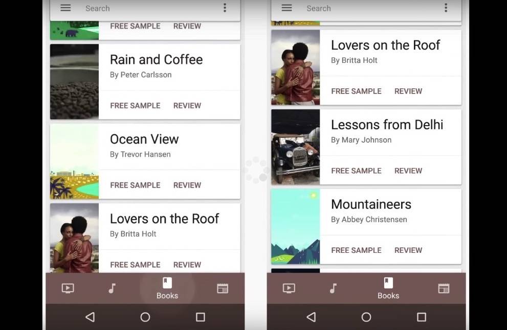
Material Design elements will be simpler. For example, the app will have to follow the color of the icon as the primary color. The usual scrollable menus on the left or right will be removed. Menus will also be arranged plus there will be changes to the bottom menus.
Google just wants your apps and menus to be simple. The company believes in simplicity and it’s hoping that the new Material Design will showcase that. Watch the video below for a preview:
The March 2016 release of the specs of the Material Design will include split screens plus switching between top level views with those bottom navigation bars. You will also see learn how to display password input on text fields if you need to and see accessibility guidance on color, contrast, motion, and hierarchy among others.
Check out Google’s latest design specs HERE.


