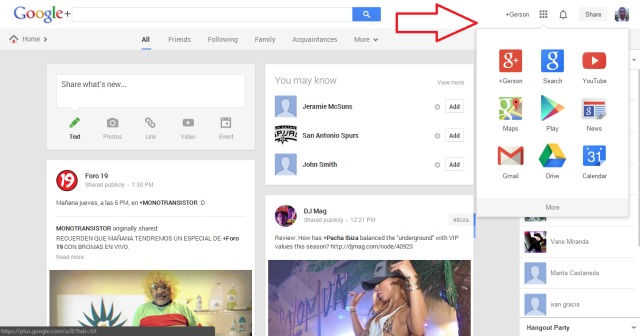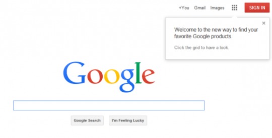
This morning we’re getting multiple reports that Google has changed up their usual black navigation bar on their homepage, and replaced it with a brand new Android-style app launcher. The horizontal black bar for navigation to Search, Images, Maps, Gmail, Play, YouTube and more have all been moved to an app launcher menu. Blending the lines between Android and desktop even more.
The new square icon on the top right of Google’s main page resembles the app drawer launcher from Android, and now opens a similar drawer with a grid-style layout of the same navigation destinations for Gmail, Search, YouTube and more. Now all in a easy and convenient system similar to what we’ve all been using on smartphones for years.
In case you didn’t notice, they actually look exactly the same to the related icons on Android. Right down to the recently updated YouTube icon and all. This design has been spotted as far back as March of this year, but rarely seen my more than a few eagle-eyed readers, but today TechCrunch has confirmed it’s finally ready to go live.

Update: Google’s made the changes official this afternoon in a brand new blog post.
In a recent Google+ post showing off the new design we got confirmation right from a Googler. Community Manager Justine Rivero dropped in and said, “Glad you noticed! We’ll be rolling out this new feature in the next few weeks… stay tuned!”
Obviously this isn’t Google Chrome OS merging itself with Android or anything, but it’s nice to see Google continuing to improve and refine our experience. With billions of Android devices in the wild it makes sense for our PC experience to be similar to mobile. Who’s seeing the new design and layout?
VIA: TechCrunch


NOOOOOOOO! i like the black bar, i don’t want yet another button or menu to go thru to do what i want.
i will also change to yahoo , this sucks, so will my company, like 3000 employes , take that google.gaagle,giigle,guugle,
no you won’t
NICE! Hope to see something like this in Android, or better yet more Chrome/Android integration. Give me a reason to buy a chromebook, besides wanting photoshop on it.
I am still seeing the black bar on my end.
Is that a euphemism?
And it’s now official
http://insidesearch.blogspot.com/2013/09/updating-google-bar-many-products.html
Nooo! I want the black bar back NOW! At least for desktop users, this is just more inconvenient. 2 clicks instead of one. At least give us the option! Not everyone wants their browser “optimized” for mobile.
Fully agree. It’s just an unnecessary additional click, just like the changes they made to Youtube’s quality adjustment options. I’m gettn real sick of these “improvements” that actually just equal out to more work.
I’m all in favour of simple clean screens but you have to keep click efficiency paramount. In gmail you now have to move your mouse all the way other to the right and then two clicks from the app you want. I would have though a hover sidebar click would be better
Stupid and unnecessary “improvement”. Google’s homepage is just a huge blank page with only their logo and the search bar, so why do they “hide” the buttons when there is so much room left. To the other useless options (at least for the most people) like “Advertising Programs”, “Business Solutions”, “Privacy & Terms” etc. you can still access with just one click. I don’t get it.
This is NO improvement. Now it takes longer to navigate through all the
inconvenient unnecessary icons. At least give us the option to keep and
customize the black toolbar.
^^ Let alone I can’t even seem to find certain things at ALL now without the black bar. That thing was incredibly helpful :/ I’m scripting an addon to create one of sorts right now because I miss it so much :< GOOGLE Y U DO THIS.
this is an additional two “clicks” to access my calendar… while it sounds petty, this is adding steps rather than reducing. Please give me the option to keep the tool bar.
Chrome has been crashing since this app was installed. Cannot use extensions that don’t come from Chrome store in the launcher. This is a piece of crap.
Cmon Google! you keep trying to fix shit but you’re making it worse. I liked having the apps as my homepage instead of the Google page. Now we have no choice. -.-
When I push on home icon, it asks me to complete action by launcher / twlauncher, I cannot remove it, even after removing it. What can I do
Bring back the old bar or at least give us the ability to revert if we want to?
Improvement? Is that what their calling it? This is no improvement; this is an outrage. Bring back the black bar. It was simple and easy, with no unnecessary tab box. Give us the option to change back.
So I have to click twice now for the “conveniently accessible” Google features?
Stupid.
Oh yes everything to suit Google’s convenience and more clicks. The black bar was much easier and faster. Shame on you Google it should have been made an option not a permanent change for all.
Customer service what????
I am switching to YAHOO News…what Google wants to give them a larger market share increase?
Yea this is kind of awful. I would like to see their reasons for how this is an improvement in any capacity. I typically love Google and still do, but this mad me sad.
Is there a way to brink the black bar back?
This is crap. With the black bar these programmes were already there in front of you, discreetly at the top of the page, and you simply clicked on whichever one you wanted to open. Now you have to click once to open the stupid ‘Apps Launcher’ then again to open the programme. Stupid. Stupid. Stupid.
Once again some mid-level shit decision. One more click to access any other google product. I thought we were all about removing extra clicks these days not introducing them?
As a side note, seems the community/product is not in favour. They will roll-back soon enough.
It doesn’t work so good…
Thanks, really nice.
Excellent move by google. Whereas microsoft is exposing menu functionality to the ribbon, google is moving from the ribbon back to the menu. That’s how it should be. Well done google, I love the extra mouse clicks and those big fat ugle icons.
Google wants to remove clutter from the home page, and make a sleek interface. The google search home page is already the most barren looking web interface out there. Why this poofy change?
Google translate is now three clicks away instead of one. Nobel prize for ergonomy. As a suggestion, I would say to add some required key presses and a captcha.
I hope that the one responsible for the new apps buton doesn’t read this, because I am afraid that he wouldn’t understand the irony…
Stupid and unnecessary improvement.
I just waste over an hour of my time trying ti figure out why my wife’s desktop lost the black toolbar but my computer had not. I thought we screwed it up, but instead realize that I block stupid auto updates to my computer just for this type of “surprises”.
Some of us still use dektops and want a home page with quick one click links.
I am guessing staff at Google dont use Google apps – otherwise the idiot that added 3 extra clicks to find translate would have been tarred and feathered and would feature as the new “mascot image” for the next release (IceCream Tarred and Feathered) where life for users had less clicks. – WTF!!! – Sergy – Start using your own companies products. Please bring the black bar back.