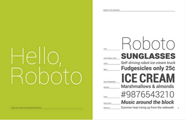
Along with the talks of the new Android 4.0 Ice Cream Sandwich OS came chats about the devices that would get the update, such as the Galaxy Nexus, and chats about a new typeface of all things. Google opted for a new typeface with ICS that is dubbed Roboto. The name left geeks everywhere with Styx running through their heads, but Google had a reason for the new typeface. Google’s Matias Duarte talked a bit about the Roboto typeface recently.
Duarte says that the Droid font face that Android has traditionally used was designed for screens with a lower pixel density than the HD screens that are common in devices today. He says that the Droid typeface struggled to give the openness and information density needed in ICS. The Google typeface gang set out to create a new typeface that would be visually appealing and take advantage of high-density screens like the Galaxy Nexus offers, and then still be legible on lower density screens like the Galaxy S.
Roboto sprang from the straight-sided grotesk fonts, though circular fonts like future were considered. The lower case letters were softened up to make them easier to read with the “e” and “g” opened up and the “a”, “c”, and “s” characters remaining closed. It’s a bit surprising to me how much effort was put into the typeface alone. The team working on the typeface is still at work extending the font to work on computers. I hope the OS is as polished as the typeface.


Correction: it’s Futura not “Future”.
not sure but why does it matter if the hardware manufactures just throw their own customized UI up. You spent a lot of time on interface but didnt make your design mandatory.
Domo Arigato, Mr. Roboto.
I think it looks good. Already using it (changed font on my DX) and like the subtle change.