


The Google Play Store is one of the products from the tech giant that they seem to want to experiment on with several new features and looks, all executed thorough server side updates. But it’s probably one of those rare times that they’re doing several things at once and basically changing a lot of the user interface items on the app. It’s pretty interesting to see if these changes would work or people will complain about it (probably some of the latter).
One of the changes that they’re testing out is renaming the formerly Movies, Music, Books section into just the Entertainment section. When you click on that tab, it will still show different tabs for Movies, Music, Books, and Newsstand. Maybe Google just wanted an umbrella tab so the name will be shorter and people will be curious as to what “Entertainment” is. The carousel for featured items has also been revamped, with the images not stretching from left to right anymore and the “Apps and Games” and “Entertainment” sections have also been relocated.
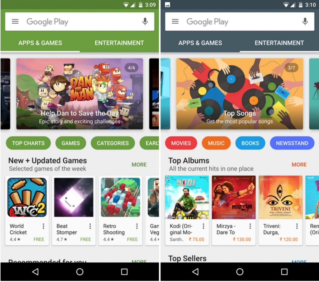
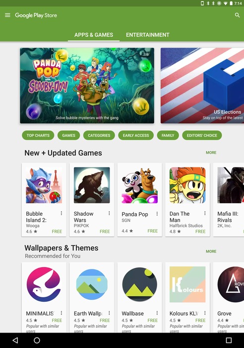
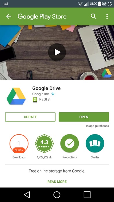
They’re also looking at removing the white space bar where you used to do all your searches. It had the hamburger menu, an icon for voice search, and of course the Google Play branding. Now you would have to tap the search icon on the top right of the screen in order to do your search, including the voice search option, a;lthough people rarely use voice search for the Google Play Store anyways. Lastly, when you open a Google Play link from other apps, you’ll see a green banner with the branding pop up.
We’re not assured that any of these test features or UI will make it to the final version. So if you’re one of those receiving these new features/layout, test them out and let us know what you think.
VIA: Android Police


