


It may just be cosmetic, but the refresh of the Google Play Store app and notification icons is something still worth noting. It may not be something that ordinary people would notice, but those who have an eye for detail will probably notice that they indeed look better now. And Google likes playing around with the design and all, so who knows how long this will last or if the next update will even bring a better look.
Basically, the app icon of the Google Play Store has now finally gotten rid of the “suitcase” it has been carrying since forever, back when this was still known as the Android Market. Now you just have the Google Play logo on its own, and it looks so much better as it is cleaner and simpler. However, the round icon variant is still the same and as Android Police states, it looks like the logo placed on a dinner plate.
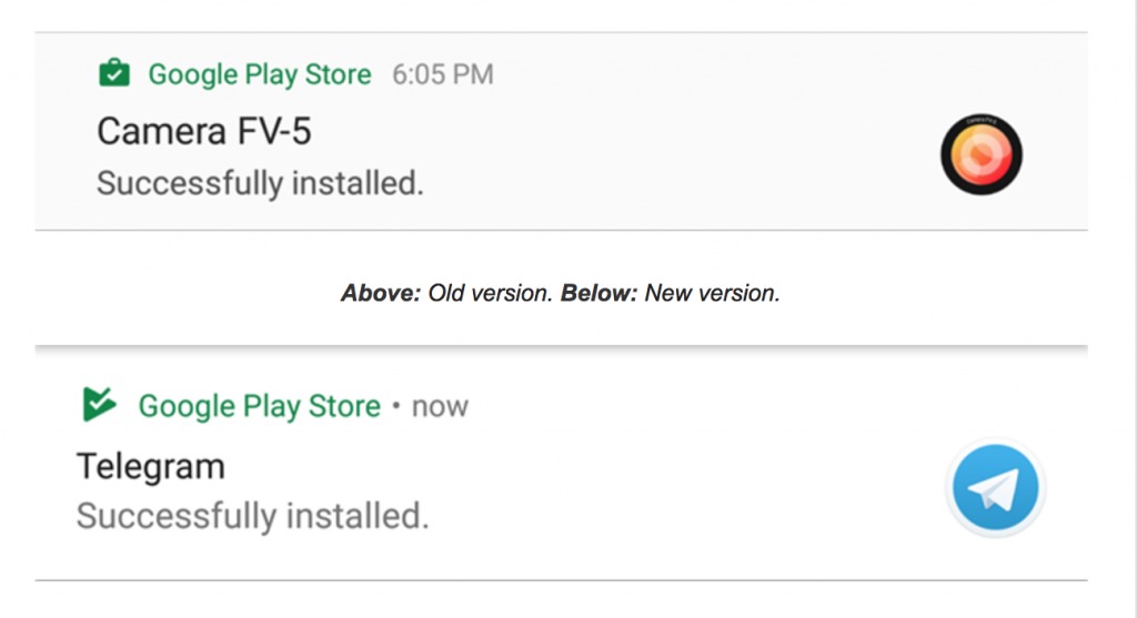
The other cosmetic change is with the notification icons. The standard “tote bag” with the check mark is now gone and instead you have the checkmark on a triangle (just like the Google Play logo, but in just one color). The icon colors depend on the color of each of the content stores, like apps, books, movies etc. For the stacked updates, you will no longer see a stack of blocks but just the same triangle app icon you would see for single updates.
The update to the Google Play Store is slowly rolling out to users but if you want to have it already, you can download the APK from the source link.
VIA: Android Police


