


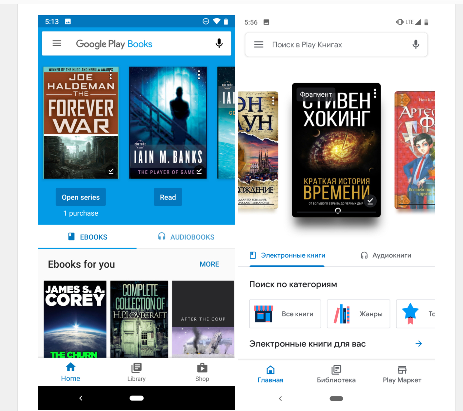
We expect Google to update and/or redesign most of its own apps now to match the Material Theme that they have been rolling out to their various apps and also encouraging third-party apps to adapt as well. The latest of their first party apps to get an updated look is Google Play Books, although it looks like it has only rolled out in Russia for now. The changes are also not that obvious and some are actually a bit detrimental to those reading ebooks.
The changes to the app are minimal, unless you’re really particular about minor UI tweaks. The most obvious ones to the critical eye are the hollow iconography, the profusion of white backgrounds, the rounded corners, and of course, the changing of the fonts to Google/Product Sans. You now get a redesigned Home screen and carousel with new category buttons and the white navigation bar as well.
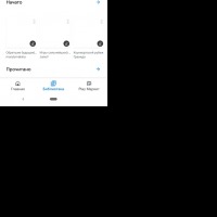
Some of the changes you’ll see in the Iibrary tab include the 3-dot menu now becoming an overlay at the upper right, smaller cards, the more background now becoming an arrow, and updated icons, backgrounds, and fonts. The tabbed categories are basically the same but the sub-categories now are in oblong buttons.
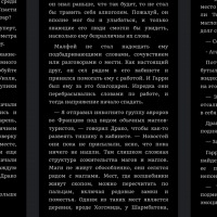
The reading experience on the app hasn’t changed much, although the small tweaks aren’t good for those who want better accessibility to the app. Some of the text on the page have shrinked and some of the interactive elements are also smaller. Although of course you can always adjust the font sizes since this is an ebook reader after all.
When the update rolls out to a wider audience, we’ll know for sure if this look is final or if they’re merely beta testing. It’s a server-side switch so we’ll just have to wait til the update reaches us.
VIAL: Android Police


