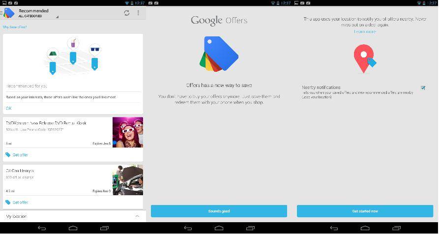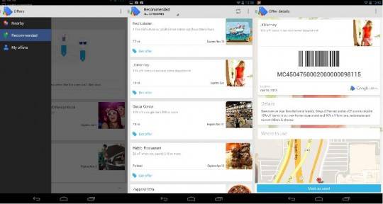
Google Offers has been updated, and adheres to the new Google app design guidelines. With a card-based interface and gesture-rich navigation, Offers now looks like most other Google apps. In addition to the UI changes, it also alters the way offers are redeemed.
Some of us recently began receiving refunds for Offers we hadn’t redeemed. Part of the issue with that was that the offer had been redeemed, but the establishment just never bothered to tell Google about it. As such, Google has probably doled out a bunch of cash or redemption credits they didn’t need to. The easy fix? Don’t make yourself a clearinghouse for offer payments.
Along with the new design guidelines are the ability to save offers for later use, and redeem them once you get to where you want to go. Rather than buy the offer via the app, you can now skip the middle man and deal with one transaction. For us, this makes redeeming offers a bit more streamlined and a lot less annoying. You simply save the offer, and it’s saved to the “My Offers” section of the app. Once you select the offer, it provides you with a barcode for the cashier to scan, and even provides a map and directions to the nearest location (if it’s a chain of stores).

For Google, it simplifies their interaction with those involved in the Offers program, and relieves their need to manage accounts payable. By simply acting as the conduit for offers, they still provide a service that drives traffic to businesses, but can stay neatly tucked away from any disputes or aggravation.


