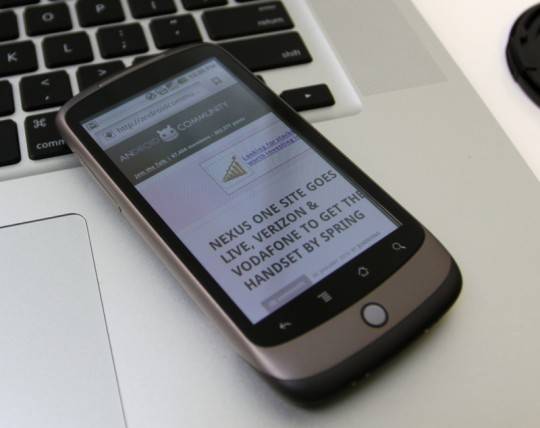
Well, apparently nobody can’t get enough of the “Google Phone”, as many are still calling it, but hey, can you blame them, I know we can’t either. The Google Nexus One has been the greatest news lately, especially yesterday. Our adventurous leader has now an Android 2.1 handset to play with, and that he did; he’s done also an unboxing video of the Nexus One.
Vincent is impress at how slim (at 11.5mm) the Nexus One is, but with a big 3.7-inch AMOLED display, the handset is reasonably long and broad (at 119mm and 59.8mm respectively). He’s not very convinced by the choice of colors (I have to agree with him), but likes the pleasantly responsive glass capacitive touchscreen and said the plastics feel of reasonable quality. Using the phone with just one hand a la Palm Pre seems a little tricky, since the row of four capacitive buttons and the trackball are quite low, there’s also no dedicated camera shortcut.
In comparison with the HTC HD2, the 1GHz Qualcomm Snapdragon processor on the Nexus One is fast and slick. This, of course, minimizes some usual Android lag-points, like opening the apps menu, which is now different in Android 2.1 than that on 2.0.1, it now overlays the icons over the homescreen, instead of pulling up an app-drawer. Still, Vincent feels that pitting the Nexus One vs the Motorola DROID will show how much difference there really is. I’m all for that, like many of you must be too, especially now that we know the Nexus One will arrive in a couple of months to Verizon. Switching between apps using thumbnail cards webOS-style is also a nice addition, and the camera software feels more responsive than the DROID’s, and even though the on-screen photo quality of the “N1” looks decent, some testing is required to find out if it is actually better.
Below, you can read more on Vincent’s thoughts on the Google Nexus One, also, watch the unboxing video of this wonderful device:
Despite the HTC connection, there’s none of that company’s clever Android modification: this is stock Android 2.1. Google have increased the number of homescreen panes from three to five (still short of HTC Sense’s seven) but HTC’s clever on-screen keyboard with its reasonably accurate auto-prediction and correction is absent. The lack of multitouch may prove frustrating too; we’ve found ourselves making a few mistakes from trying to type too fast. The DROID’s hardware keyboard isn’t perfect either, so it’ll be interesting to see which we’re faster with.
[youtube]http://www.youtube.com/watch?v=v4XSQ7u3s8U&feature=player_embedded[/youtube]
[Via SlashGear]


