


Leaked images suggest Google’s Android app icons are in for a redesign. The alleged app icons, which you can see below, suggest Google wants to keep apps looking similar across platforms. From the web to your Android handset, apps may have a similar aesthetic moving forward.
The app icons are believed to be reworked to give them a similar look and feel to their web counterpart. Currently, apps on the web look a touch different form those on Android. While not necessarily confusing, Google may just be looking to move in a singular direction.
This change can likely be attributed to Sundar Pichai, who now heads up both Chrome and Android. Prior to his appointment as chief of both services, he ran Chrome while Andy Rubin took care of all things Android. With Rubin leaving Android for androids, Pichai is likely taking both Android and Chrome down the same (or at least similar) aesthetic path.
What we don’t know is whether or not the web icons will change to match these purported new Android icons. Android Police note a fair level of confidence in their source, but there was no news on whether or not these were meant for Chrome as well as Android. The change affects just about every major Google service for Android.
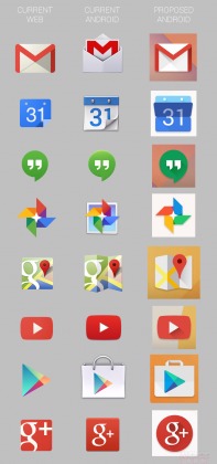
We see from the design changes that Google is moving away from a flat design, but not all the way back to the skeuomorphic design we saw a few years back. The reworked apps have a touch of depth, with shading and a more aggresive color palette. Perhaps the most drastic (and best) change affects Maps, where Google has dropped the cartoonish feel in favor of a plain design.
These apps could make an appearance at I/O this year, or just roll out incrementally over time. There is also nothing saying these are even accurate, or finished products. Some we like (Maps), while some we wish Google had left alone (Hangouts). What do you think of these new apps? Excited for a change, or just tired of all the tweaking? Let us know in the comments section below.
Source: Android Police


New icons look like shit!
yeah, new icons look like TRASH.
They must have some reason they’re getting rid of transparent backgrounds. Hope I don’t have to change all the icons of my apps for some stupid reason.