


If you’re the kind of person that doesn’t really like looking at maps or can barely understand maps, navigating through a new place with only a map, physical or digital, at hand can be tough. Google Maps is already user-friendly as it is, but the latest update to the app brings even easier ways to recognize places and features. They have updated their maps’ looks to fit the different “experiences” when you use the app and they’ve also now included new color-coded icons to represent the places you look for the most in maps.
People use Google Maps when driving, navigating, commuting (transit), and exploring new places. And the maps for each of these experiences now highlight features that are relevant to each of them. For example, gas stations are more prominently shown when you’re navigating, while trains stations are obviously, for when you’re commuting through your city’s train system.
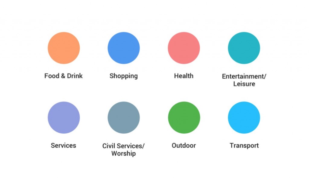
Another new thing that you’ll see when you open your Maps is that you now have color-coded icons that represent places like cafes, churches, museums, and hospitals. The icons are now a little more obvious, but to add even more to its identifiability, they also have their own color coding. The eight major categories are Food & Drink, Shopping, Health, Entertainment & Leisure, Services, Civil Services & Worship, Outdoor, and Transport. Each category has different specific places with their respective icons.
The changes will take effect not just on Google Maps, but other Google products where it is integrated, like Assistant, Search, Earth, and Android Auto. They will also eventually appear in third-party apps, websites, and experiences that use Google Maps APIs.
SOURCE: Google


